HOME | DD
Published: 2004-08-03 10:05:17 +0000 UTC; Views: 12395; Favourites: 161; Downloads: 6595
Redirect to original
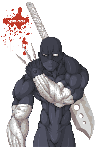
Description
been playing around with styles, i think i like this one the most. heh, if u seen the original drawing, u can see theres been some changes. hope u like it.Related content


Comments: 246

Wicked cool man! The Kunai could be bigger but w/e he looks badass.
👍: 0 ⏩: 1

looks great add some darker color and fix the sword but other then that its great
👍: 0 ⏩: 1
splatpixel In reply to blackdra [2004-08-04 00:37:37 +0000 UTC]
thanks for the crit, i'm too lazy right now to fix it tho.
👍: 0 ⏩: 0

Awesome work, shading is magnificent. Dunno how you do it, but you do it well.
👍: 0 ⏩: 1
splatpixel In reply to budgieisking [2004-08-04 00:36:05 +0000 UTC]
heh, thanks alot man. and thanks for the fave.
👍: 0 ⏩: 0


")

i dont think i would be cool to run into him in a dark allie way.. o.O EVIL MUSCULY NIJA!! o.o
👍: 0 ⏩: 1
splatpixel In reply to deadlydigital [2004-08-04 00:34:19 +0000 UTC]
heh, me too. i'd run away like a lil bitch.
👍: 0 ⏩: 1
you know i went back like 5 pages to see what you said o.O; your liked toooo much lol 

👍: 0 ⏩: 0

That is truely amazing! My favourite part is the linework itself, with all the muscles. You coloured it in very professionally and neat. Flawless. I also like your little logo you put in the background.
One question: How do you make these? Do you first start of with a brush and make a drawing, then trace it over with the pen tool and colour it in? You don't have to go much into detail, or you can keep it as a secret, was just wondering
Oh and I don't mean to bitch but isn't it supposed to be in the Characters folder?
Now for my critisism: I think the blade needs a little extra work, it looks rushed compared to the rest. If you don't want to add colors because you like to keep your color pallete low I can understand, but otherwise you could add an outline and a reflection on it. You could also take the colors for that from the bandage, so your pallete wouldn't get bigger.
My second nitpick would be the background. I think it's kinda plain, yet stylish. However, a dark cloudy background would look good on this, perhaps with some brown greyish rocks and/or mountains.
But again, love the line work and the smooth colours, how many of them did you used btw? Looking at this image makes me want to make sprites again with my Wacom, you can tell you're definatelly talented!
Okay I must stop writing now ")


👍: 0 ⏩: 1
splatpixel In reply to zoanoid [2004-08-04 00:33:35 +0000 UTC]
thanks much for the comment, crit and fave.
for the question. i first draw it out on paper, scan it, take it into photoshop, turn everything into a 1 bit, take into Paint, clean it up, then i start coloring.
👍: 0 ⏩: 0

could you be any engenius'er? cuz that is like t3h r0x (so to speak..)
👍: 0 ⏩: 1


 (Smile)")
splatpixel In reply to gas13 [2004-08-04 00:28:47 +0000 UTC]
thanks much for the comment and fave!
👍: 0 ⏩: 0

omfg i love it. this must the best pixel work i've seen from you yet. the muscle detail is superb as always, and those bandages! damn they're good. they looks so 3D. i love that shade of blue!
👍: 0 ⏩: 1
splatpixel In reply to kittyasystol [2004-08-04 00:27:22 +0000 UTC]
thanks much, glad u like it. and thanks for the fave.
👍: 0 ⏩: 1


awesome, the detailing is superb, particularly like the way the arm bandages look.
👍: 0 ⏩: 1
splatpixel In reply to gdpr-503718 [2004-08-04 00:26:06 +0000 UTC]
thanks. that part took the longest, heh.
👍: 0 ⏩: 0

I think when you get to these sizes, it might be w-a-y easier to make it vectoricly...
Anyways, very cool as always... Amazing muscle work...
👍: 0 ⏩: 1


nice texture and shading on the fore arms
Heiko
👍: 0 ⏩: 1
splatpixel In reply to Heiko [2004-08-04 00:24:30 +0000 UTC]
thanks alot. that part took the longest to finish.
👍: 0 ⏩: 0

very not bad mr. splatpixel great shading on everything... everything except the metal parts .... looks a bit flat compared to the rest of the detail-icious pixels :-P just my humble opinion... everything else is spot on and pixellated sex
")
👍: 0 ⏩: 1
splatpixel In reply to statichavoc [2004-08-04 00:23:07 +0000 UTC]
thanks, but thats not metal, his arms r wrapped up.
👍: 0 ⏩: 1
no no no i meant on the sword and the knuckles... they look flat :-P the wraps are obvious and look great.
👍: 0 ⏩: 0


awesome work dude
just dont like the ... thingys in his hand they are either 2 thin or too long
love the muscle work
another gr8 pixel art splat congrats
👍: 0 ⏩: 3
splatpixel In reply to RocketDude [2004-08-04 00:21:15 +0000 UTC]
Kunai!!! thats wut the fuck these things r called! thanks to whoever said that. it's been bother me for days. anyways thanks for the comment, maybe they r a lil small but i dun really wanna fix it, heh.
👍: 0 ⏩: 1

I rekon they look fine. Seriously even after it was said that they were to small, I still can't notice whats wrong with em?
👍: 0 ⏩: 0
maybe the guy's just big
👍: 0 ⏩: 1
lolol
i think the kunai are a bit too thin, the guy looks good
👍: 0 ⏩: 1
no i meant maybe the guy's realyl big that's why the kunai look too thin

👍: 0 ⏩: 1

They're called Kunai or something...
I love the forarms with the bandages. They look awsome. The sword is super coolies as well
👍: 0 ⏩: 0
<= Prev |