HOME | DD
 spock84 —
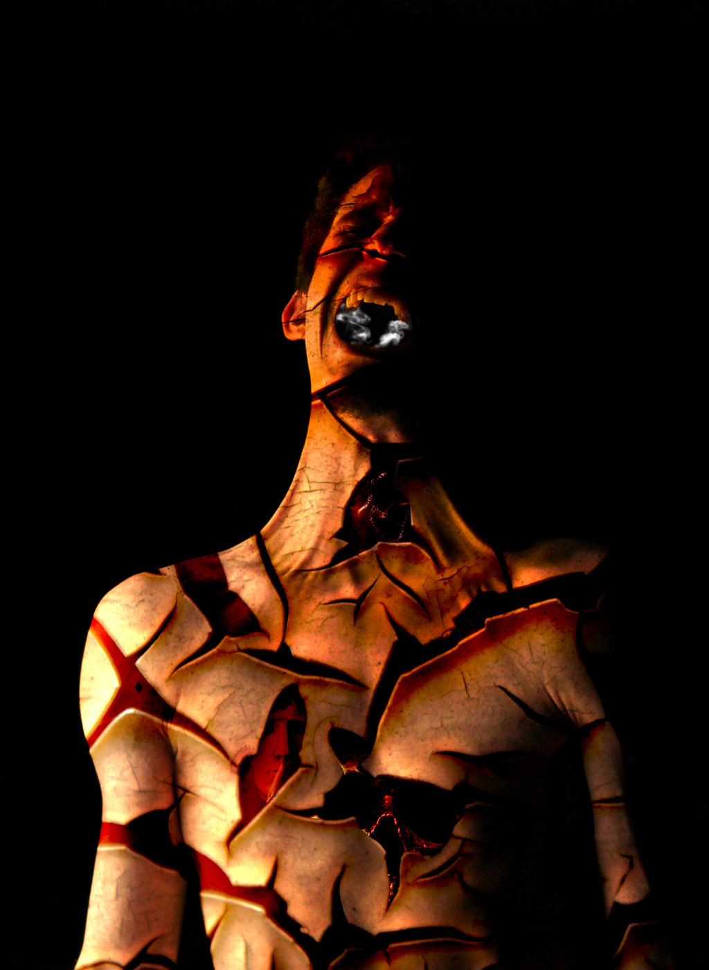
Pathetic Zombie Puppet
spock84 —
Pathetic Zombie Puppet

Published: 2004-12-05 01:32:35 +0000 UTC; Views: 32361; Favourites: 422; Downloads: 7247
Redirect to original
Description
Still don't know whether I'm done with this or not. IMO there's some room for some sort of textures in the areas where you only see the background.This picture is quite a bit of a rip-off of Fredrik Ödman (fredrikodman.com) who's been of great help with his photoshop skills the last month and a half. Thanks a lot to him.
Related content


Comments: 205


A great concept. Very good photoshop skills. Is the background seperate from the foreground? If so, how did you get the shadow? Mabybe you could find a photo of cables (bridges, etc.) and use those instead of the drawn strings. Keep up the creative work!
👍: 0 ⏩: 0


looks great yo, only thing i would suggest is ...
on the leg, looks like you added a litle shadow to the "erased" area, gives it great depth... but on yer other "erased" areas it looks a bit amaturish. like you just took that marque tool and cut that shit out.
give it a little shadow here and there... DONT BE LAZY!
👍: 0 ⏩: 0


 (Smile)")

Hi. I just wanted to say this: great picture.
nothin' else.

👍: 0 ⏩: 0

this is posibly one of the funniest things i've seen in a while+fav
👍: 0 ⏩: 0


wow.. definitely an amazing piece. I love the way parts of his body aren't all completely connected, really adds something to the entire picture. Excellent work, I'll be looking forward to more of your stuff!
👍: 0 ⏩: 0


nicely done, I do think the edges of the masking are a bit too hard perhaps soften your mask a bit. And the lines look really like pencil lines it might be better if they looked more like cables or something. Anyway thumbs up on the clean masking, I'm a sucker for that.
👍: 0 ⏩: 0

Looks Really good, but I'm looking for more in the areas where he is severed and missin body parts. I can quite make sense of it. Looks to be unfinished I love the Colors and the expression, they kick ass!
👍: 0 ⏩: 0

its not my style at all.i dont see any message from this picture to be honest")
👍: 0 ⏩: 0

This really caught my attention. not sure what the message is though. My impression is that of Kurt Cobain.... Not sure about the emasculation though....
👍: 0 ⏩: 1

Maybe that's why he looks so angry...
👍: 0 ⏩: 0


wow this is some awesome stuff, how can i get this guy to give me some pointers?
👍: 0 ⏩: 0

I would suggest that this guy file a lawsuit against whoever or whatever did this to him, but, it seems like his case barely has a leg to stand on.
👍: 0 ⏩: 0

Creepy...
I'd be screaming too if I had no nads...
This is a truly remarkable manipulation... flawless in it's absurdity...
Well done...
👍: 0 ⏩: 0


Really kewl. I particularly like the distinction between the background and foreground colors and the clipping used on the figure.
👍: 0 ⏩: 0

this is freakin crazy man! i love it!
...bet that tape was fun to get off...
peace
a-s-a

👍: 0 ⏩: 0


Very good photo to start with, I mean it really looks good. I'd add the chopped shadows in a few areas, I mean, the faux-3D depth of the cut-off parts...
Do I make any sense? I mean, the missing dark oval on top of the ankle, and in the arm... you know...
Very cool job nonetheless.
👍: 0 ⏩: 0


oh god. his thing is gone. i'm afraid. great shot.
(sorry, but this is definately not a subject i can comment in a critique-heavy way)
👍: 0 ⏩: 0


sorry but i can't understand why is this a daily dev
this can be done in 20 minutes
it's a nice work and idea really...... but for daily dev ?!!??!


👍: 0 ⏩: 2

Ciril said what I was thinking of saying. Thanks.
I'll have to add, though, that this absolutely did not take just 20 minutes to do.
 (Wink)")
👍: 0 ⏩: 1
sorry i mixed up you two... please read my comment to Ciril so i don't have to repeat myself
👍: 0 ⏩: 0

hehehe....
i was the same thoughts for many features that were featured in the past.
but the purpose of daily deviation features is just to make un-known artists known... of course only the ones that deserve that.
and this picture deserve it. many things can be done in 20 minutes.... in fact most photos are taken in less than a second... you see time doesn`t matter. it is just about a good motif, story, original and creative motif....
👍: 0 ⏩: 1
kay
you said it
but still... i vote for the story, i vote for the motive, i just think the pic itself has some obvious flaws in shadowing and perspectiive... and that you can fix it, now that you've became famous
👍: 0 ⏩: 1
you dont become famouse just because of one daily deviation feature.
you usually get 1000-2000 page visits, comments and new watchers...
👍: 0 ⏩: 1
no, actually you're wrong.
almost everyone has at least 1000 pageviews, but daily devs bring hundreds of favs and comments to one's page in a day. so people notice his/hers work easily.
you don't have to justify yourself just becouse one person doesn't like the work hun
cheers

👍: 0 ⏩: 0

Keep up the good work, by the looks of this, it won't be the last i see.
👍: 0 ⏩: 0


!!!!!!!!!!!!!!!!!!!!!!!!!!!!!!!!!!!!!!!! !!!!!!!!!!!!!!!!!
👍: 0 ⏩: 0


Love the piece, it's a fantastic idea. My only suggestion would e to have the skin slightly pulled out where the puppet strings attach, like they're actually pulling the flesh.
And as a possible extra, maybe just have the muscular structure showing in some of the gaps, or perhaps the intricacy of the veins.
Just a couple of thoughts.
👍: 0 ⏩: 1
Thanks, they just seemed the best way of fleshing the concept out.
👍: 0 ⏩: 0

I checked out the guys site and pretty quickly found the picture you say yourself you are "ripping" off. luckily, concepts cannot be copyrighted, only the final product.
You're interpretatiion of the idea is better in my opinion. I love the clearness of your manip and the fine details. I slightly dislike the way the 'broken' arm and wrist are suspended by single strings on his right arms, it doesn't look right somehow. But everything else is brilliant, I love the way you blended the white straps with the skin.
👍: 0 ⏩: 0

I see what you mean by the background textures, although you may be able to achieve the effect I think you are looking for (to emphasize the "missing" spaces) by changing the color of the background some. Right now it is too close to the color of the tape, and doesn't really stand out as much as it should. Good work on the cut-out pieces, especially the shadowing of the upper leg.
👍: 0 ⏩: 0
<= Prev | | Next =>