HOME | DD
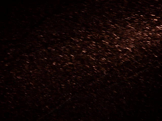
 spoofdecator — rain texture

Published: 2010-08-18 04:00:22 +0000 UTC; Views: 83586; Favourites: 1311; Downloads: 15836
Redirect to original
Description
well I think this was a good idea for manip makers (Smile)") ...I was always looking for good rain texture..enjoy! and link back if you use!! I wanna seeeeeee Tera
...I was always looking for good rain texture..enjoy! and link back if you use!! I wanna seeeeeee Tera
Related content


Comments: 638

you are so very welcome, it was my pleasure
👍: 0 ⏩: 0

I used it twice here: [link] Thanks a lot, it really helped!
👍: 0 ⏩: 1
")


you're quit welcome
👍: 0 ⏩: 0

thanks for using this texture!! looks great!
👍: 0 ⏩: 1

your welcome!
thanks so much
👍: 0 ⏩: 1
 (Wink)")

Thanks for the stock! I have used off-site at howrse.com, and you are credited on the image.
Here is the on-site [link] , you are credited in the artist comments there. If you would like the off-site link, comment back.
👍: 0 ⏩: 1
no worries, hun...I posted a comment on your wonderful visual poertry..hope you don't mind cuz i am a huge helper type person
👍: 0 ⏩: 1
Don't mind at all! Helpful people is what the world needs!
👍: 0 ⏩: 1
OHHH GOOD, i ALWAYS GET WORRIED TO CORRECT OTHERS...MY MOM SAYS IT IS NOT POLITE, LOL
👍: 0 ⏩: 1
Yah, no worries! P.S. do you have caps lock on?
👍: 0 ⏩: 1
haha! sorry bout that...sometimes I accidentally hit it...you were the recipient this time..
👍: 0 ⏩: 1

impressive, and goodluck!!!
👍: 0 ⏩: 1

Interesting texture. It would probably need tweaking a bit but it could make an interesting back ground for a css design/journal skin.
👍: 0 ⏩: 1
hmmm...well go for it!! you are very knowledgeable about that! I would love to see the results
👍: 0 ⏩: 1
I'm too lazy and it would need tweaking too much.
👍: 0 ⏩: 1
Too much contrast beteen light and dark makes it impossible to find a font colour that is very visible against both. The only option is to go for a bold colour like electric blue or red which is too frenetic, too gaudy and too in your in your eyeball.
👍: 0 ⏩: 1
well, I had to make it like that because when someone overlays it, they have to take down the opacity...it looks pretty good like that in others artwork. I am sure it could be better tho.....all my stuff could be.
👍: 0 ⏩: 1
I'm sure it looks great as others artwork, I was just talking about it as a background texture for css and the like. Comprendez?
👍: 0 ⏩: 1
ohhhhh...yes i get it...duh. if it were less illuminated and blurred plus drops were smaller on larger background maybe?
👍: 0 ⏩: 1


ahh destiny..! hope you are well, and here is an example of the useage of this rain texture>> [link]
It made me feel good...there are not many good texture for this and this one works great!
thanks for liking it, and you're welcome! Tera

👍: 0 ⏩: 0
<= Prev |