HOME | DD
 SrGrafo — Avatar Editor Rework!
#2017 #anime #avatar #avatars #editor #grafo #items #layout #manga #rework #roleplay #rp #sr #store #ui #void #website #srgrafo #rpvoid
Published: 2017-02-22 10:30:28 +0000 UTC; Views: 1172; Favourites: 12; Downloads: 0
Redirect to original
Description
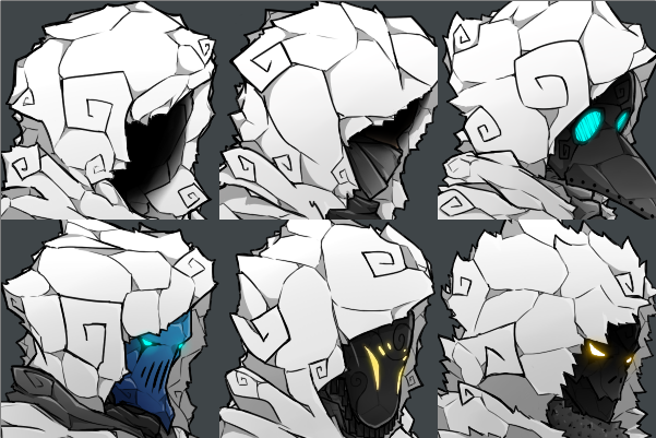
This is for the roleplaying website RpVoid.comDamn this took a bit of extra planning but here are the main notes
One of the main issues with the current layout we have, is that you scroll down and you leave your avatar at the top, so you cant see the modifications you do unless you scroll back up every time. So now you can see (not 8 but 16) items in the right side, without the price tag or other tags on top of them, more clean and scrollable in an horizontal way.
After some discussions, the sorting buttons are not mainly used so we changed it to whats used and what the users need/want, this is first a wishlist system, or in here "Faves", which allows you to fave pieces, and later by the Faves button it will display all the items you faved.
In the same way, there is a button that will show all the Owned items, the other two (name/price) will togle if display the names below the items or the prices.
Instead of using extra space with the "vip", "colorable", "rare", "shared" tags, now they are implemented in the very boxes below the items, being
grey = normal item
grey with colors on top = normal colorable item
golden = vip
golden with colors on top = colorable vip item
all the above with green borders = rare
Another improvement with the new layout is that, it allows you to instantly remove parts of your avatar, since when you click a category button, it will show in that space (select item box) the item that your avatar is using, and a button down there will appear as "remove"
Finally, the p1,p2,p3,p4,p5 well, yesh, those are the slots a user will have to place the color palettes he/she purchases, this might be implemented later since we need to work different color palettes for different themes and needs.
Ignore the tabs at the top (Avatars/Rooms/Equipment, etc), those need work but basicaly it is what it looks, all the editors will be in one page and users will be able to toggle between them with a short click, so editing your avatar is a click away to editing your room
and one tiny change is how much it annoyed me that the Back Body was in the 3rd row instead of the 4th with background and particles, no moorreeeee
Related content


Comments: 1

Wonderful that it is no longer colorblind friendly
Looks good tho
👍: 0 ⏩: 0