HOME | DD
 SSJ-Mabus — Blades of Steel - Toronto
Published: 2013-10-23 16:03:53 +0000 UTC; Views: 256; Favourites: 3; Downloads: 1
Redirect to original
Description
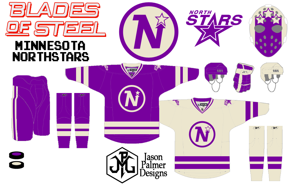
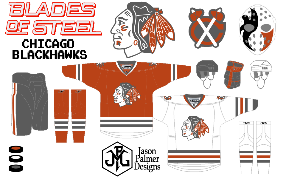
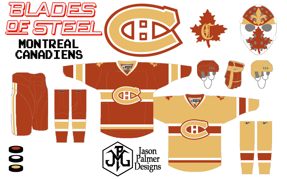
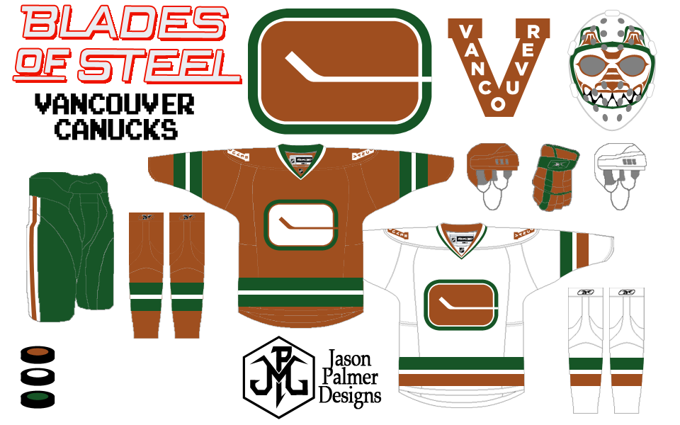
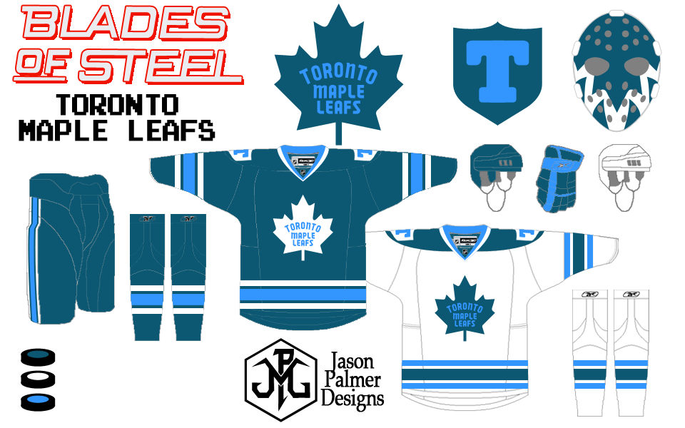
This is the seventh in my Blades of Steel series. It's a re-imagining of the NHL teams/cities featured in the classic Nintendo game "Blades of Steel".I followed a few simple rules for this project:
- all team colors remain faithful to the video game
- primary logos & jersey designs are based in team's histories (with minor detail tweaks)
- all teams will have secondary logos (got creative with those who did not have them)
- customized vintage mask designs (were also improvised)
Side notes...These colors always reminded me of the Toronto Argonauts CFL team. I decided to go with the late 60's era
jerseys and primary logo -- I liked them better than their 80's threads. The secondary is from the 1917/19 Toronto Arenas who later became the St. Pats and then the Leafs. The mask is an upside-down Leafs logo made to look like a scary mouth.
Thanks and Enjoy.
- Jason