HOME | DD
 stapler — Point of View

Published: 2001-06-11 08:59:15 +0000 UTC; Views: 207; Favourites: 0; Downloads: 45
Redirect to original
Description
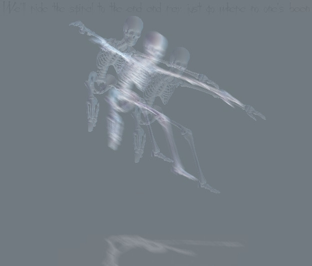
Point of View.Kind of a 'Run, Lola Run' type of thing. The same ambiguous image, three different ways of seeing it. Colour manip and text by me.
Related content


Comments: 7

oh man, this is sweet! I'm a colour freak, so colour manips are wicked. Nice goin' stapler!
.:they call me woozie:.
~wooziefied~
👍: 0 ⏩: 0

well... i can't read the red one. but i tink it's pretty funky. although i dont really like jap-like cartoons.....
👍: 0 ⏩: 0

I wouldn't blend it, but make the frames b/w the pics more exaggerated. Something like film frames or tv sets or photo edges. Maybe even have them change as you go down where the red is all crazy and 'splattered'. I like the concept alot and text is great but maybe uninvert the text in the red. One for readability and two, because it looks like you just inverted the whole picture. Now there's nothing wrong with simple but maybe just a little more funky. Wow us with concept and technique.
•----------•----------•--------•
pass the koolaid, o great leader,
it is I, lowly dork42
👍: 0 ⏩: 0

nice work man, I love the red/negative one, its so....whoa. then again i love negative stuff, its just whoa....hehe
nice job, and i the txt gives it a nice edge.
-Nick
[ http://lookmoreva.myeva.net ]
👍: 0 ⏩: 0

conceptually brilliant, especially if you made the image yourself.
LT http://www.longtooth.com
👍: 0 ⏩: 0

I agree with the above comment.
Did you not make the girl ?
Nice concept.
👍: 0 ⏩: 0

hey stapler
i think this pic would be
more neat if the sections blended
into each other somehow
nifty work all the same
👍: 0 ⏩: 0