HOME | DD
 startarevolution — Type 1 - Letterspacing 1

Published: 2009-06-02 20:49:28 +0000 UTC; Views: 146; Favourites: 0; Downloads: 5
Redirect to original
Description
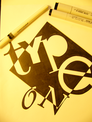
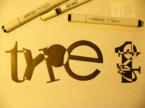
This for my Typography 1 class at The Art Institute of California - Los Angeles. (Instructor: Jack Keely)The assignment was we had to do was to do two compositions using a 4 inch square and the text "less is more.", and condensed or expanded letterspacing AND one with extremely tight leading.
I really couldn't pick with one I liked the best of the ones I did, so even though we had to do only 2 I did 4, 2 of each.
This one is for the letterspacing. I really wanted to use the box that we had to use, but in a different way. I decided to put "less is" really small and space the characters out, and then put "MORE" bigger and in the box, reversed out of it. I wanted to put the "." in the box as well, so I put it at the bottom to give the box a lot of space in the middle.
Done in Rapidograph & Copic marker on Marker paper.