HOME | DD
 Sugargrl14 — Goodbye II
Published: 2009-01-24 03:10:39 +0000 UTC; Views: 22441; Favourites: 1566; Downloads: 405
Redirect to original
Description
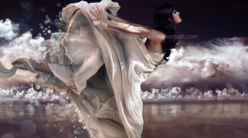
Goodbye: [link]I wanted to create the same feeling, but darker than the first one. A little more colder.
Stock Used:
=dazzle-stock [link]
stock.xchng [link]
Enjoy!

Sorry for the edit, I changed the size of it.
©Sugargrl14
My work may not be copied, reproduced, edited, published, transmitted or uploaded in any way without my written and expressed permission.
Related content


Comments: 122


what does the CS# stand for. And thank you for replying. Some people who have a ton of favorites on somethings sometimes don't and it makes me sad.
👍: 0 ⏩: 2

Well, I see you question has already been answered. But it's no problem! I try to always answer people's questions
👍: 0 ⏩: 1
Well thank you very much!Even if you didn't answer it, the thought is still sweet?
👍: 0 ⏩: 1
No problem! Yes, the thought is still sweet.
👍: 0 ⏩: 1
I'm sorry I didn't mean to put a question mark. 
👍: 0 ⏩: 1
I was kind of confused about that 
👍: 0 ⏩: 1


That is beautiful! Your really getting better with all of this, keep going!
👍: 0 ⏩: 0

Dazzle. Yay!
Phantastic.
I like especially the effects and of course her pose.
👍: 0 ⏩: 0

This is amazing. I like the first and this one!
 (Smile)")
👍: 0 ⏩: 0

Oh wow! This is really nice! I love the result of "tissues"!
Sorry for my english! hihi
👍: 0 ⏩: 0

gorgeous and sooo glamourous...
--
photography has NO boundaries...


👍: 0 ⏩: 0

this is dazzling!! 
👍: 0 ⏩: 0


You did a good job. <3 This version is gorgeous.
👍: 0 ⏩: 0


You should try a geisha type picture, a kimono can be costly but your amazing with manipulation, you could do it. Wonderful image.
👍: 0 ⏩: 0

It reminds me of the 'communal' heaven bit from What Dreams May come, where people float and fly over this suspended ocean. I love it lots
👍: 0 ⏩: 0

Wow beautiful work that, congratulations! You are a great artist!
👍: 0 ⏩: 0


 (Wink)")

So I decided to break away from the crowd here and give some more in-depth feedback...
You have some technical issues here, such as the cutting out of the model - evdience of the backdrop of the stock is still there (see the leg, around the dress). Your lighting is off; shadows that aren't supposed to be there are there (see leg), random splotches of light appear from nowhere (see hand, parts of dress). I know these appear on stock, but there are ways of fixing these issues, such as painting over, clone stamp etc.
You said you wanted to create a darker atmosphere, which you have not. Nothing in this piece suggests something dark, something that is a farewell or a goodbye. You need to work a lot harder to create an atmosphere.
Also, you only used two stocks? Try adding more components to your pieces for depth, because right now this looks a little plain and boring. Majority of the pieces in your gallery seem to lack depth.
Composition wise, I hated how you cut off part of the models dress - its not visually attractive.
Creative use of the circles, and you have a good sense of colour.
There you go, my two cents.
👍: 0 ⏩: 1
Thanks for the tips, I rushed on this one and didn't put too much effort into it, and that's why it's in my scraps.
Now, I have a suggestion for you. When giving a critique, you should make the artist aware of the mistakes, like you did, but also make them want to improve. Stating, "Majority of the pieces in your gallery seem to lack depth," isn't going to make me want to improve, at all. Who would after hearing that? Also, why is only using two stocks a bad thing? I've seen people only use one stock and made it into something beautiful!
But, thank you for the tips. I'm still learning with photo manipulation, and some pieces are just practice. I'm definitely trying to improve on this, though! I have a lot more to learn
👍: 0 ⏩: 1
Thanks for the reply, and sorry if I hurt you, it wasn't intentional.
When I say your pieces lack depth, I just mean that there isn't anything there that pops, or makes me look deeper; its just a bit flat. Its just something to consider when you make your next piece. If I heard that comment, on my next piece I would try to add more depth to it.
You don't fail as an artist, trust me. It's all about what you think, its all in your head, not somebody else's; as long as you think its good, then it is. If you think it needs improvement, then it does. The art world is harsh, you got to be prepared for critique after critique. If you want to make it as an artist, you gotta grow some tough skin.
I like your style a lot, its refreshing, original and eye-catching. Would you like to do a collab? You can look through my gallery and see what I can do. It would be fun working with someone like you
👍: 0 ⏩: 1
Sorry about the first reply, I was a little...emotional at the time xD
I'll try to add more depth next time. I'm use to critiques now, and I don't know exactly why I overreacted to yours, I guess it was just that I was already feeling low about my art. Sometimes I love it, sometimes I hate it! I know my flaw, I'm my own worst critic.
Thank you! Glad to hear that ")
👍: 0 ⏩: 0


the watermark ruined the picture ")
nevertheless it is quite beautiful picture ^^
👍: 0 ⏩: 0


Wow, that's really really pretty. I love the smooth, ethereal quality.
👍: 0 ⏩: 0

Noooooooooo.... this so great... I never find art photography like this... great.... nice job..
👍: 0 ⏩: 0


simply gorgeous definitely accomplished your goal with the shades you chose...love the feeling i get from this this one..
👍: 0 ⏩: 0

pixelatedmemory [2009-01-24 05:15:46 +0000 UTC]
This is stunning! 
👍: 0 ⏩: 0

its lovely. i think you accomplished what you wanted from this beautifully.
👍: 0 ⏩: 0


| Next =>