HOME | DD
 SunnyGho — Color: LP's BlueFire page 2-3
Published: 2005-01-26 15:48:03 +0000 UTC; Views: 10643; Favourites: 113; Downloads: 1297
Redirect to original
Description
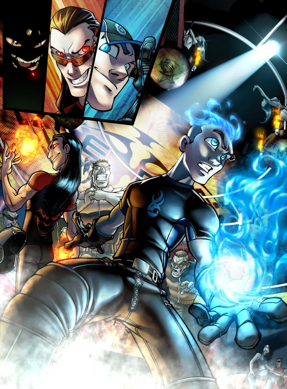
splash page for LP's comic, BlueFire. Worked on this about 10-12 hours..im not really sure cos there is many pause and revision, but i think it's around that. the illumination is tricky here, some says that the light on blue's face is awkward, but i dont know how it really should be ;
;i really like how this page has turned to anyway, with the 3D-BG and LP's fire..well..hope you'll dig this too
")
Pencils:
Colors: Sunny ( me )
3D-BG:
Related content


Comments: 33


weits... heboh sekalee.. haha sampai ipod gw jatoh..
sayangnya warna matanya terlalu plain.. kecuali memang style elo begitu
👍: 0 ⏩: 0

where is that comic?is the comic online or what?the art is incredible,did u draw with pen+paper or did u do it on ur PC? that shit is the bomb!how many did u do?
👍: 0 ⏩: 0

love it ... influenced by joe madureira's ...he he he
👍: 0 ⏩: 0

so, you're the colorist behind BlueFire...
awesome work!
👍: 0 ⏩: 0


This is really inspiring stuff, especially as this is an area I'd like to move into myself at some point in the future - the sense of form you manage to give here is amazing - lighting issues or not, there's a definitive depth of feild at work here - brilliant stuff
LL
 (Smile)")
👍: 0 ⏩: 0


shit... keren banget
salam kenal... wah salut banget gue liat gallery loe... amazing!!!
👍: 0 ⏩: 0

this is amazing, and the lights seems right to me ^^
👍: 0 ⏩: 0

you sure add life to LP's work! you.. you.. *hugs you* i love you maaaan!! *jim carry dumb and dumber style*
👍: 0 ⏩: 0

Good god man >_< beautiful. I'm more than surprised you only have 10K pageviews o_O I'd figure at least 100, seriously. Hope you don't mind me watching you.
👍: 0 ⏩: 0


This is really powerful page! The guy on the center, the blue flame.. The brilliant colors! Congratulations to both penciler and colourer! : D
👍: 0 ⏩: 0

that is just...so cool. yup. the flames are brilliant, looks like it's gonna pop outta the page and singe my hair!
👍: 0 ⏩: 0

very very excellent. *worship u guys.. thumbsup for perspective lines & superb colourings.
👍: 0 ⏩: 0

TAlk about amazing coloring.. This is aweosme! Love every lighting, fire and smoke effect, and all the textures just look so damn good
👍: 0 ⏩: 0


gilaaaa, blending colornya mulus sekualiii @__@
mantap yak kaito
👍: 0 ⏩: 0

I love your guys' work. I don't even know what to say. It's just amazing.
👍: 0 ⏩: 0

This is just too awesome. Usually I leave longer comments, but once again I am rendered speechless by your art.
👍: 0 ⏩: 0


wonderful ^^
u'v got my fav
But, How do you do that !! ")
 (Wink)")
👍: 0 ⏩: 0

This one got really complicated lighting situation! O_Ob That 3 main sources of lighting, one red, 2 blues.
I think you did quite a good job, I love the huge screen behind them too, the only thing that bothers me more is the long hair guy's hair at the bottom panel, it just doesn't seem as neatly done as the other parts. :3 Other wise, I like how you dealt with the lighting condition, the reflective lights and the main light source.
I love the texture.... *bite on it* X3
👍: 0 ⏩: 0


I think the reason people think the lighting on the face is off is because if you look on the bridge of the nose you'll notice it has a bluish light on it but the rest of the light on the face is whitish.
Also, because of the the way it looks the fireball is positioned its seems you lightened the face thinking the fire was on the other side of the guy.
I can understand your thinking for shading like you did but the direction of the face and position of the fire makes it look like most of the left side of the face would be exposed to the light.
👍: 0 ⏩: 0

I really don't see how the light on Bluefires face is awkward, the only thing that I rekon could be wrong is that there should be more light comming off of his fire hair. Wich is an incredibly minor critiuqe on an awsome colour job, I love the shiney feel on his shirt, and overall your colours just rock.
👍: 0 ⏩: 0
