HOME | DD
 supersampled — __MINDFUCKING CLICHE

Published: 2004-03-19 18:29:38 +0000 UTC; Views: 2101; Favourites: 24; Downloads: 1260
Redirect to original
Description
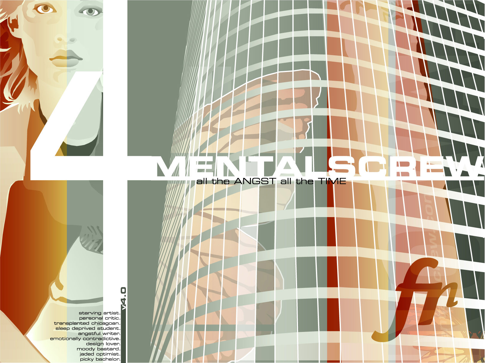
college workthanks alot to sean for advise and giudance
Related content


Comments: 45

scraped? i dont see why, i think ive seen this before along time ago, i like it, +fav
👍: 0 ⏩: 0


that's kewl man...
the pic in the bg is sweet!
the 2D is great... love the text
gave me a good laugh.
mP

👍: 0 ⏩: 0

great work .. i love the upside-down-ness of it .. gives it a shot of something to make it stick out from the rest
👍: 0 ⏩: 0


superb work like always. the angles you take on the things you create are really inspiring
 (Smile)")
👍: 0 ⏩: 0


very hectic and chaotic, i like it, but it hurts my head if i stare to long.
👍: 0 ⏩: 0

nice piece of art!
i really like the way u do...
keep it up
👍: 0 ⏩: 0

thats weird and confusing but well cool
great woprk
👍: 0 ⏩: 0


yeah nice work like it a lot...magnfic colors magnfic 2d..all great ! GJ!
👍: 0 ⏩: 0


This makes me think of wirestyle's last submition. A pack of gum with words written on it. It was meant to be the new intro pic for his website I believe, but the sad thing about was, people actually favorited it! I feel as if they didn't even really take all in what they were looking at. Or maybe there's some inside joke I am not getting but I think it is pathetic to favorite a pack of gum with words written on it. I think reminds me of your piece because in that instance it seemed like so much ass kissing was taking place that no one could have a mind of their own. Anywayz... Great piece!
👍: 0 ⏩: 0

The 2D vector typography really bring out the mindfu*kin thingy from this college work.
I must admit that without these really well planned out typos, the deviation would not be as "mind blowin" ")
👍: 0 ⏩: 0

it looks like ur lookin at the image upside down..but the work is excellent...its like a pro at work here ")
👍: 0 ⏩: 0


 (Wink)")

the term 'mindfucking' reminds me of the wonderful 'Adbusters' magazine.
👍: 0 ⏩: 0

i love ur 2d more than ever now nice work!
but dont flip the picture on me, it makes my head spin +fav
👍: 0 ⏩: 0


great work.
really dig the style of it all and the chaotic quoting
👍: 0 ⏩: 0


Nice one man. Like the photograph idea. Great piece, very professional (minus the masturbation part).
👍: 0 ⏩: 0

that is REALLY good-looking. sweet stuff and background subject
👍: 0 ⏩: 0


well done man. quite a trip. bitchin typographic layout... very impressive. dam sekseh piece of work

👍: 0 ⏩: 0


love the way the vector merges with the sky.. some good vector brushes too
what sort of college course is this btw?

👍: 0 ⏩: 0

omg.itsupsidedown
it looks pretty, i like the colours ^^

👍: 0 ⏩: 0