HOME | DD
 supersampled — stemFlow_ Terminus

Published: 2003-12-03 15:40:47 +0000 UTC; Views: 1183; Favourites: 15; Downloads: 1254
Redirect to original
Description
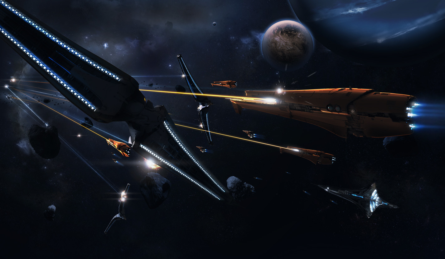
_________________"and so there I was, admist the energy___________________________intense and extreme, I felt as if I was losing myself
___________________i had to return to the source, it was my only chance of a final resolve"
[link]
part of the flo_ pack featured on overflow.nu
Related content


Comments: 44

This is nice!
Great colors and perspective.
And the lines and numbers fit in very well.
A+
Good job.
👍: 0 ⏩: 0

Very thought provoking. Great colour choice. Nice work!
👍: 0 ⏩: 0

Looks very nice and modern. Great work. Loving the idea
👍: 0 ⏩: 0


sweet colors..
the 2D and brushing.
killer sweet work..
mP
👍: 0 ⏩: 0

awesome design dream...it looks soo perfect and well put together for sure..the purple colors looks yummy  (Smile)")

👍: 0 ⏩: 0

hmmm nice and creative design my friend... loving the colorsheme and 2d yuo have done here... it all fits perfecly... keep it up
👍: 0 ⏩: 0

That loox like something form 2 Fast 2 Furios!! u should designe stuff for there next movie!!
👍: 0 ⏩: 0

whoa - excellent work on this piece , but ithink the glow is a little bit overdriven :
you should try putting down the contrast coz it looks too bright ( the colours )
excellent choice of colours : )
+ i think its too blurry in someways - i knw this is a really newbie suggestion but oyu could flatten the image then sharpen and send again - or you could just sharpen the 2d rectangles : )
excellent work overall -
👍: 0 ⏩: 0

oh really swiiit! great perspective and the colors play well with each other
")
👍: 0 ⏩: 0


Awesome colors. The numbers in the ine are a neat idea. overall very clean and nice looking. Great work.
👍: 0 ⏩: 0


I saw this on the overflow site.. looked great there and looks great here!
👍: 0 ⏩: 0

Somewhat overshadowed by his bigger brother - but nevertheless an awesome composition.
👍: 0 ⏩: 0


")

yeah, its been said multiple times by others here but i wanna say it too, the colour is intense, like it alot
👍: 0 ⏩: 0


well like i said in msn..
great work as always..
i love the depth and the pink/violet ambience..
👍: 0 ⏩: 0

Awesome work man , love teh color scheme . depth is great too ^^ +fav
👍: 0 ⏩: 0

damn all of em r done in photoshop, that's what it looks like for me! great job! val.
👍: 0 ⏩: 0


This is very nice
reminds me a bit of james widegren
very nice 2d and color either
I like this style
+fav
👍: 0 ⏩: 0

awsome! love the concept & colors. and design is great
👍: 0 ⏩: 0

That indeed is a nice concept and colors,comething different for a change  (Wink)")
+fav.
👍: 0 ⏩: 0


like it man, very great pic, like the cool style of this pic!
👍: 0 ⏩: 0

man that is crazy...
love it
im glad i +watched you
oh u can touch up my peices if u like hehe
👍: 0 ⏩: 0


Some awesome ideas in this and also a great use of colour. Love the light rays. Good work
👍: 0 ⏩: 0

