HOME | DD
 syragon — Depth of Mind

Published: 2003-02-05 04:31:50 +0000 UTC; Views: 17074; Favourites: 80; Downloads: 8344
Redirect to original
Description
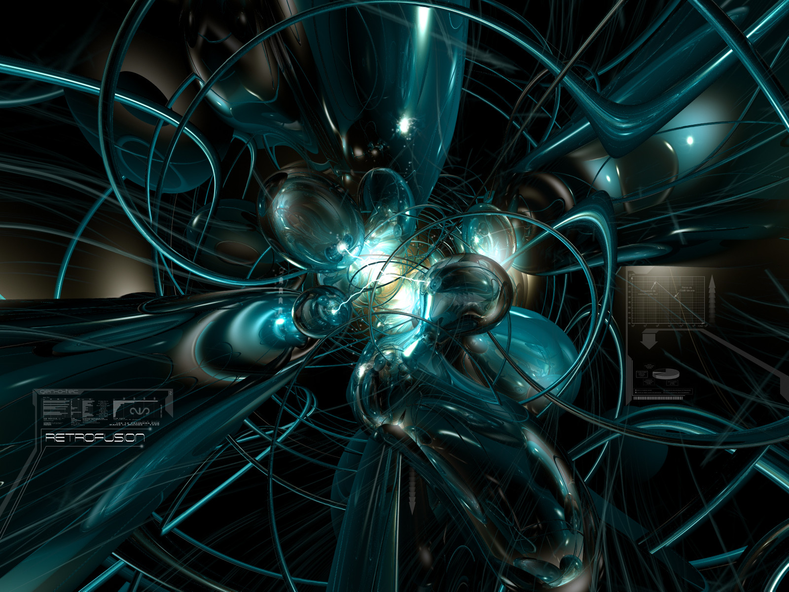
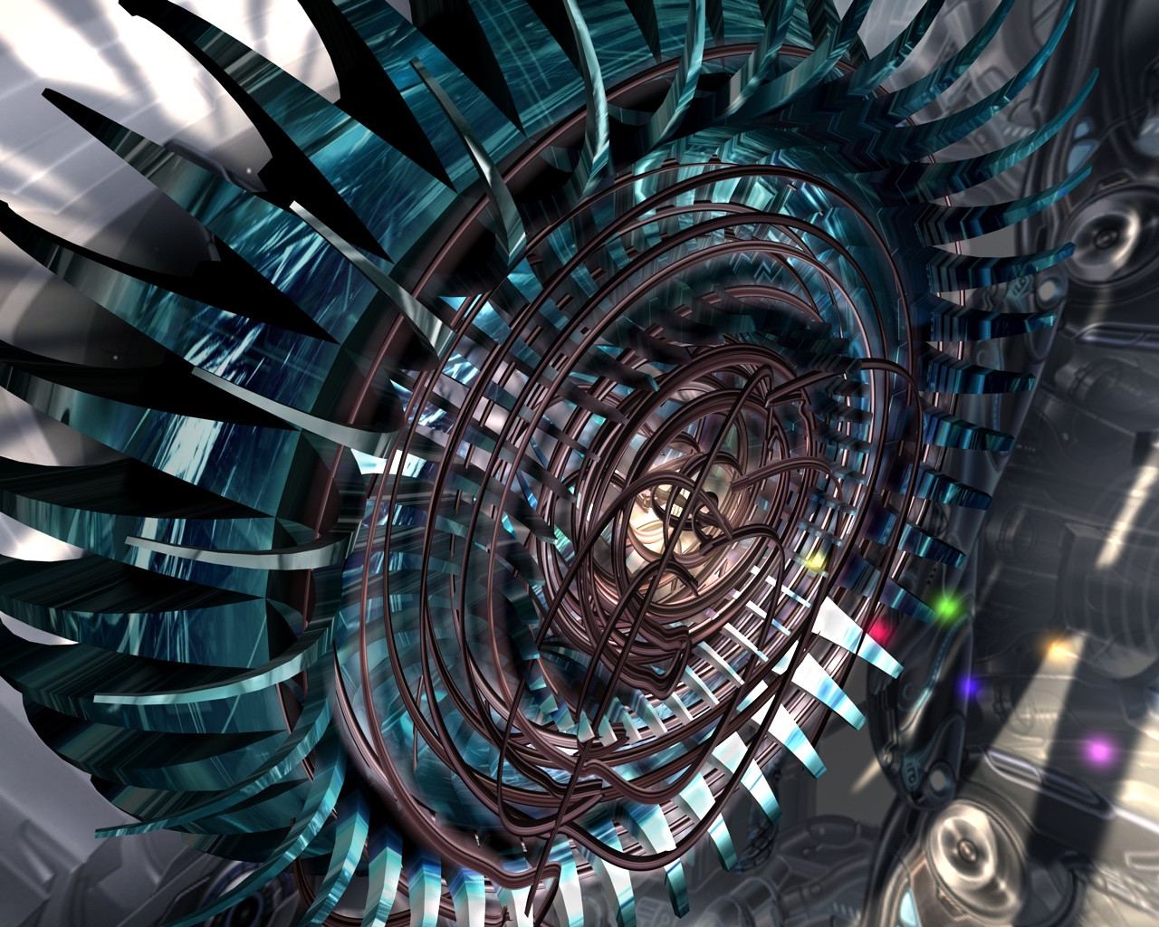
"Depth of Mind"2003 Collab: Syragon & Lockheart7ca (tainted-soul)
Been a while since I submitted any work to deviantART. Been quite busy lately. Here is some work I did with about 5 of Lockheart7ca's Bryce 5 renders. Composed in Corel Photopaint 10.
/-: zip file (Download) includes:
1600x1200
1024x768
Sepia Tone (1600x1200)
Cropped Section
-:
Related content


Comments: 108

Love the use of color and the overall depth of the piece . . .best of luck with the marriage and the baby (on the way)
👍: 0 ⏩: 0


i'm sorry but this idea has been done ...and done .....and done ....and done ..yes very well it may be pretty but is there anything different here?
👍: 0 ⏩: 0


like it alot i see you flipped it a couple of times also i see some hard core jags in that upper right corner
but good job
👍: 0 ⏩: 0


Excellent. Simply Beautiful. This is going on my favorites.
👍: 0 ⏩: 0


YOU'RE ALIVE!!
THE CHICKEN FUCKER LIVES!!!!
CHEERS!!
nice render man hehe
👍: 0 ⏩: 0


Hey, that's pretty tough. Thick with design. Awesome!
+fav
👍: 0 ⏩: 0

yeay man , u DO like to render and paste !!!
only bryce and photopaint hey ???
👍: 0 ⏩: 0


i love the use of the colors
they really make this whole image what it is
verry nice
👍: 0 ⏩: 0


the colours in this one are what i really like a lot about this piece its nice to see strong colour contrasts used like this...really nice
👍: 0 ⏩: 0


Loads of detail, great super-smooth shapes and perfect colors choice. Just too busy for my personal taste, but fantastic work nonetheless
C
👍: 0 ⏩: 0


I think this is very interesting. It kind of swallows you in and puts you in the picture.
Is it supposed to be one thing or is it supposed to be just a masterful blur
👍: 0 ⏩: 0
bloodpixel [2003-02-05 19:20:35 +0000 UTC]
i agree to *niteangel
great colors contrast but the renders fusion cold be better
anyway...i love the abstract forms and the reflected material =]
👍: 0 ⏩: 0


...Sweet...
desktop properties... -clickity- ...background... -clickity-
👍: 0 ⏩: 0

Good job man. I liked how you have all that detail coming from that right middle circle. It looks good.
👍: 0 ⏩: 0


That looks super tite man... nice rendering... very very intricate too... good job my brother...
👍: 0 ⏩: 0


/very/ neat...so wonderfully detailed and complicated...cool stuff.
👍: 0 ⏩: 0


So nice! The coloring in this is absolutely wonderful! This is a great piece
👍: 0 ⏩: 0

re: x4's comment above
Oh and an awesome skill it is
Awesome work hun...
👍: 0 ⏩: 0


great reflections and lovely colors great work mate
👍: 0 ⏩: 0

nice, i like the detail too....i was wondering when u were gonna submit, good to see your back in the groove
👍: 0 ⏩: 0

Looks great, your new style of blending is Awesome. Contrasting colors too.
👍: 0 ⏩: 0

wow
so many different colors and sizes of shapes and all this stuff
great work
👍: 0 ⏩: 0

schweet lookiinnn', where u been??????? u need to come into the channel, me misses ya!!
👍: 0 ⏩: 0


awesome and great colour. I dont think i have seen this type of colour from you before
gj
👍: 0 ⏩: 0


Looks great, especially the central region where it's busier. I too love the 'telephone cord' things. The typo is so subtle that it almost doesn't need to be there though. Minor nitpick. Good stuff!
👍: 0 ⏩: 0

I like this one a lot. There is so much to look at. My one issue with it is the blending of the images... seems a little forced.
Nice color choices too.
-e
👍: 0 ⏩: 0

holy shiza, so this is why you have been in-active for so long. Talk about kick ass! nice job bra
👍: 0 ⏩: 0
| Next =>