HOME | DD
 takmaj — Queensboro Bridge
Published: 2013-08-17 12:54:15 +0000 UTC; Views: 33430; Favourites: 3124; Downloads: 0
Redirect to original
Description
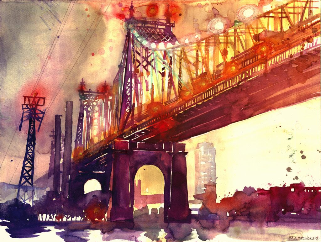
Queensboro Bridge painted from the photo by Tudor Hulubei. Sorry I haven't posted anything for so long (my master in architecture is in progress) Lines are a little askew, because I didn't use the ruler...and I wanted to achieve more artistic look (yeah I know it's not that awesome as I wanted it to be, but well I'm sharing it anyway) hope you like it (Smile)") greetings
greetingswatercolor on paper 56x42cm
I was inspired by comedy Anger Management, in which Dave Buznikand Dr. Buddy Rydell stop their car in the middle of the bridge to sing "I Feel Pretty".
please don't forget to visit my FB page - I upload there many many more things than here
: www.facebook.com/pages/Takmaj-…
Related content


Comments: 346


This is very good indeed
👍: 0 ⏩: 1


Wait. You DIDN'T use a ruler? I couldn't even tell! I love the way you painted the lights...they look like actual lights, as if you poked a few holes in the painting and held it up to the sun to let the sunlight in. I actually, felt myself squinting a bit after staring too long into their depths. It's quite a fascinating accomplishment, really. I honestly believe you've somehow managed to imprison light inside of your watercolour. Your light is usually exceptional, but something about THESE are simply stunning. Maybe it's because I haven't seen many artificial lights in your watercolours and if there are, there's a darker general ambiance. Great job! Also, I've wondered this for a while: when you use splatters and splotches in watercolour do you do so intentionally, or is it just a beautiful after effect?
👍: 0 ⏩: 1

Hallo! You've been featured here amazing-arches.deviantart.com/…

👍: 0 ⏩: 1


The perspective really grabs you, & the breathtaking color work
👍: 0 ⏩: 1

Moved to the Featured Folder of ! Thank you for sharing your work with us, and I look forward to seeing more!
")
👍: 0 ⏩: 1


Your color coordination is just excellent!
👍: 0 ⏩: 1

I can't understand why you would think that it isn't awesome, because it really is incredible. I love the colors you used, and in my opinion the lines all look straight
👍: 0 ⏩: 1


Love the colors. Especially the contrast of orange-red and purple-blue. So pretty
👍: 0 ⏩: 1

Looks soooo amazing! I love your work!
👍: 0 ⏩: 1

| Next =>