HOME | DD
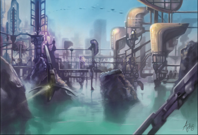
 tare-musume — Laboratory scene 2nd iteration
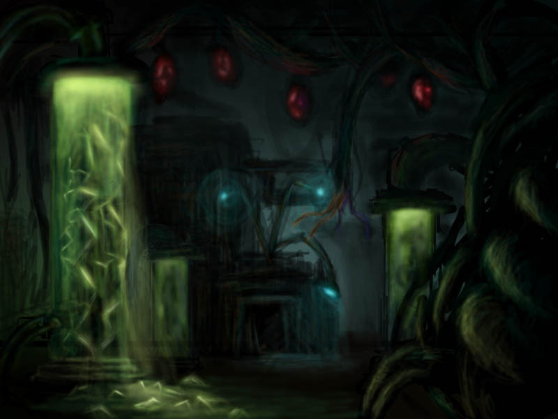
Published: 2005-08-26 09:56:40 +0000 UTC; Views: 3444; Favourites: 21; Downloads: 83
Redirect to original
Description
Well, here is my second iteration of the lab scene we were supposed to do. It's sooooo much better than my first one, which is not worth putting up or even describing. Anyway, i'd like some constructive criticism if anyone wants to...Related content


Comments: 5

This was one of my favorite for the class. I love the contrast from the light to dark. Gives a really earie feel!
👍: 0 ⏩: 0

Wow...I really like the dark, creepy, spooky effect--and the green glowiness. I think that you could work on making this a little less blurry though... Overall, great job!
👍: 0 ⏩: 0

I really enjoy your use of colour and how you handled the foreground vines
crits: Its hard to make out whats going in the dark mid area of the bg which may have something to do with the perspective and also the way its rendered. Having the desk in the bg rendered out with light hitting the edges would give it more shape. None of the objects seem to recede into the background which cause the bg as a whole to appear flat. This also can be pushed with the desk being placed more in perspective.
hope this helps
here is an example. Khang Le's lab bg [link] 
👍: 0 ⏩: 0

Well done. I find everything rather good. As *vinya stated, you really can illuminate things to that spooky sort of glow. I also enjoy the green flow you have going on there, in the front -- along with the back.
Good job.
👍: 0 ⏩: 0

I say it's wonderful. ")

👍: 0 ⏩: 0