HOME | DD
 TaylanTatli — Blue

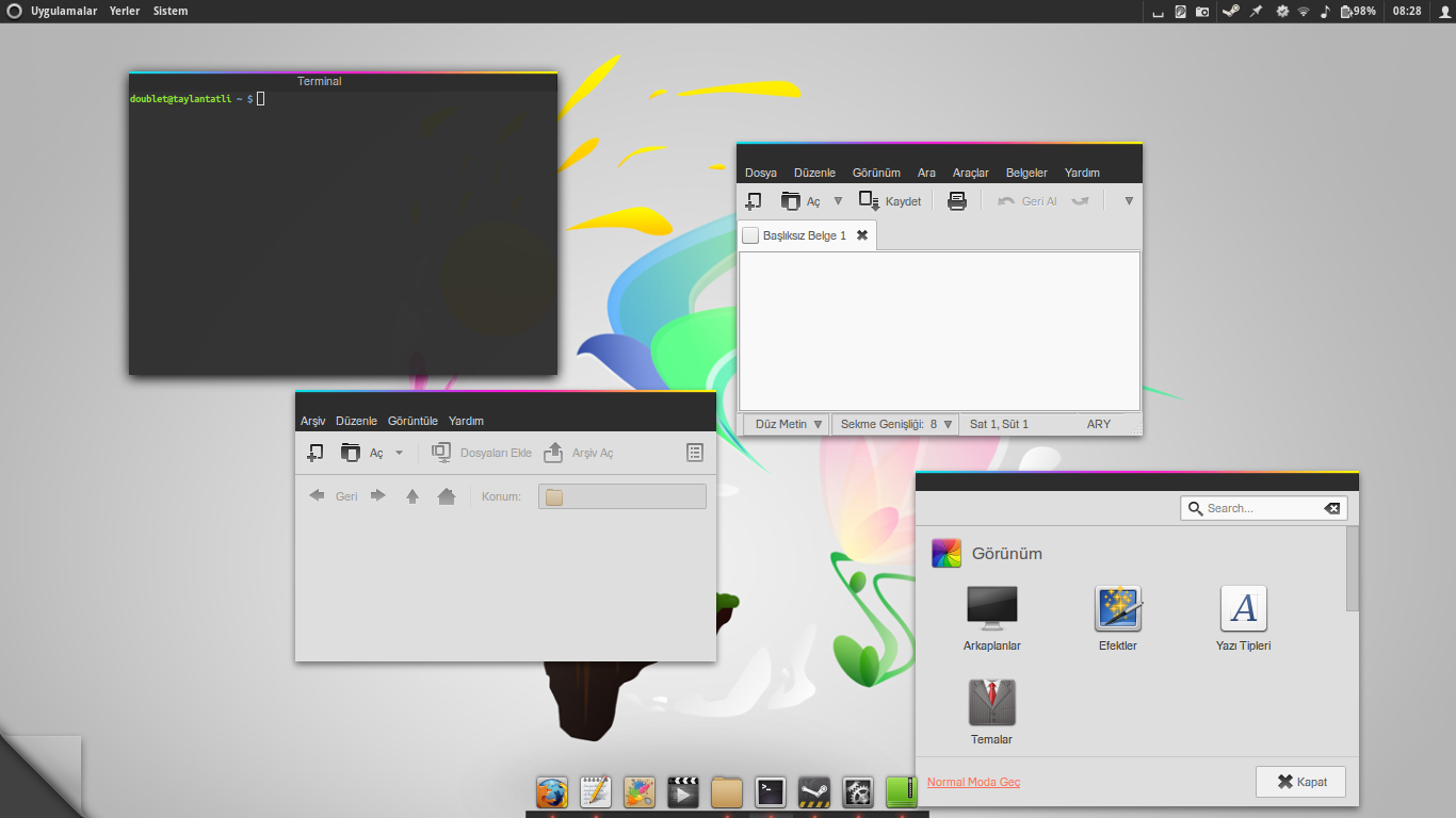
#arch #gnome
Published: 2014-12-18 17:14:30 +0000 UTC; Views: 1339; Favourites: 11; Downloads: 20
Redirect to original
Related content


Comments: 12

How did you get the topbar icons spaced like this? Also what is the Star Icon?
Thanks!
👍: 0 ⏩: 1

Actually I don't remember what was star icon. It's an old screenshot.
You have to edit theme's css file to make icons spaced like this.
.panel-status-indicators-box,
.panel-status-menu-box {
spacing: 27px;
}
.system-status-icon {
icon-size: 16px;
padding: 0 0px;
}
27px enough for uniform look, otherwise system icons and extension, indicator icons etc. will have different spaces. Sorry for my English, if I'm not clear.
👍: 0 ⏩: 1
ahh thank you for your response. I actually found that info in another one of your posts after the fact and gave it a shot but did not have any luck with Gnome 3.16. Thank you for responding though. I always watch your shots on Deviant. They are always great!
👍: 0 ⏩: 0

Thank you.  (Smile)")
👍: 0 ⏩: 0

")

Hoş bir görünüm yakalamışssın. Ben XGTK kullanıyorum ama Mosemite denemeye değer gibi gözüküyor
👍: 0 ⏩: 1
Teşekkürler. XGTK'yı kullandım bi ara da daha sade temalar daha çok hoşuma gidiyor. Mosemite cidden güzeldir.
👍: 0 ⏩: 0

What do you think, should I make a version with this simpler version of the dash too?
Oh, and what gtk theme is that. Fits perfectly, actually.
")
👍: 0 ⏩: 1
This is your theme, your decision.
👍: 0 ⏩: 1
It's Mosemite: www.deviantart.com/art/Mosemit…
👍: 0 ⏩: 0