HOME | DD
 tazsaints — UBF Mini 01: Trophy Design
Published: 2010-02-07 07:09:43 +0000 UTC; Views: 5444; Favourites: 85; Downloads: 62
Redirect to original
Description
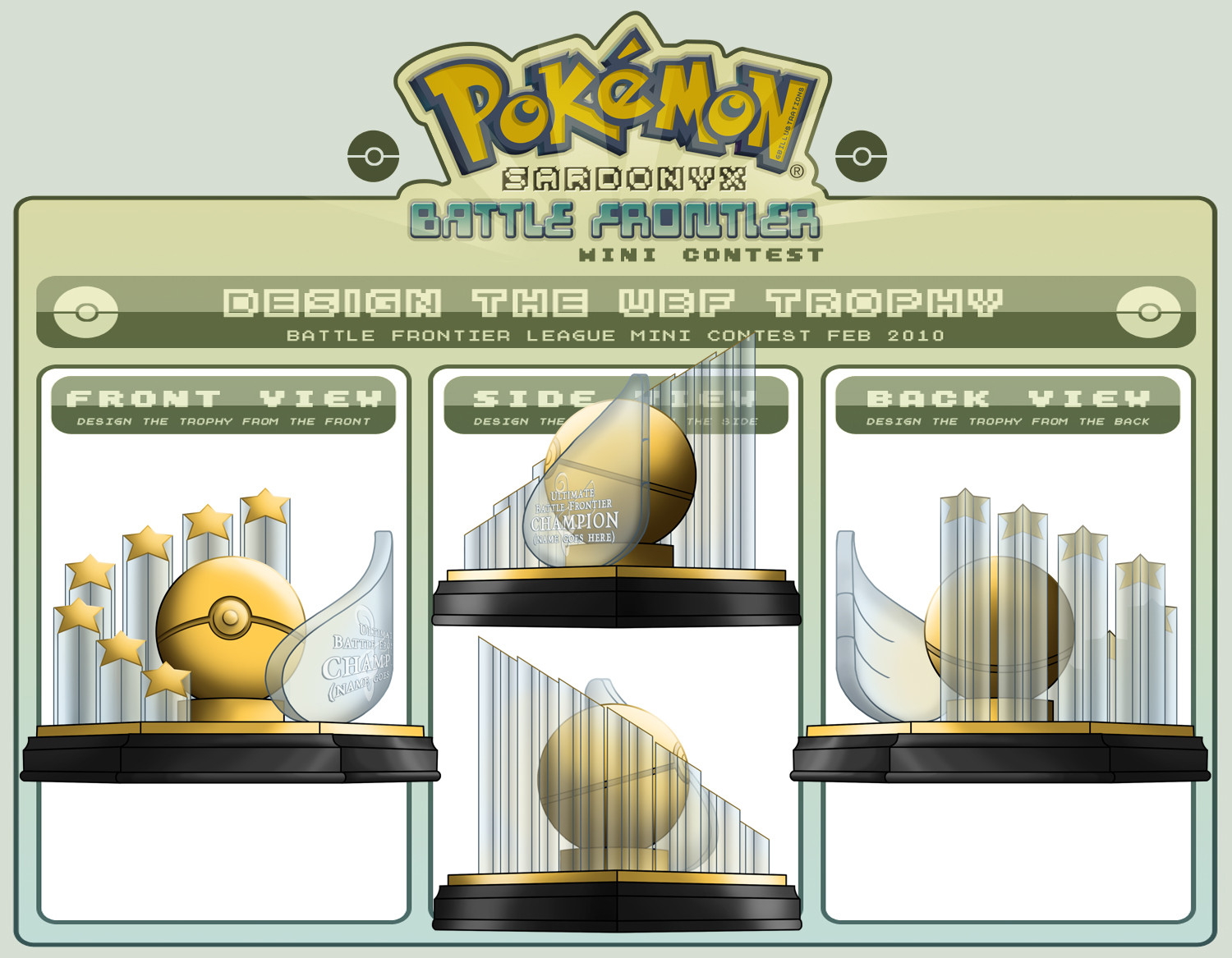
BEHOLD!! My trophy that would actually be the cheapest to make IRL of the entries thus far, as it's just Gold foil/leaf and acrylic.
Mini Contest entry for the
Challenge was to design a trophy for the Champion of the UBF. I went for a more contempory design, based on real trophies that you see in the corporate/sports world.
All the elements are symbolic in some way;
-- Pokeball - Should be obvious.
-- 7 Stars representing the Trainer and their Team.
-- Gold and Clear colouring to represent Victory (gold) and Ice (Snowpoint City).
-- The Wing shape for the name Plaque comes from the Blues' family crest. 'Tis rather difficult to incorporate such a delicate design into a trophy.
-- Said crest is engraved into the wing behind the name.
-- Finally, the base is Hexagonal, representing Snow[point City] as Snowflakes have six points to them.
Hope you like!!
Related content


Comments: 87


that's a very well-thought out design, not to mention that it looks AWESOME and i'd be honoured to have won it
👍: 0 ⏩: 1

Woot! Glad ya' like!
👍: 0 ⏩: 1

Ooh... out of all the other trophies that I've seen designed, I can say for certain that this is my favourite one out of all of them so far~ I hope you win ^^
👍: 0 ⏩: 1

Thats a very awesome design, you got ze mad skillz
👍: 0 ⏩: 1

THE GLASS, it makes it shiny, fragile and a potential weapon, THIS IS THE PERFECT TROPHY.
...so shiiiiiiiiiiinyyyyy
👍: 0 ⏩: 1
'Cept it wouldn't be glass, but Acrylic resin, as that stuff is durable and harder to break lol.
But THANKS. >8D
👍: 0 ⏩: 1
Glass is expensive. Like hell I'm paying that much!
👍: 0 ⏩: 1
dammit, this is a lose lose situation how bout we just make the thing so bright you cant actually see it
👍: 0 ⏩: 1

Hey, this is sweet, it's simple, clean and does the job, i like it!
👍: 0 ⏩: 1
Thanks a bunch!  - :D")
👍: 0 ⏩: 0

Thanks!! I'm glad you think so!
👍: 0 ⏩: 0

Wow! You gave it a lot of thoughts! Awesome!!!
👍: 0 ⏩: 1

This is fucking amazing. I think I see a winner.
👍: 0 ⏩: 1


Awesome, I like how it's simple, but includes everything that needs to be included I like you incorporated so much symbolism into it (the stars, she shape, the colors, etc.) Right now, this one has my vote.
👍: 0 ⏩: 1
👍: 0 ⏩: 0

 (Smile) - :)")

 - :o")

OMG this is so excellent Taz I really hope this will be the trophy!!! I've seen alot of people are putting pokemon figures on their trophy and personally I don't think they should be, because not everyone is gonna have that pokemon etc etc LOL
sorry for my rant D:
But I really like the design/layout!
👍: 0 ⏩: 1
Haha, thanks! I hope this design goes through too!
But yeah, I can't say I liked seeing actual Pkmn on the trophies either. It just didn't translate well IMO, hence me going for the contemporary look.

👍: 0 ⏩: 0
<= Prev |