HOME | DD
 TazzyDee — FrightClub Crit.
Published: 2010-04-26 02:16:47 +0000 UTC; Views: 159; Favourites: 0; Downloads: 2
Redirect to original
Description
Howdy. Hope you don't mind me choosing your work for #FrightClub 's critique contest. I'll just jump right in.Firstly I love how it's intriguing as a thumb, but at full view it almost takes my breath away. It's usually the other way round, a thumb can look so effective, but be a disappointment to see the lack of detail that you thought was there. Here, it's the opposite. You have to fullview to get the full effect.
Also I love the way this has grown on me. I've developed a story, character, thought processes of character over the past few days! You've created a strong narrative from such a simple, and may I say very-often-photographed idea. Also the title is perfect but could be shortened to 'Desires' and work equally well, as the image is so expressive.
Inspiration
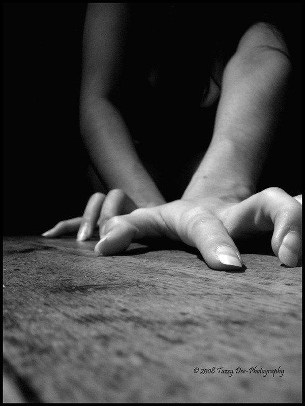
Firstly, the connotations this image brings to mind. Immediately it feels like horror films. a friend said it reminded her of the film Let the Right One In, (young vampire heroine) and my sister immediately said REC, (Spanish zombie/virus infected film). You've really captured the essence of addiction, lust, craving, and JOY at being covered in blood. A young model (is it you?), almost childlike. Innocence with a blood spattered mouth is exceptionally disturbing.
Expression
i'm kind of amazed at the high quality of acting going on here, amazing blood make up; the detailed pattern of it is perfect, just as if she's been gnawing on someone, it seems naturally smeared, like you see on lion's chops after they've fed. Also the small details: teeth stained, skin unphotoshopped; these imperfections along with the perfect expression create a strong sense of realism. I believe this.
The Technical
Shadow in bottom right may be too severe, the one light source creating a strong shadow under her chin. Perhaps you could have faffed about with better lighting, some hair illumination, but perhaps it would have lost some of it's magic and become just another staged studio shot. It's real, and guttural, and that's a huge impact of horror. In fact the lowkey, soft lighting makes it all the more creepy.
Eye detail highlights? Perhaps the eyes should sparkle/glow more, as I would imagine them to after a vampire feeds, but again, I love how you've kept it real. The eyes work dull, and the red ring is a beautifully subtle touch.
Composition/Angle
taking one step back or forward can work wonders sometimes. Really think about how the frame is balanced. I wouldn't say the composition of this is perfect, perhaps the model could either be centred more, or slightly further back, but this doesn't detract from my overall love for it. her head looks slightly disjointed to her body, almost like it's been stuck utop another photo, but it works. It's like she's looming out, possibly indeed disjointed from her body in this instance!
Background
I like that there's nothing to detract from the main focus, but I can't help but imagine how cool it would be if there was a separate light source from above, like a spotlight, but not too distractingly bright, but a spotlight illuminating her kill in the background. Maybe just a figure crumpled on the floor, or a wrist outstretched, pale as death and covered in blood. But I like the dark surrounding, it feels absolute, encapsulating both her in body and spirit.
So...
So while the originality of the idea is low, I'm still astounded at the power this image wields. You have executed an old idea with a personal, original, fascinating vision, and it's absolutely yours. And if it is a self-portrait, you win full points on all counts (and even if it's not, still full points!). Seriously, well done, and I eagerly await to see the rest of your upcoming horror adventures. Please let me know anytime you need help or any such stuff
This is my entry for #FrightClub 's critique contest