HOME | DD
 tetsuo — revisiting devart
Published: 2001-03-05 19:51:38 +0000 UTC; Views: 659; Favourites: 3; Downloads: 157
Redirect to original
Description
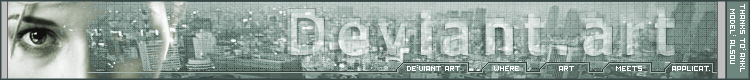
i haven't submitted for a long time and decided to submit a header (which i hope will be better than my 1st one).in any case please tell me what you think i should add/remove to it...
addition: Choose my header!!
not fleshes. Something like vot for me!
addition: it is now (due to a request by a friend) 2 pixels shorter than your average joe!
Related content


Comments: 19


ýòî ïðîñòî ñåêñóàëüíî, íî ÿ áû íå ñòàë äåëàòü òàêîé õåäåð äëÿ äåâàðòà - ñäåëàë áû ëó÷øå åãî äëÿ ñåáÿ, ÷åññëîâî....
ïèçäàòî, anyway
LISkauskaas>>>
>>-2001-->
👍: 0 ⏩: 0

Love it, love it, love it. It's so cyberpunkish. F*ckin' great! Will probably be my header for a long time!
👍: 0 ⏩: 0

as i said before, apart from the pixel-styled font, very nice!
° thisign °
👍: 0 ⏩: 0

ohhh, damn kewl, fuckin great header...realy good !
👍: 0 ⏩: 0

so this be my competition well..they godda pick one of em
/me shrugs
different stlyes for different people heheh
Flesh
http://obliviousflesh.virtualeweb.com
👍: 0 ⏩: 0

i like. my new header =]
http://www.drain.f2s.com ::Twisted Drain::
👍: 0 ⏩: 0

Cool header, finally i'll change the orange header i had before.
--------------------
/// xpedition ///
http://www.nitrocorp.org
👍: 0 ⏩: 0

i really like this alot, nice job and the eye/face really goes with the rest of the header
👍: 0 ⏩: 0

Its hard to read, but it looks really cool.
----------------------------------
http://www.createdbycheney.com/
👍: 0 ⏩: 0

I like it alot. And the face on the left side is very nice addition.
.:schrunk:.
http://perfectcircledesign.cjb.net
👍: 0 ⏩: 0

Fantastic job Tetsuo, this is magnificant. Although the dimensions should be 750x80 rather than 752x80.. the width is too large and distorts the layout.
Vince Brown (Attila)
attila@deviantart.com
👍: 0 ⏩: 0


Pretty cool man i like the face on the left and i like the background is that a stock photo of a city or something i couldn't really make it out, but great job. Hopefully some people will use this as their header.
- nicolas
👍: 0 ⏩: 0

Ïèçäàòî... íàêîíåö-òî Àëñó ïîëó÷èëà õîòü êàêîå-òî ïðèìåíåíèå !
Ìîëîäåö !
Äà ñäîõíåò Ìàòòåî !
de erium
👍: 0 ⏩: 0

hey nice man, I really like that. really fits the color scheme of the site too (unlike my headers!)
👍: 0 ⏩: 0

that is damn fine... love the way you've blended the face into the rest of the image, great text too.
.bin
👍: 0 ⏩: 0

This is really nice, I love it, a really good header.
The only thing i can think to say is to maybe work with the models face a little, some layering effects or blur, just to soften it and blend it in. Other thatn that excellent, its at the top of my screen now.
Goochtek:random bursts of polygonal thought
👍: 0 ⏩: 0