HOME | DD
 the-danzor — Team Fortress 2 Forum

Published: 2010-10-12 19:36:01 +0000 UTC; Views: 11076; Favourites: 36; Downloads: 0
Redirect to original
Description
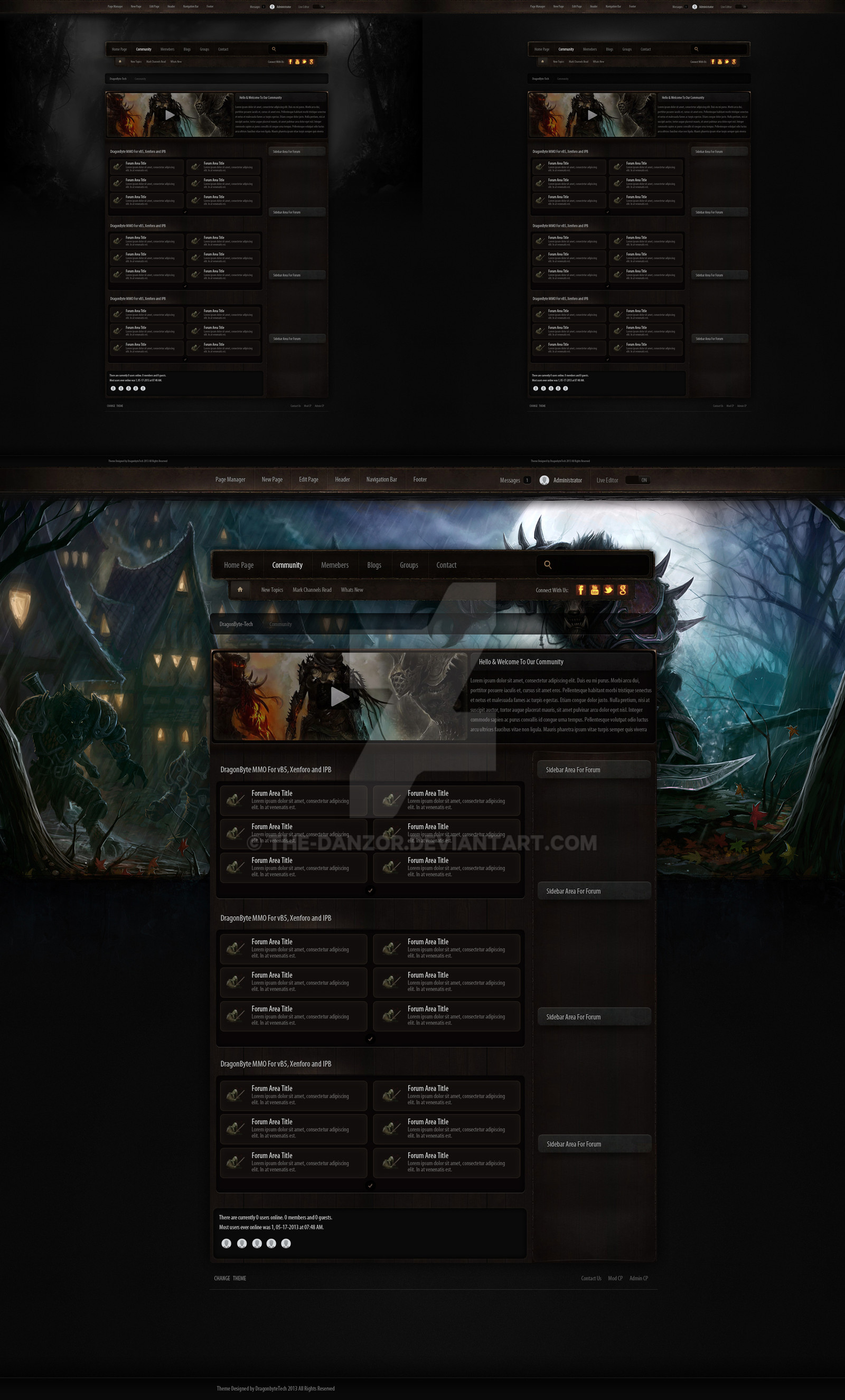
Team Fortress 2 ForumDesigned and coded by me for IP.Board 3.1.# for a TF2 Gaming Community.
Download for full view
This is not for sale
Related content


Comments: 22

I never see better form design for TF2... such a good job!!
👍: 0 ⏩: 0


Very nice work mate. Colours and symbols for the new posts suit the game nicely, as well as the mineshaft down the bottom... That's a great touch to the footer. Haha!!!
")
👍: 0 ⏩: 1

Youre great at skins, but i would apreciate to see some websites apart from forums from you
👍: 0 ⏩: 1

As soon as someone hires me for something other then a skin, i will certainly post it.
👍: 0 ⏩: 1
Sounds good, im sure your good at sites aswell
👍: 0 ⏩: 0


IMO header is too high compared to the rest, but it looks nice, generaly.
👍: 0 ⏩: 1

As great as it looks I'd have to agree that the header seems a bit large. People with smaller monitors will have to scroll. But, it is great as usual!
👍: 0 ⏩: 1
I agree, and although i do not normally design a head that big. The design is more "Visual" rather then content friendly, giving the user an appearance of being in a TF2 map while browsering each section of the site. Also the template is still in testing, so may be asked to tweak the template further. Having the large header on the forum index, where as all other pages have a smaller header etc.
👍: 0 ⏩: 1
Good to know.  (Smile)")
👍: 0 ⏩: 0


like the way you've designed this, grats to a nice layout
 (Wink)")
👍: 0 ⏩: 1