HOME | DD
 TheArtfulMegalodon — Aztec Gods The Process

Published: 2008-05-27 04:49:24 +0000 UTC; Views: 4505; Favourites: 50; Downloads: 735
Redirect to original
Description
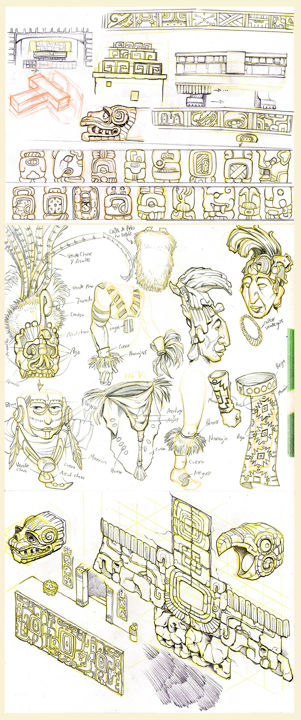
Here's those Aztec gods again, but I wanted to show the process. CLICK THE DOWNLOAD BUTTON TO SEE IT LARGE and get a good look at all the pretty textures!It started with lineart on watercolor paper, to which I added Elmer's glue, white acrylic paint in places, liquid frisket which was later removed, and other things.
Then I added the watercolor, the second layer there, with things like salt thrown in.
The last phaze has been coated with aging varnish and then crackling varnish, with black show polish rubbed in to make the cracks visible.
It took awhile, and I think it came out alright.
What do you think?
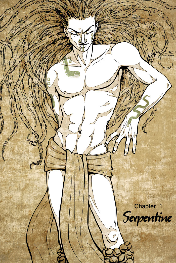
Oh, and as a reminder, the one on the left is Tezcatlipoca, and the one on the right is Huitzilopochtli.
Related content


Comments: 8

This looks amazing! It's always awesome to see your latest work. You're always coming up with new ways to make your art original and stunning.
👍: 0 ⏩: 1

Thank you. Let's hope that stays true.
👍: 0 ⏩: 0

Those are beautiful. I love the effect you got with the cracks and aging. Amazing work. =3
👍: 0 ⏩: 0

Yay Materials and Techniques II. And yay Aztec gods! Have you taken Mesoamerican art yet? It's right up your alley!
👍: 0 ⏩: 1
No, and I won't be. A friend of mine took it, and I looked through her books, but it held no real interest for me as a class.
👍: 0 ⏩: 0

I am constantly in awe of your patience when it comes to these traditional pieces.
👍: 0 ⏩: 1
Well, this time, the patience was required.
👍: 0 ⏩: 0

Oooh. I love the gritty quality of these pieces. They\'re very well done. I also really love the conflicting color schemes (rich brown and sallow yellow). I think though, with the softness of the colors you used, you lose some of the masculinity of the initial drawings. They\'re still very good, the characters just don\'t look quite as strong. Maybe more shadows would help? Just a comment, though, I still love it. <3
👍: 0 ⏩: 0