HOME | DD
 TheArtrix — Artrix's take on Danny Phantom
Published: 2006-03-04 21:24:22 +0000 UTC; Views: 19533; Favourites: 181; Downloads: 1087
Redirect to original
Description
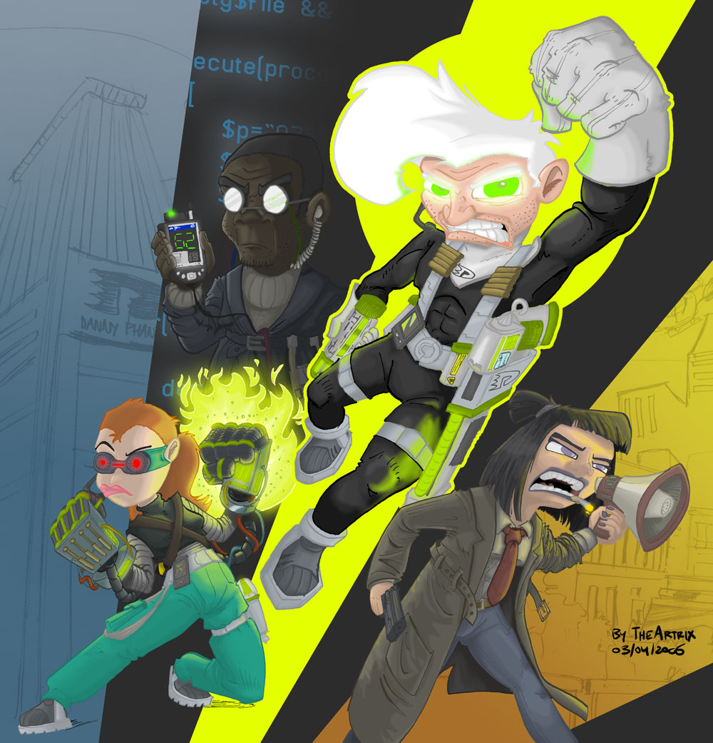
Okay people, the Artrix's take on... line up continues with Danny Phantom, let me start off with this little background story...2013 A.D, Danny Phantom's ghost fighting was no longer needed, as Fenton Works Inc. had obtained full control over the ghost plague that once terrorized the city. Even though Danny's parents were running a successful business, Danny finished college and managed to get employed at an insurance company, so he could obtain a steady income, a normal life, and retirement as ghost fighter.
That, however, was rudely interrupted, as two years later, ghosts begin to terrorize other parts of the world, including the United States itself. Governments quickly declare a war on ghosts, which would be the first time in history that the entire human race would have to face one single common threat.
Danny feels that his services as ghost fighter are, once again, needed, and tries to assist Fenton Works without being noticed by the authorities. Unfortunately, Danny was arrested by the FBI and put on trial for crimes against humanity. It was his own sister, Jazmine Fenton, who started a movement to let people realize that he is, in fact, the hero, not the enimy. The movement didn't changed the government's mind, but a high-priced lawyer, hired by millionaire Samantha Manson, released Danny Phantom from all charges simply by stating that there are no laws citing anything about mixtures of humans and ghosts.
After the movement put enormous pressure on world leaders, governments recognized Danny Phantom as an ally in the War on ghosts. Sam bought Fenton Works and rebranded it to "Danny Phantom inc". Tucker, who studied advanced computer science at Michigan Institute of Technology, was hired to be the badass hacker. Danny's parents were hired to be the company's CEOs, so Sam could assist Danny herself, just like the good 'ol days. It would not take long for Jazmine to join the gang, and has specialized herself in advanced weaponry.
Now... what am I missing here... oh, nothing I guess.
Now let's move on to the actual image. It is, without doubt, my best achievement when it comes to shading. Light effects have developed in an exponential rate in the past coupla days, among other things. This is also the first time I'm applying a technique that allows me to color outlines relatively quick, and the shading makes it all mold together. Still though, it was an extreme load of work, and even though I'm saying it myself, it's paying off in spades.
But why would I want to make this, well, for one thing, Danny Phantom is growing on me. I can see the fight sequences improve and the show is actually developing an epic storyline. Still though, I always thought it could be better, and more exiting. Sometimes, they want to do something cool, and then it completely falls flat on it's face (especially the slow motion scenes).
So I thought to myself "I'm just going to make Danny Phantom completely badass for once". For that, I started by changing the target audience to the commercialistic hip 18-25 demographic. Then, of course, put the characters into somewhat similar, but cooler, steriotypes. Sam stopped being a whining goth and is wearing a trenchcoat and wielding a Colt Government M1911A (thanks to =CabalcoTech for loaning me that gun reference book). Tucker was clearly inspired by fuctional hacker Morphius, and Jazz (I was listening to jazz while shading her, lol, funny pun, lol) pretty much became a million times cooler (and useful) than in the actual series. Danny pretty much remained the same, except for some more muscles and a 5 'o clock shadow. Since he's a full-time ghost fighter now, he can fully equip himself with the latest ghost hunting technology.
Well, that much for description, critique would be very much appreciated, even though I haven't mentioned some minor glitches here and there.
-----edits:-----
Danny's left hand is now reversed and doesn't look like it's bend in impossible ways anymore.
-----next:-----
Art Trade: UrvyBalboa[2]
Related content


Comments: 40


cool cool cool cool cool cool cool cool cool cool cool cool cool cool cool cool cool cool cool cool cool cool cool Looks so unbelivably super ultra wicked awesome!! cool cool cool cool cool cool cool cool cool cool cool cool cool cool cool cool cool cool cool cool cool cool cool cool cool cool cool cool cool cool cool cool cool cool cool cool cool cool cool cool cool cool cool cool cool cool cool cool cool cool cool cool cool cool cool cool cool Danny Phantom and his friends look unbelivably awesome!! cool cool cool cool cool
👍: 0 ⏩: 1

While I certainly do appreciate the praise, this doesn't constitute a proper critique, and therefore I'm declining it. This belongs in the comment section.
👍: 0 ⏩: 0

This is what would have happened if Rob Lifeld created Danny Phantom! LOL!
👍: 0 ⏩: 1
Nah, there aren't nearly enough pouches for that.
👍: 0 ⏩: 1
Ya still got the muscles and snarling!
👍: 0 ⏩: 1
True, but at least I actually drew their feet. Haha.
👍: 0 ⏩: 1


"simply by stating that there are no laws citing anything about mixtures of humans and ghosts."
Men......
So simple....
Yet...... So Beautiful...
👍: 0 ⏩: 0

Pretty good, maybe even a bit of AWESOME here and there, but I am still a bit disturbed of Danny's Solid-Snake-like beard stubbles.
👍: 0 ⏩: 1
While I think the way I did it is below my current standards, I still think Danny looks a lot better with a 5 o'clock shadow.
👍: 0 ⏩: 1
It still looks a bit creepy to me, but to each his own.
Also, I'd like to point out that Sam reminds me of Detective Harvey Bullock from B:TAS
👍: 0 ⏩: 0


Yo, if the show was like this, I would actually watch it. I always felt it had a lot of potential but never tapped into it's full resources. Nice way to shine it off, man.
👍: 0 ⏩: 0

Danny reminds me of Solid Snake in this picture... :/ not too sure why... D:
👍: 0 ⏩: 0

Ah ha ha! I love how you drew Sam and Tucker! I can totally see them this way!
👍: 0 ⏩: 0


Well, it's too bad that an "adult" theme as used in DP is used for a cartoon mainly for kids, IMO. Though I think Butch Hartman's choice of doing that deserves high respect.
Maybe, they'll dig it up again one day, and make it the way it deserves to be. Like they did with other superheroes. Only better, I hope...
And season one, as it is aired over here, 1-13... well, generally the first 9 are referred to as the magnificent 9, but IMO, it only begins after that (public enemies, control freaks, and off course, the ultimate enemie. Evil future version of Danny takes over the world and tries to make sure his past self makes the right choice to become evil? How's that for a plot? ")
And the animation only begins to become really good after TUE too, IMO. Like PE, which is a really good ep in story line, seems to lose all art skills after the commercial break

👍: 0 ⏩: 1
Season 2 is indeed lightyears better than season 1. Perhaps it's because season 2 has two good direct-to-TV movies (episode 2.05, The Ultimate Enimy particularly). Also, some season 2 episodes are actually exciting, which I can't say about season one. Let's hope that season 3 will add enough innovation and plot twists to give the series a worthy closure, unlike, let's say, Samurai Jack.
👍: 0 ⏩: 0
👍: 0 ⏩: 0

My favorite part of this picture is definitely the background (which I know you probably won't go for, but I really want to give you props for it). It definitely has that special comic book feel to it, and still has the clean-cut, apparently principaled essence that a graphic designer would be very appealed to.
Of course this isn't the only element worthy of praise, because I also find the accuracy and precision you put into the weaponry and equipment very admirable; I find artists who can be creative and bold, but still have the typicically mathematically-associated aspect to perform more linear and clean cut pieces such as this to be very impressive.
The character designs are also very powerful; the way you aged them was realistic and still memorable of their former identities. I think the problem with most fanartists is they tend to be very flattering to the characters twenty-four-seven, and something that you do very well is cut down on the flattery and show a more cynical, meticuluous image of the characters you draw.
I also see what you mean about the shading - something in particular that catches my eye is the shading of Sam's trenchcoat (I can't keep my eyes off of it) and the effort you put into the glow of Jazz's hand weaponry (which really paid off). I think my only real criticism to offer would be the shading on Danny's face, particularly the eyes. I think that's where the image gets a little flat, but putting a glow on something as abstract as the eyes is no small challenge, so I definitely don't see it as an act of carelessness. Everything else to me seems right on; this would be the perfect cover for a Danny Phantom doujinshi if you were into that sort of thing.
And about Danny Phantom the show, I definitely had a dislike for it in the beginning, but certain aspects are beginning to grow on me. I know exactly what you mean about stuff like the "slow motion" action scenes (I think it was kind of foolish for Butch and company to keep that FOP-esque, three-still-action-poses-flash-before-the-screen-scenario as a motif). I think more than anything that drives me away from Danny Phantom, and I'm ashamed to say it because it's so petty, is the fans. If everyone weren't so bloody obsessive about canons or ships I could enjoy the atmosphere of the show a helluva lot more. Overall it's a good show, it just seems to play a little more in a certain way that says "product" than "experience."
Anyway, didn't mean to rant. I just wanted to tell you that this picture is very impressive, and as always, you should be very proud of it.
👍: 0 ⏩: 1
Thanks for the lengthly comment, I appreciate it, and it's certainly noted, especially the part about the eye glow (it didn't came out all that good in the print as well).
As for the show itself, I would lie if I said that the fan community wasn't bothering me. Of all the years I witnessed Internet communities, it must be one of the worst to date. Especially the whole anti/true fan debate is retarded. "Don't like it, don't watch it" has always worked well for me, why ruin it for someone else.
👍: 0 ⏩: 0

Let's see...very nice pic...cool back story...I like Sam, but that 'whining goth' crack made me chuckle...about Jazz, you've seen "Secret Weapons", haven't you? Trust me: she comes off a lot better elsewhere. (Someone at a message board made an excellent point about the show: a character's believability and likability will often be sacrificed for the sake of a joke...one of several reasons why DP is just average to me.) Overall, fine work.
👍: 0 ⏩: 1
I just re-watched the episode, and I do see (and agree to) your point. However, the Jazmine you're seeing here is more based off a scene from episode 2.11, Micro Management, where she is training fighting ghosts (somewhat) using some virtual reailty system. I do not exclude the possibility that we're going to see more Jazz in ghost fighting action.
👍: 0 ⏩: 0


That REALLY rocks, Artrix! I love your take on the characters and the BG storyline there.
Great job! The whole feel of the piece is one of action.
DP is really growing on me too. ^__^
👍: 0 ⏩: 0


Wow, this looks fantastic, you've really made use of the colored outlines in this, and the shading style works awesomely with them. I've tried coloring outlines and found some shading styles just clash with colored outlines and as the outlines aren't solid black they sometimes end up being a lighter color than the shading, which can make the picture look odd, but you've used a style that works really well and actually fits with the outlines. There are points where the colors of the outlines and the colors of the character blend together and look like one shaded area, which I think is a really great detail :]
Nice work on all the lighting effects too, especially on Sam's hair, and the glow highlights on Jazz. I quite like the gradients of color in the background as well.
👍: 0 ⏩: 1
Some parts actually show the phenomenom you just described (outlines lighter than shading), but they dissapeared due to the anti-aliasing (which means the glitch was very minor). I colored the outlines before the coloring and shading phase, and it was indeed difficult to choose the correct outline color priror to coloring the areas. Berhaps I should work the other way around next time.
👍: 0 ⏩: 1
That's actually a good idea, to add the color to the outlines after all the rest of the coloring/shading is done, I'll have to remember to try it that way around. I don't know if also adding slight highlights/shadows to the outlines in the places they are on the character coloring would be a good idea to try, or if it would just make them look too cluttered though.
👍: 0 ⏩: 0


i cant find words to describe it... its just damn
and i love the way you draw your art its just cool
👍: 0 ⏩: 0

The CG's look very great. some cellshading and smoothness in one, very cool indeed. I find the use of raw scetched backs and completely finished fronts very urban.
I'm really not finding any errors here. great art.
👍: 0 ⏩: 0

Looks Great overall, but upon close inspection, i can only see one problem...
Sam's Left arm has too much depth. by the way the arm is angled and the size diminishes, the megaphone should be behind her head, by about 6 inches i'd say.
It also looks like Danny's Right hand is bent backwords (fingers that is). I tried to put my hand in that position, and my thumb is on the outside. But that couls just be an oversight.
But besides all that, Excelent job
Cant wait to see more!
👍: 0 ⏩: 1
I did noticed that Sam's left arm didn't turn out all that well, even though the folds in her sleeve may be deceiving somewhat, I should've drawn her arm in a different angle, which probably would've been much easier too.
The latter glitch, however, was able to pass me entirely, and I might actually take the time to fix this. Something felt wrong about it, but it wasn't because the hand was reversed. I appreciate your input very much, commentary like this is why I enabled the "advanced critique" option.
👍: 0 ⏩: 1


Well the first season or two are usually not all that great cuz they need to establish the plot & characters & such. But I am glad to hear that DP's growing on you (but is it too late, seeing as how the idiots at Nick are gonna pull the plug on it soon? Let's hope not!)
Anyways, this could definity be great cover art & story line for a DP fancomic.
👍: 0 ⏩: 1
Of course it's quite difficult for a show to live up to it's potentual in it's first season. And Danny Phantom has improved a lot since season 2. Still though, Teen Titans left a better impression on me during it's very first season, so I think it's not entirely impossible to get things straight during the first episodes. Of course, that's a subjective matter. Of course, a very good example of the bad-season-1 syndrome is Ed, Edd 'n Eddy, which improved drastically ever since.
I might make some occasional Danny Phantom fanart, but that's pretty much gonna be it (no fancomics), as I'm busy enough producing this webcomic.
👍: 0 ⏩: 0

Wow, that's...that's just freakin' amazing. I love their older designs, and the background and outfits give it a sort of feel from the comic series "Dark Minds"  (Smile)")
Awesome work yet again.
👍: 0 ⏩: 0