HOME | DD
 thedevstudio — Low-Ink Logo Examples
by-nc-sa
Published: 2008-01-20 10:06:15 +0000 UTC; Views: 9612; Favourites: 7; Downloads: 1649
Redirect to original
Description
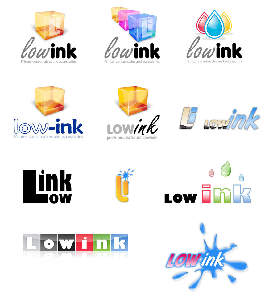
Range of different logo designs presented to the client. Although I prefered the top left single cube with the Li branding, the client chose this one . Even the transparent cubes was better!The 3 drops logo (top right), the drops falling onto the text (right side) and the bottom left logo, were all heavily influenced by other images found on DeviantArt, alas I can't find them again to give links.
To be honest, I wish I'd done a more simpler logo cube, as I think this would have been far more flexible in print, screen, etc.
Related content
Comments: 3

lol @ that black one *gag* "Link Low" lol
you have some really pretty ones here tho.. without knowing what the company is about, I'd have to say my fav is.. bottom left. I am a sucker for reflections on white.
However, the one the client chose wasn't too bad... as I said, without knowing what they are about, can't say.
👍: 0 ⏩: 0

I would choose third one (those drops are really nice!), it's most flexible. Nice job overall.
👍: 0 ⏩: 0


