HOME | DD
 ThePhantomDoodle — Paintng test
by-nc-nd
ThePhantomDoodle — Paintng test
by-nc-nd
Published: 2018-07-27 23:15:34 +0000 UTC; Views: 183; Favourites: 14; Downloads: 0
Redirect to original
Description
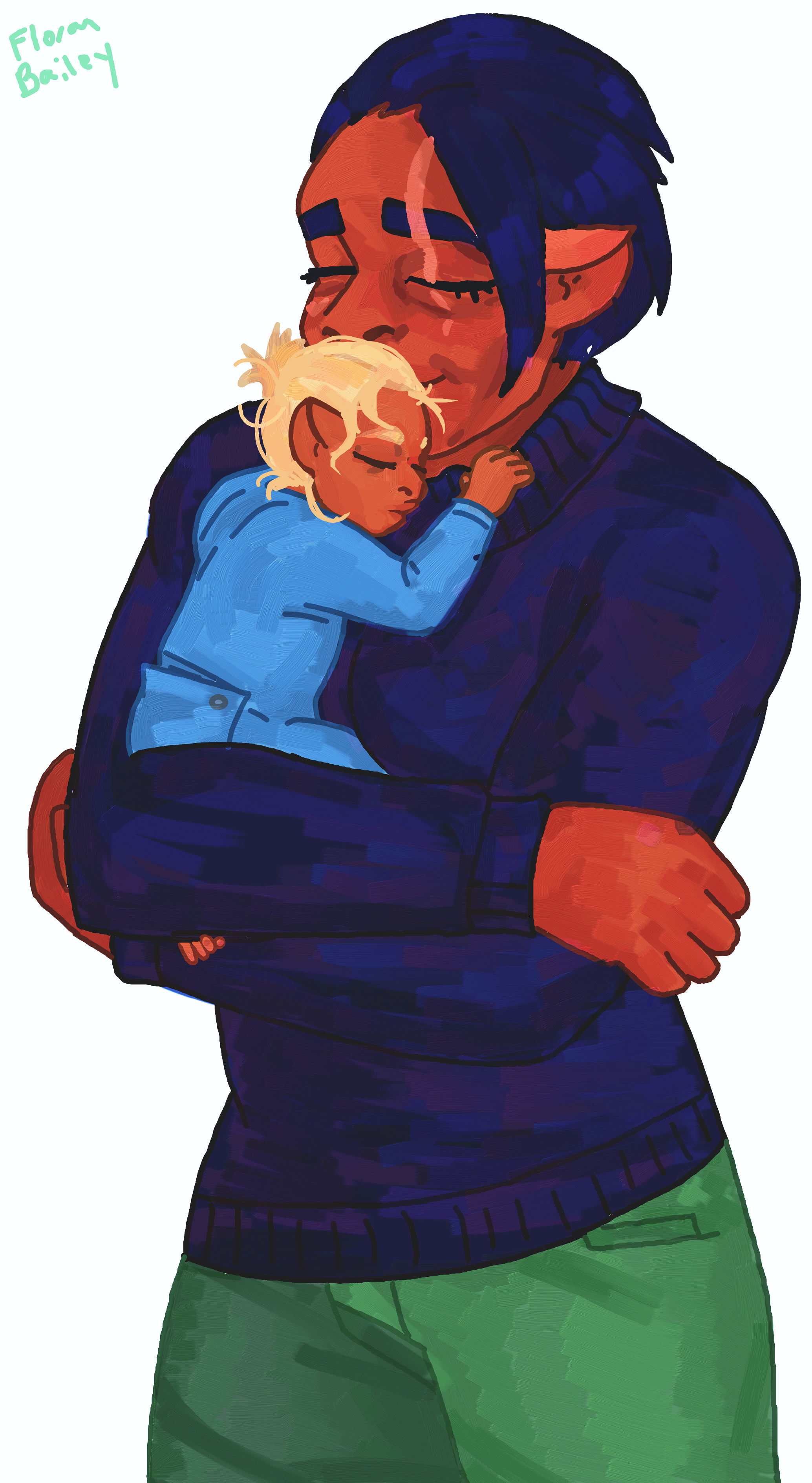
Profile of character drawn: docs.google.com/document/d/1OS…If you critique that too I'll draw one of your characters.
Related content


Comments: 7

I'm here from ProjectComment!
First of all, I think this piece, drawing-wise looks pretty decent! You got the shapes right, the anatomy looks good from what I can tell, the lines look good even though they were not the main focus of the piece, as you state it is a "painting test".
Painting-wise, which is the focus of the piece, I have a few suggestions I want to give you!
Every detail that looks like it could be worked on can be fixed by the same thing: looking at references. I can see you tried giving the clothes some texture so that we can see what fabric they are made of, and that is great! Sometimes digital paintings lack texture, but I think you really tried to avoid that and it shows! So, next time you paint something, I think it could be beneficial to have 2 or 3 references (or more!) of each part of the piece you are painting, so that you can study what shapes work on fabric and where the shadows should go. Same thing for hair and skin! I think it would be very good for your whole sense of volume and that would make the piece look even better!
Looking at references will also make you notice how values affect our work. I'm pretty sure there are a lot of tutorials out there about those, but setting a black layer on top of the whole piece to "color", can make you see the values of the piece, thus making it easier to work on it! I recommend you check some values tutorials out!
So yeah, like I said before, you did a pretty good job with this, but I think looking at references next time will make you improve a lot faster! Studying the world before drawing it will make our drawings look a lot better, so I wish you the best of luck with it!
I hope this comment was useful for you somehow!
👍: 0 ⏩: 0

Hello! I love your drawing!
I am also here from ProjectComment so I am going to give advice and critique your drawing. No matter what I say, keep doing what your doing!
To begin with, I feel like the overall value of the painting is too dark, and could use some light colors and highlights. Highlighting SAVES so much of my artwork, so just a useful tip for ya.
I love the baby and the baby's hair! the baby is so cute!
I really love the fact that it looks like acrylic paint, but I feel like in some areas it looks too streaky, thats only when I zoom in though.
Also I think that the hair and her sweater are too close in color.
I also think that maybe you could have made her arms a tad smaller? She looks like she lifts some serious weights haha. I have problems with drawing arms as well, so your not alone, trust me.
I love your drawing either way! Dont let words stop you!
👍: 0 ⏩: 0
Hello! I’m here from ProjectComment.
First, let me note that I’m red-green colorblind, and while that doesn’t usually come into play with my comments, I get the feeling the characters here might be green, but I’m not sure, so if I say anything regarding the colors and it seems like a weird thing for someone to say, that’s probably why.
Okay, now on to the actual comment – This looks like a really adorable, touching moment, and I think you did a great job of capturing it. I’m not sure why I have the impression that Tessa is giant compared to a human (maybe it’s the size of her nose and ears, and the overall bulk), but I do, and yet you manage to capture a moment where she looks tender and caring. So, well done to you for that.
The proportions – even with how tiny the baby looks – all look good. Nothing leaps out at me as seeming too large or too small for the rest of the figures. I like your linework and how you used darker tones of the same colors (something I try to do every now and then but fail at), and I *really* like the sort-of pixilated shadows and highlights. I can’t quite define the effect they present, but it works.
As for areas that could serve as examples for improvement, I think I’d point to two small areas – first, her forearm looks completely perpendicular to the viewing angle of the person looking at this, whereas I think it’d be a great effect if you could have it look a little angled back away from, in this case, the monitor screen. That would help add depth to the image, which could help make it pop. The other note I have in this regard may be kind of silly, but I’ll say it anyway – I feel like her ears should be a little further back on her head, simply because there has to be room in her skull to hold her eyeballs in front of her eardrums and the like. Maybe her physiology is completely different than what I have in mind, but it’s just something that stood out at me as I looked at this. Nudge them back a bit past her jawline, and I think it’d work fine, you know?
Overall, though, great work capturing this moment… very cute and well done.
That’s all I have, but if there was anything you were hoping to get a comment on that I missed, just let me know and I’ll try to swing back for another look.
Kevin
👍: 0 ⏩: 0
 (Smile)")


I really love the way you drew their anatomy. It just looks right.
👍: 0 ⏩: 0