HOME | DD
 ThePsych0naut — 7-17 Lineart Study (Baalbuddy)

Published: 2023-07-17 19:07:07 +0000 UTC; Views: 1422; Favourites: 26; Downloads: 2
Redirect to original
Description
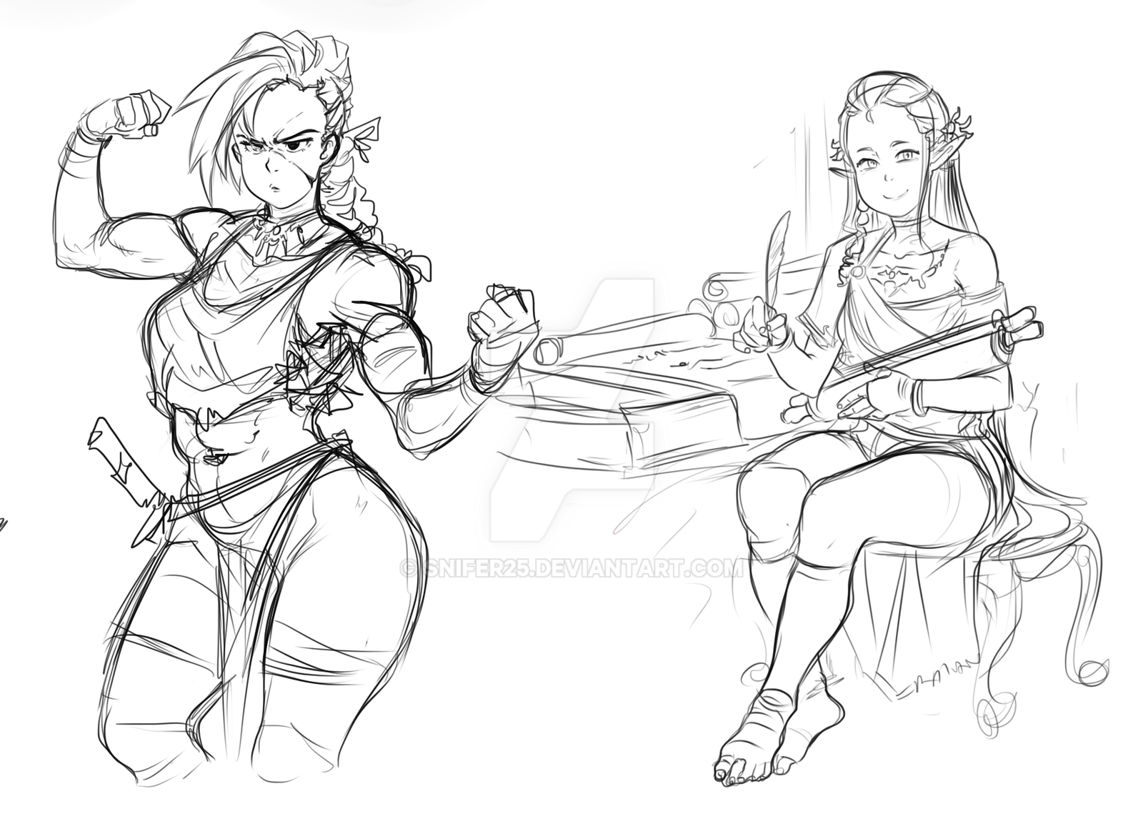
DISCLAIMER: This isn't my original work; it belongs to Baalbuddy, a web cartoonist who draws thirsty comics.I love the sense of clarity that characterize his crunchy line quality. What I've noticed is he always prioritizes his shape language and sense of rhythm over his folds; and when he does folds he tends toward scratch-y, jaded lines for the sake of confidence (sometimes at the direct cost of accuracy, buuuut it's clear he inks on a breakneck schedule). If I had to guess, I'd say he only uses a tablet for clean up and inks his sketches with a micron felt tip pen; that would explain why he's so piece-meal with his strokes, opting to connect the dots with big shapes and sharp, "fast" lines for patches of detail. To get the closest replica of his style, I followed his blots. These feature when he deems a tapper is to thin, when he's starting a stroke, or when he's wallpapering over a minor mistake.
Because he's a web cartoonist, Baalbuddy emphasizes his schedule over extravagances, minimizing--as much as possible-- details that detract from areas of interest; trusting his intuitive sense of negative space to guide the viewer.
Read left to right the attention goes to: the jagged talk bubble; the faerie; and then either adventuring gear behind the bed or Virgin Knight, Virginia herself. The effect is smooth, simple, but eye catching. Emphasis on simple. As in reliable effective.
What I take away from this study:
Focus on shape before details. People will forgive visual inaccuracy if what's (slightly) inaccurate is still entertaining.
Vary line weight.
Thick lines=fast Thin lines=slow
Thickness of line also conveys shadow and tension.