HOME | DD
 TheRyanFord — DeviantART Logo Icon

Published: 2011-07-07 23:19:11 +0000 UTC; Views: 23378; Favourites: 297; Downloads: 4876
Redirect to original
Description
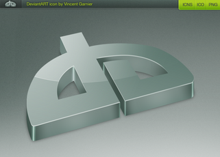
Actual deviantART logo, rendered for desktop icon use. At largest there is a 512px version, at smallest is a pixel-perfect 16px version. For use only on your desktop as a link to deviantART.com.ZIP file contains a Mac-friendly .icns file + a Windows-friendly .ico file.
Uploading because I've seen a lot of truly terrible attempts at redrawing our logo in icon format. You guys deserve to use the actual logo on your desktop, not a sad substitute.
Related content
Comments: 82

Thank You! I would like also to know which is that texture on the background, did u create it or u got it from somewhere?
👍: 0 ⏩: 1

You can easily create that texture by using the "Noise" command > lowering opacity.
--
Amazing logo! (:
👍: 0 ⏩: 1

Snortgiggling just thinking about a few of the icon attempts. This is a wonderfully designed vector logo in all the right proportions, so proper icons are a gift to the community. Brilliant stuff, sir.
👍: 0 ⏩: 0

oooh fancy 
damn, that reminds me that i should update my icons with the new dA logo 
i just hope they are none of those "terrible attempts"
👍: 0 ⏩: 0

That 
👍: 0 ⏩: 0

deviantART is written with Klavika Bold + light.
👍: 0 ⏩: 2

in fact not really
It's a lightly modify klavikal
👍: 0 ⏩: 1

But the font is klavika modified or not. oh you.
👍: 0 ⏩: 1

yeah but it was modified
And also they reduce the height of the bold one to fit the height of the light one
👍: 0 ⏩: 1

Nice work.
Does this mean we get a dA iOS app!?!?!?
👍: 0 ⏩: 1

Let's not get ahead of ourselves.
👍: 0 ⏩: 0

lookin' good Ryan. i never got into adding websites to my dock
👍: 0 ⏩: 0

If I ever have something dA related installed, I will be sure to come back to this!
👍: 0 ⏩: 0
<= Prev |


