HOME | DD
 thundersaber — Begin

Published: 2002-02-23 16:44:30 +0000 UTC; Views: 2826; Favourites: 14; Downloads: 260
Redirect to original
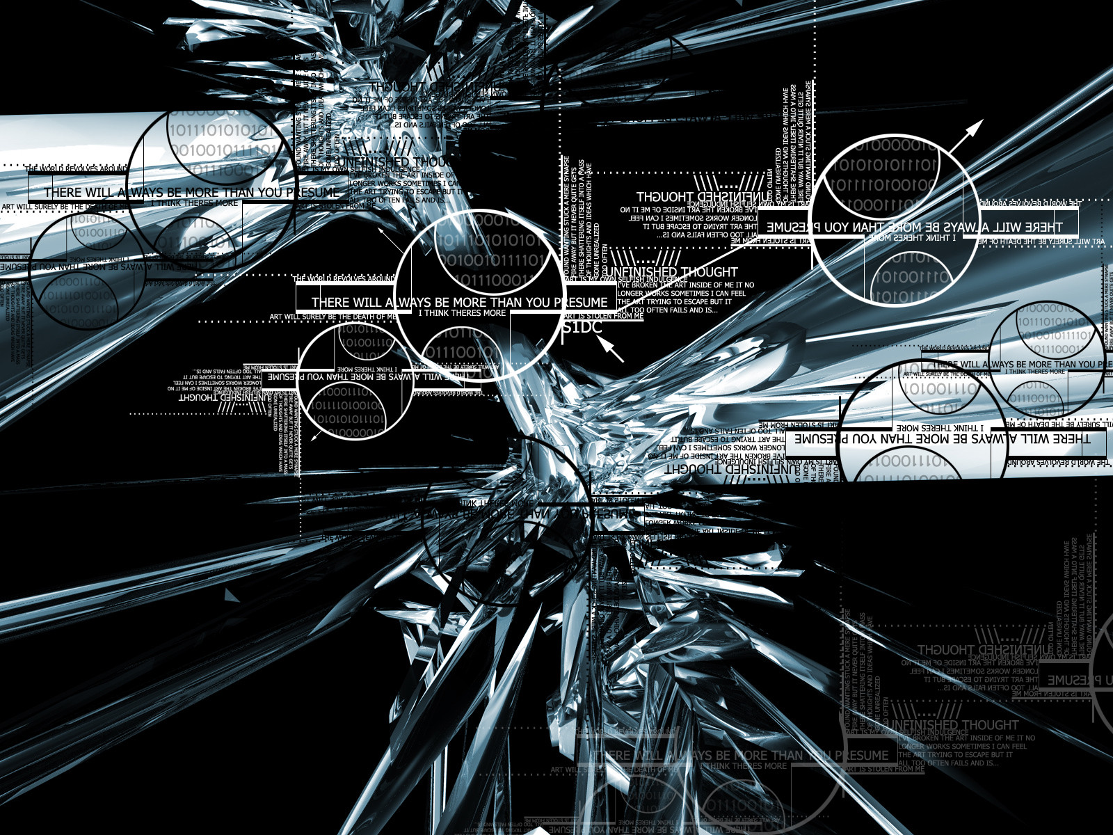
Description
.Related content


Comments: 24

You have done A LOT of nice stuff but this is by far your best. I like this WAY too much ^_^ V. kewl m8
👍: 0 ⏩: 0

I think the broken dreams text should be placed a little differently but still awesome work.
👍: 0 ⏩: 0


That is exceptional and impressive. I love it. NiceJob, keep up the excellent work
👍: 0 ⏩: 0


i agree with arleetec too the angled text doesnt fit. but the rest is very cool. i liike my grids a little lower opacity too, and a bit smaller. still very good piece.
👍: 0 ⏩: 0

cool colors, and i agree with arleetec
-----
:endogen:
:: Save Me From This Place ::
👍: 0 ⏩: 0

Pretty cool but the angled text that you have is just not working. I think you should take it out.
-----
I mah
s!
👍: 0 ⏩: 0


now that i looked at the full view, the 3 lines of text starting with "the broken dreams gives rise..." are very distracting and in the wrong place.......removing them will be much better.......
ewww.....
-----
-=[GundamZZ]=-
👍: 0 ⏩: 0


id move the "broken dreams gives" text to the bottom left corner and have it horisontal. dont look that good as is but other than that this walls great. good work me likes
-----
----------------
adjö och goddag
goddag och adjö
👍: 0 ⏩: 0
WOW.....amazing work here.......just love it!
hehe....
-----
-=[GundamZZ]=-
👍: 0 ⏩: 0


wow friken awosme i wish i could do that
-----
-------------------------------------
up..
👍: 0 ⏩: 0

quite nice. but the text coming off at an angle seems totally out of place, and that font used is all wrong...
👍: 0 ⏩: 0

very nice kinda techy and trendy and blue
*downloads*
👍: 0 ⏩: 0


okay???
its more than okay
fantasic I love it
-----
My path is the right path https://anachron.deviantart.com
.: :.
👍: 0 ⏩: 0

Looks pretty awesome.
-----
--[WARNING]--
Warning Ahead
👍: 0 ⏩: 0


Hey man, pretty neat
-----
Jeevan
Inspiration comes from design. Design comes from inspiration.
http://jsonic.co.uk/
👍: 0 ⏩: 0