HOME | DD
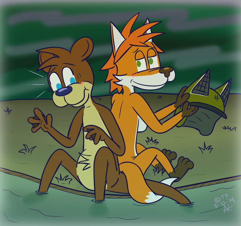
 Thyloguy — Spin Cycle!

Published: 2014-01-09 05:31:44 +0000 UTC; Views: 988; Favourites: 22; Downloads: 0
Redirect to original
Related content


Comments: 20

Amazing. He's sure one cute and handsome otter.
")
👍: 0 ⏩: 1

You're welcome. Keep up the good work.
 (Wink)")
👍: 0 ⏩: 0

This Picture just reminded me that i have an Otter OC that i kinda forgot about.
Good work though
👍: 0 ⏩: 1

Don't forget about your characters! I've got about 75 or so to keep in check over a bunch of different series.
👍: 0 ⏩: 0

Looks like Owen's enjoying that whirlpool there. ^^ Cute.
 (Smile)")
👍: 0 ⏩: 1
That's his favorite thing, ha! Thanks!
👍: 0 ⏩: 0

He gonna be dizzy soon after he spin in the water
👍: 0 ⏩: 1
I wouldn't want to be in the water if he just ate...

👍: 0 ⏩: 0


Just call him "The Pretzel" ha!

👍: 0 ⏩: 0

You continue to improve.
Now I challenge you to try this: implement thick external contour lines and varied thinner internal contour lines, with slightly thicker line weight for parts that cross over other parts! Make the line weight difference bold so as to have them pop out!
👍: 0 ⏩: 1
Thanks! Yes, I do want to attempt a drawing with different line thicknesses.
Unfortunately, I didn't save the original .ai file of the line art for this one, I just have the exported .png of it.
👍: 0 ⏩: 1
Ah, on your next piece then!
I know people who like to discard the original .ai, .psd, .whatevernativeextension so that their art can feel like a completed piece. To a degree, I can agree with the idea, but sometimes I like to go back through my old stuff and turn them into something of a coloring book format. That way I can print them out and give them to friends or younger family for them to color.
The varying line thickness is a visual aid to help the viewer understand the depth of the image. Thicker lines pulls things closer and thinner ones push them farther back. I don't think I have any good examples in my gallery because I've been working on school stuff for so long now and haven't had the time to do anything that I want since I've learned more. . . . I have a little while now, I think I'm going to draw something for fun now! With any luck I can post it within the week.
👍: 0 ⏩: 1
I keep all my .psd files and I usually keep the line art as a picture file. I've got plenty of characters I can practice with the varying line thickness. I'll probably do one over the weekend.
👍: 0 ⏩: 0

")
Just don't get motion sickness looking at it, ha!
👍: 0 ⏩: 0
