HOME | DD
 tigerandmonkey — Basic forms lesson 1

Published: 2003-01-15 12:44:42 +0000 UTC; Views: 599; Favourites: 8; Downloads: 75
Redirect to original
Description
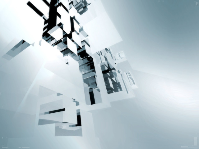
A very balanced composition, guides were used in excess.I would like to call it art, but I wont dare.
//Calle
Related content
Comments: 10

this is awsome....simply perfect
colors
forms
and design
fantactiuc job...
gonna chech the rest later...
👍: 0 ⏩: 0

damn right....
great colors, and the composition and peicing of it together rawks...
👍: 0 ⏩: 0

nice work , i would of made a few of the elements smaller perhaps as the focus seems unclear.
all round i like it tho.
👍: 0 ⏩: 0

you should most certainly call this art, for that is what this is. you just made it to my artistWatch with this piece. i like things simple, but chaotic, and even though there's isn't much chaos here cos this image is balanced out so well, there's just a bit in the upper left hand corner. the typography is wonderful and the shapes you've used compliment one another quite nicely.
👍: 0 ⏩: 0

Wow, that's really classy. And yes it is very balanced. Good work, can't wait for lesson 2
👍: 0 ⏩: 0

Yo man ! Welcome to DA, now you are HOOCKED and will never leave this place, aaaaanyway kick ass graphics man. keep it up !
👍: 0 ⏩: 0

I really enjoy the soft colors. They're so refreshing. The design is very neat too. I'd call it ART!
👍: 0 ⏩: 0


