HOME | DD
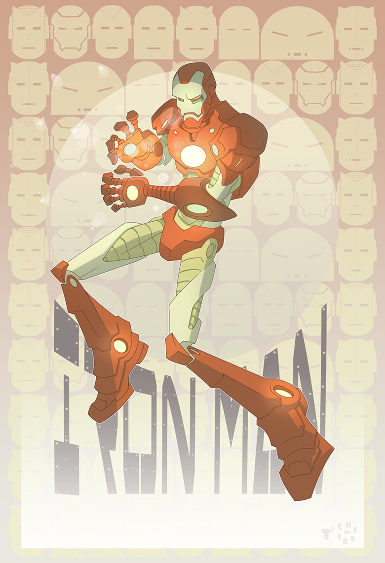
 TimTownsend — Townsend IRON MAN redux
Published: 2009-03-22 00:47:47 +0000 UTC; Views: 17343; Favourites: 434; Downloads: 449
Redirect to original
Description
This working for you guys?Related content


Comments: 108


works for me. i dig it anytime he looks more mechanical than organic
👍: 0 ⏩: 1


")
 (Wink)")

Iron man looks great... sorry I cant say the same about the background. But, seriously your rendition of Iron Man is pretty cool and fluid.
👍: 0 ⏩: 1

Thanks. So far the vast majority are loving the background. Its still growing on me. We'll see. I appreciate the input!
👍: 0 ⏩: 0

Yeah, it's working alright. I love that background.
👍: 0 ⏩: 1


Awesome detail, mate. Lean is in. Nice change from crazy muscled chunkyness.

👍: 0 ⏩: 1
I thought so too.  (Smile)")
👍: 0 ⏩: 0

this approach to IRONMAN works well... just because of your style! i don't think many others could pull it off, including me! i gotta try someday! cool work though, very cool! i am jealous! lol
👍: 0 ⏩: 1
no prob! how many stages do you go through to get to a finished piece? what lead to you use? 2h, h, Bs?
👍: 0 ⏩: 1
Pencils, inks, colors. I use an HB lead.
👍: 0 ⏩: 0

its a great rendition. you can already tell by your nice character qualities that make it unique than usual homage drawings to these superhero drawings. the character forms are geometrical like, typography seems to be always, along with the pattern background. also the color scheme are soft like. i like your style.
👍: 0 ⏩: 1
Thank you! I really appreciate your input!
👍: 0 ⏩: 0

DUDE!
This rocks, Iron Man is my favourite Superhero ever...You should do prints...
Other than his chest repulser this is spot on for the new Fury Files Iron Man figure.
I still think you should do a war machine pic...
👍: 0 ⏩: 1
No kidding? Can you give me a link? Id love to see what it looks like. And thank you!
👍: 0 ⏩: 1
Sure heres mine from my collection!
[link]
👍: 0 ⏩: 1
Ha! Very cool. Thanks for sharing!
👍: 0 ⏩: 0

That's awesome, man. He really looks mean and lean in that armor. Nice color combination and layout!
👍: 0 ⏩: 1

Lol. Thanks, amigo!!
👍: 0 ⏩: 0

I dig this look. Are you vectoring all this stuff?
-k
👍: 0 ⏩: 1
Thanks, Karl! No vector. All the line art was done by hand. Im wierd that way. Gotta have that original when Im done.
👍: 0 ⏩: 1
wow...that makes it even more impressive dude. You should do a whole comic in that style.
-k
👍: 0 ⏩: 1
bawk bawk bawk (my chicken noise).
👍: 0 ⏩: 0

I definitely like all the Iron Man heads in the background!
👍: 0 ⏩: 1

I also have to say I love the use of the different helmet styles as the background. I like the color scheme for it, maybe the red could be more rich and dark to help pop the character image in the foreground out.
It is a really interesting look for IM. It seems so robotic. It could say a lot about the man inside
👍: 0 ⏩: 1
Thanks for the feedback! Exactly what I was looking for. Much appreciated!
👍: 0 ⏩: 1


Looks good but this is more of a personal nitpick, don't see anything that looks like War Machine's helmet.
Personal favorite armor.
👍: 0 ⏩: 1
Lol...I swear to God, as soon as I finished this, it occured to me that Id forgotten about War Machine. Too funny. Thanks for the feedback!
👍: 0 ⏩: 1

No problem man, although I'd really call it more of a nitpick, but that's just me.
👍: 0 ⏩: 0

LOL! My work here is done.
👍: 0 ⏩: 0

That's pretty good I never thought of Ironman as having a symbol like bats or Spider-man. But his face does it just fine.
👍: 0 ⏩: 1
That was the problem, him not having a symbol. Then I thought of the dozens of incarnations of armor hes had over the years so I thought that would do the trick. Thanks!!
👍: 0 ⏩: 0

| Next =>