HOME | DD
 TobiasRoetsch — Cor Tauri
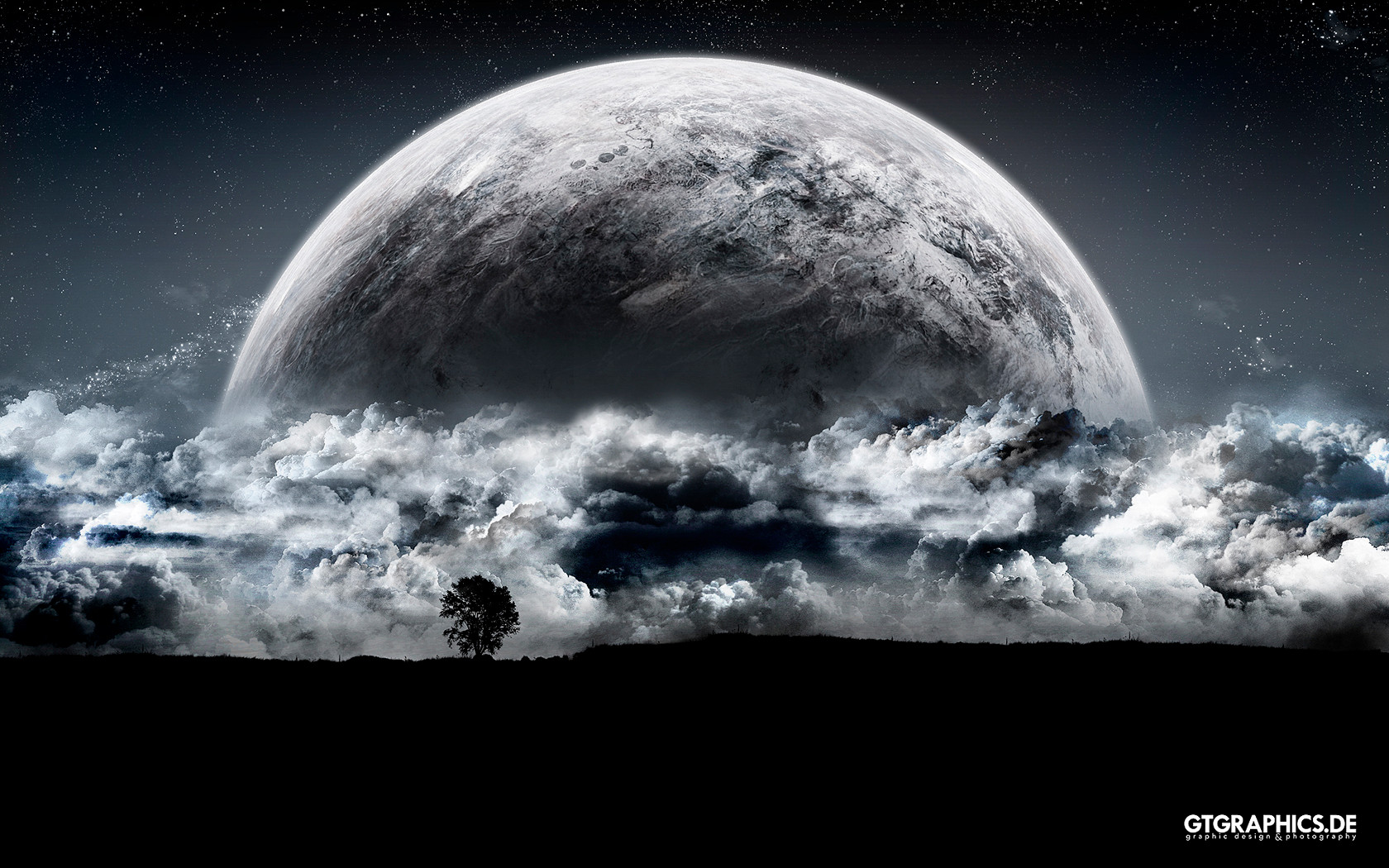

Published: 2008-03-02 00:29:54 +0000 UTC; Views: 70679; Favourites: 812; Downloads: 4579
Redirect to original
Description
 All wallpapers also are available at GT-Graphics.de !
 Cor Tauri
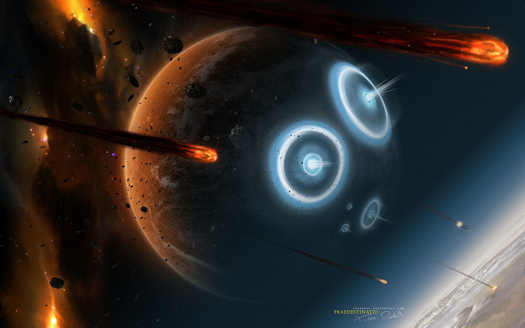
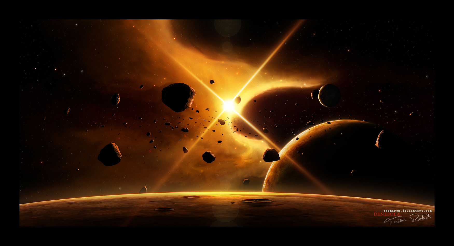
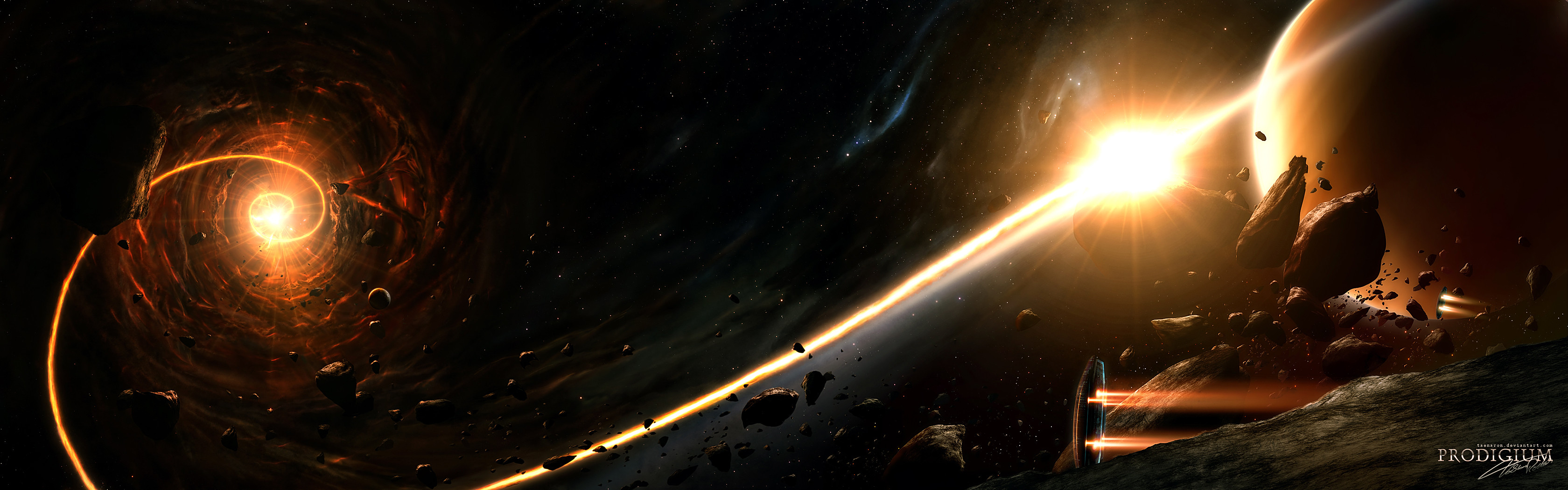
Again a Wallpaper. Warm colors, peaceful scene and the try of improving my city-planet-skills. I think the outcome is good enough to show it
 (Wink)") Maybe you even like it.
Maybe you even like it.Technical Details
- Adobe Photoshop CS, 3dsMax9, Wacom Graphire 4
- 60 layers
- 10 hours
Wallpaperpack via download
- 1024x768
- 1280x1024
- 1440x900
- 1600x1200
- 1920x1200
edit: changed nebula and some other things
Related content


Comments: 244

you can see lays in the big planet, no offence, a great WP ^^
👍: 0 ⏩: 1
")

Schöner Kontrast zwischen der hellen linken Seite und der dunklen Rechten.
Ist gut geworden
 (Smile)")
👍: 0 ⏩: 1


the rocks aren't looking as rocks, aren't that sharp
👍: 0 ⏩: 0


")
👍: 0 ⏩: 1

Don't take this the wrong way, butt eh rough etching sketch of the saturn on the right needs to be removed imo, it is ruining the overall look of this great wallpaper man, the rest is polished, clean, well shaded etc, and then i see this rough etched strange shapes off to the right
i really love the rest of this, you do this style very well, but yea can't get past the saturn on the right sorry.
")
👍: 0 ⏩: 1

That's your opinion and that's ok
Thanks for your comment
👍: 0 ⏩: 1


Great stuff! One have to navigate careful here!
👍: 0 ⏩: 1
Hehe yea true
👍: 0 ⏩: 2
 (Cool)")

Toll! Prima! Super! ...just working on mein deutscher Wortschatz...
👍: 0 ⏩: 1
hehe sounds good
Dankeschön
👍: 0 ⏩: 0


wow. just wow. any yet another fantastic work from taenaron
👍: 0 ⏩: 1


how amazing
also makes me drool when I see it
But can I know how you make planets in photoshop? ")

👍: 0 ⏩: 0


Again, beautiful 
Just, I think, the asteroid (?) on the right top looks false..

👍: 0 ⏩: 1

Spectacular as always.
Great job!

👍: 0 ⏩: 1

ansich ganz nett und schöne warme farben
bei den planten würd ich die streifen nicht über den ganzen palneten machen da wirkt der ganze planet wieder flach (und kleiner machen, vorallem auf dem kleinen planeten)
der nebel sieht auch schick aus aber irgentwie passt er nich so richtig und die form läuft auch entgegen dem restlichen bild (vll. mer in den hintergrund rücken und drehen)
bei dem stern kann man wenn man genau hinschaut sehen das der fast nur aus dicken hellen streifen besteht
bei einigen asteroiden links in der mitte sieht die textur etwas verschwommen aus
👍: 0 ⏩: 1
<= Prev | | Next =>