HOME | DD
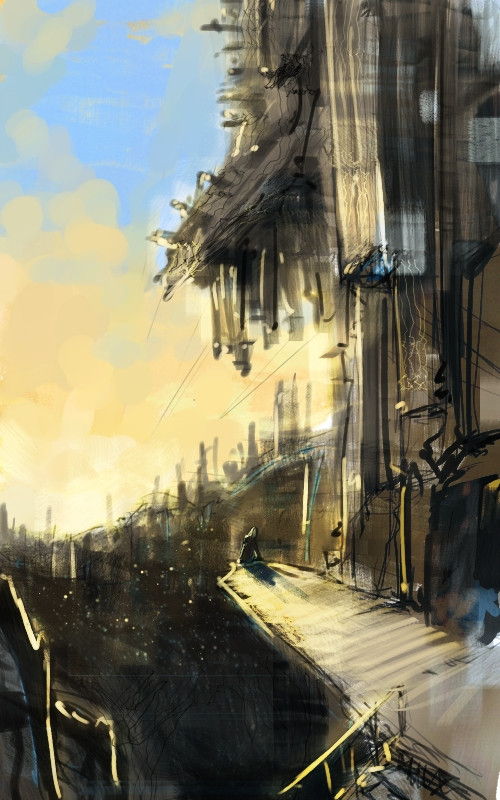
 tobiee — not really a city

Published: 2007-06-03 00:01:20 +0000 UTC; Views: 62494; Favourites: 2843; Downloads: 1661
Redirect to original
Description
this one's pretty obviously trying to be like craig mullens") and failing ahahaha
and failing ahahaha
Related content


Comments: 284


I like the atmosphere of this a lot. It gives it a nice kind of feeling. And I like the atmospheric perspective.

👍: 0 ⏩: 0

wow this pic is killer, just so ya know you inspired me to draw a scene for my team's manga. love the whole singled out thing goin on and the statue in the
background give this scenery character
👍: 0 ⏩: 0

Stunned... Really not a city, which makes it even more overwhelming 8[ ] Just how far above must be the ceiling of this structure?
👍: 0 ⏩: 0


SHIZA, last night, after looking at this, i dreamt of being there, and you could slide 50 metres across the floor
👍: 0 ⏩: 0

the space is awesome. it almost puls you into the scene.
👍: 0 ⏩: 0


this is beautiful, just because you can't be exactly like the artist you want to be like doesn't mean that your painting isn't fabulous.
👍: 0 ⏩: 0


What a wonderful picture
reminds me of a part of Neapel (Italy), where I've been a few years ago.
Beautiful, and I like the colors.
Thank you or doing such great work


👍: 0 ⏩: 0

i think out of the three landscape/ city images you submitted, this is my favorite. despite the fact tha buildings made out of extremally impresssionistic strokes layered ontop of one another, they really work together to create a deffinate image. things such as the circular rings aare supprisingly effective at conveying a round window per-say. the fact that as the enviroment slipps further back into the image, the colour fades out, something which makes the concept of depth all the more tangible. indeed, the practically transulcent statue has found all of it's detail obliterated thanks to the lighting, however, this feature really lends chataer to the background.
the female figure's so bold in comparision to everything else, even the crouw around her. this possibly causes her to jar in the image since she's so promenent, however the contrast between her and the ghostly crown really gives this a rather dream like quality.
👍: 0 ⏩: 0


He he it reminds me of two things The crystal palace in london and The animated verison of Metropolis
👍: 0 ⏩: 0

I really like how you color without many solid outlines. It really gives your work an almost dreamlike quality, as if stuff might disappear when you're not paying attention.
👍: 0 ⏩: 1

yes i agree, the lack of solid outline really add a beautiful quality to your work.
👍: 0 ⏩: 0

Craig Mullins of goodbrush? Still looks good though.
👍: 0 ⏩: 0

Beautiful aerial perspective (is that spelled right)  (Smile)")
👍: 0 ⏩: 0

Wow. This works so well. When I had it in thumbnail it almost looked like an oil painting! I love how all focus is drawn to the girl, while everything else is still absolutely magnificent.
Good work! Deserving of all the favourites!
👍: 0 ⏩: 0

very cool piece. Makes for a great scene concept sheet - i also like how it looks expressive, where the girls in focus and the worlds more in a motion blur. good stuff ^_^
👍: 0 ⏩: 0

looks like Blame + rome O_o;; sugeee
now thats just not fair ")
Clue us less talented individuals
👍: 0 ⏩: 0


crazy architecture...ness... it's very.... immersive?
and I really like the girl.
👍: 0 ⏩: 0


Oh wow...I can't do landscapes even if I tried. Well - I haven't really tried so I can't be too sure.
Anyways, your work's awesome!
👍: 0 ⏩: 0


without reading your description, craig m. was the first thing that came to mind when i saw it...i think you are well on your way....
 (Wink)")
👍: 0 ⏩: 0

you re kind of alien
because this is not from this world!
amazing ^^
👍: 0 ⏩: 0

Wow, this is so beautiful...
I don't know why, but something about this piece strikes me. It makes me feel something, and whenever that happens I know I'm looking at a work that's quite good...in my eyes at least.
Thank you for this. *favorites*
👍: 0 ⏩: 0

I love the depth, reflective ground, perspective, concept, colour scheme, and the overall execution.
I like the round window and the single female figure x3
👍: 0 ⏩: 0


Ya know, I actually like this better than some of Craig Mullin's recent work. I love his pictures that are more loose, which is why I love this picture. The way everything looks like a meaningless scribble when you look too closely, but turns into a silhouette when you pull back. I hope I can achieve such fantastic atmosphere and beauty someday.
👍: 0 ⏩: 0


not failing it's gettin there ...think of it this way....how old is craig mullians and how old r u lol acutally i think he's pretty young lol
👍: 0 ⏩: 0

Well....amazing really doesn't cut it now, does it?
👍: 0 ⏩: 0

Interesting subject matter. I love that you immediately made the focus on the lovely figure in the dress while everything else is quickly decided as unimportant yet establishing the setting. I would say this figure is the main subject but when I first saw this image the first thing I noticed was the suggestion of the large building and it's grandeur. It's subtle contrast with the background was the first sign it would have been the foreground and that this piece was about architecture. However, after just a moment the very next thing the eye goes to is the lovely figure. In full view is where this piece truly shows it's subject matter and all the devices used in it's creation. The fact that she rightfully is the main focus by the sharpness and detail in comparison to the environment and surrounding elements and also that she is in high contrast with the background directly behind her. I think what would have kept this error from happening would be to crop inward a little by slicing away a bit from the left side of the image. This is one beautiful piece though!
👍: 0 ⏩: 0

hmm. truthfully i looked at this for about 10 minutes. i really like the shadow detail and how the colors really work with each other. not very colorful but simple. its really cool
👍: 0 ⏩: 0

I like how you made everything a little unclear and focused on the girl in the corner ")

I don't know why but it reminds of that place for homeless people in the movie "pursuit of happiness"
👍: 0 ⏩: 0


Oh my gosh the picture is wonderful. Nice effects for everyone.
👍: 0 ⏩: 0

I love this ... is reaally cool scene, every detail, and the lights ... just amazing.

👍: 0 ⏩: 0

Well, I don't know who Craig Mullens is, but this is a nice peice, and a nice style, and you've done it really well!
👍: 0 ⏩: 0
| Next =>