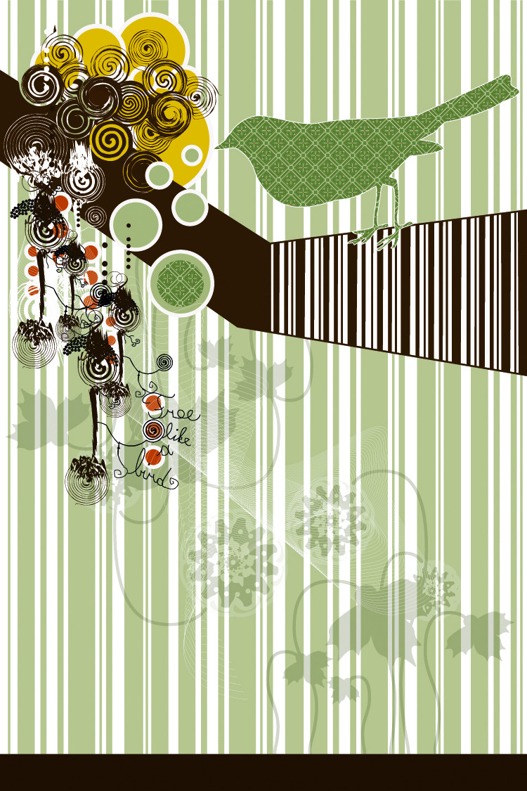
HOME | DD

Tola β€” The 4 elements II

Published: 2004-10-08 16:43:51 +0000 UTC; Views: 62780; Favourites: 1407; Downloads: 13495
Redirect to original
Description I made some changes.
Related content
Comments: 352

ScytheDesigner [2004-11-05 05:28:21 +0000 UTC]

Simple and Sweet. I dig.

πŸ‘: 0 ⏩: 0

miagida In reply to ??? [2004-11-02 06:45:38 +0000 UTC]

shit so glad to see that u got a DD
nice work. looks great

πŸ‘: 0 ⏩: 1

Tola In reply to miagida [2004-11-02 09:00:21 +0000 UTC]

Hey, thanks a lot man. I'm glad you like it

Have a nice day

πŸ‘: 0 ⏩: 0

netghost In reply to ??? [2004-11-01 07:21:10 +0000 UTC]

each portrayl is excellent! Really quite a good design.
.netghost

πŸ‘: 0 ⏩: 1

Tola In reply to netghost [2004-11-01 10:01:03 +0000 UTC]

Thanks a lot. Is very appreciated

πŸ‘: 0 ⏩: 0

liquin In reply to ??? [2004-10-27 17:12:34 +0000 UTC]

yeah, the air and water thingie looks alot better now. do u think the air would be nicer if the blue is abit colder and lighter though. ah, ure probably sick of ppl telling u stuff.

πŸ‘: 0 ⏩: 0

OftenK In reply to ??? [2004-10-27 00:24:40 +0000 UTC]

That's superb!

πŸ‘: 0 ⏩: 0

Miumyn In reply to ??? [2004-10-20 20:10:10 +0000 UTC]

omg I luv it!

πŸ‘: 0 ⏩: 0

aaliguasse In reply to ??? [2004-10-19 12:00:06 +0000 UTC]

Very lovely and simple, great colours chosen. The elements are very well shown.

πŸ‘: 0 ⏩: 0

skk [2004-10-18 22:48:17 +0000 UTC]

a w e s o m e

what else can I say?

πŸ‘: 0 ⏩: 0

superberri4 In reply to ??? [2004-10-18 13:45:18 +0000 UTC]

Ya I agree with blackswan... Awesome snowboards!

πŸ‘: 0 ⏩: 1

blackswan510 In reply to superberri4 [2004-10-19 23:20:43 +0000 UTC]

πŸ‘: 0 ⏩: 0

blackswan510 In reply to ??? [2004-10-18 02:58:46 +0000 UTC]

those would make thw COOLEST snowboards!!! love it

πŸ‘: 0 ⏩: 0

swank [2004-10-18 02:55:18 +0000 UTC]

awesome concept excuted nicely. the air element is so sweet.

πŸ‘: 0 ⏩: 0

gabriellelefou In reply to ??? [2004-10-16 02:40:57 +0000 UTC]

good solution to ilustrate the fouer elements! (and where are the fitfh...hehehe)
great gallery

πŸ‘: 0 ⏩: 0

aon- In reply to ??? [2004-10-16 02:26:29 +0000 UTC]

Great concept, synthesis and concept, synthesis, he!!

πŸ‘: 0 ⏩: 0

mason84 In reply to ??? [2004-10-15 22:05:21 +0000 UTC]

that is really nice!

πŸ‘: 0 ⏩: 0

Turkish-Romeo-BoY In reply to ??? [2004-10-14 14:09:55 +0000 UTC]

itss really nice

πŸ‘: 0 ⏩: 0

StillOnMars [2004-10-12 23:52:32 +0000 UTC]

Amazing - i really like the style!

πŸ‘: 0 ⏩: 0

shiorimaster In reply to ??? [2004-10-12 16:05:32 +0000 UTC]

Strange but cool lol !!

I like the fire it's so ... fire like !! lol

πŸ‘: 0 ⏩: 0

drowka In reply to ??? [2004-10-12 15:25:42 +0000 UTC]

it so... i cant find the word to describe it.
i love it.

πŸ‘: 0 ⏩: 0

endless-wave In reply to ??? [2004-10-12 13:22:05 +0000 UTC]

very awesome. fav.

πŸ‘: 0 ⏩: 0

gabrielxavier In reply to ??? [2004-10-12 04:54:09 +0000 UTC]

I came back to this after a day of deciding about it, and I was floored again... I'm favoriting this... I'm also requesting a print.

πŸ‘: 0 ⏩: 0

PokoFish In reply to ??? [2004-10-12 04:02:28 +0000 UTC]

This is so cool! I love it, especially the way you did the fire. Excellent job. +Fav!

πŸ‘: 0 ⏩: 0

Charshi In reply to ??? [2004-10-12 02:26:03 +0000 UTC]

Whoaaa If those were bookmarks, I'd buy 'em.

πŸ‘: 0 ⏩: 0

Pung In reply to ??? [2004-10-11 20:40:59 +0000 UTC]

Sweet sweet art.... Nice clean lines....

Dig the retro thing going on.... oh ya... i see it....oh, thats it.

mmmmmm.....

Don't mind me....

πŸ‘: 0 ⏩: 0

gderanidaye In reply to ??? [2004-10-11 19:42:38 +0000 UTC]

ooom thats real cool!

πŸ‘: 0 ⏩: 0

emerica2124 In reply to ??? [2004-10-11 17:17:06 +0000 UTC]

well deserved and you know it

πŸ‘: 0 ⏩: 0

jmecor64 In reply to ??? [2004-10-11 07:49:29 +0000 UTC]

How simple. But is Engaging.
I love it.

I like this kind of art. , I'll be checking some of your work later.

πŸ‘: 0 ⏩: 0

HikariAkuma In reply to ??? [2004-10-11 07:45:50 +0000 UTC]

Sweat beans! This is really cool! I really like your choice of colors, especially for the middle elements~

πŸ‘: 0 ⏩: 0

mllebienvenu In reply to ??? [2004-10-11 07:35:09 +0000 UTC]

Ooh..these are very nice They'd make a lovely set of bookmarks :-D

πŸ‘: 0 ⏩: 0

RavenWillowHawk [2004-10-11 07:32:50 +0000 UTC]

Very simplistic, I like it! Well done.

πŸ‘: 0 ⏩: 0

ahlen In reply to ??? [2004-10-11 06:16:36 +0000 UTC]

love it

πŸ‘: 0 ⏩: 0

catgir In reply to ??? [2004-10-11 06:15:00 +0000 UTC]

cool..I love it

πŸ‘: 0 ⏩: 0

bunnygirl In reply to ??? [2004-10-11 06:13:40 +0000 UTC]

What a neat idea!! And done so well, too. Hey, my Astrological Element is Fire And that's the one I like the most too. Really nice work on all of them.

πŸ‘: 0 ⏩: 0

mirari [2004-10-11 05:50:05 +0000 UTC]

This work is definitely an improvement over the original, and i envy your vector skill. Excellent piece.

πŸ‘: 0 ⏩: 0

CheiftainMaelgwyn [2004-10-11 05:40:01 +0000 UTC]

Dude, this is brill! So simple and yet, awesome!
395680394580294385902 flowers for you.
::huggles::

πŸ‘: 0 ⏩: 0

draliane In reply to ??? [2004-10-11 04:31:43 +0000 UTC]

really cool

--
β€œWhat is done for love is always beyond good and evil” ~ Nietzsche

πŸ‘: 0 ⏩: 0

Bobtheconquerer In reply to ??? [2004-10-11 03:31:17 +0000 UTC]

Nice vector work.

πŸ‘: 0 ⏩: 0

rowla In reply to ??? [2004-10-11 03:19:54 +0000 UTC]

You captured the essence of all four elements so well. Great work here

πŸ‘: 0 ⏩: 0

Angelophiliac In reply to ??? [2004-10-11 02:48:35 +0000 UTC]

im thinkin of ways to make this work in a house usage object...

πŸ‘: 0 ⏩: 0

yoyo In reply to ??? [2004-10-11 02:46:03 +0000 UTC]

sweet job

πŸ‘: 0 ⏩: 0

IVSienna In reply to ??? [2004-10-11 02:41:26 +0000 UTC]

Oooh I love it! Nice work

πŸ‘: 0 ⏩: 0

nanitomx In reply to ??? [2004-10-11 02:29:12 +0000 UTC]

its really relaxing , you should make a print out of it

πŸ‘: 0 ⏩: 0

drawerx In reply to ??? [2004-10-11 02:08:33 +0000 UTC]

very stylish, i love the vectors and the disegn in general, good work

πŸ‘: 0 ⏩: 0

SoldatsAgent In reply to ??? [2004-10-11 01:51:39 +0000 UTC]

After looking at the other version of this you have, I like this version much more. The renditions of water and air are much better than before

πŸ‘: 0 ⏩: 0

superberri4 In reply to ??? [2004-10-11 01:43:41 +0000 UTC]

That's beautiful! The earth one is perfect..

πŸ‘: 0 ⏩: 0

MagnumTheNemesis In reply to ??? [2004-10-11 01:41:27 +0000 UTC]

GREAT JOB! what font is that it looks cool.

πŸ‘: 0 ⏩: 0

loofah-lise [2004-10-11 01:25:11 +0000 UTC]

oh yeah, and congrats on the daily deviation

πŸ‘: 0 ⏩: 0

loofah-lise In reply to ??? [2004-10-11 01:24:37 +0000 UTC]

awesome design qualities
the color schemes rock

πŸ‘: 0 ⏩: 0


<= Prev | | Next =>