HOME | DD
 Tola —
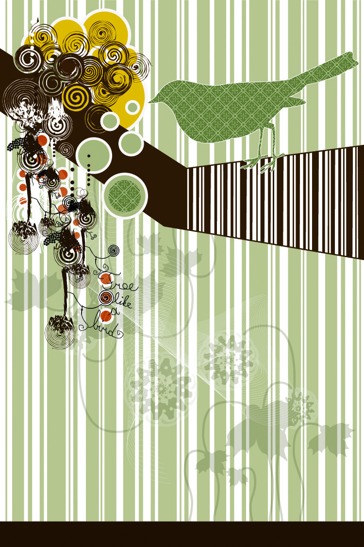
The 4 elements II
Tola —
The 4 elements II

Published: 2004-10-08 16:43:51 +0000 UTC; Views: 62918; Favourites: 1407; Downloads: 13495
Redirect to original
Description
I made some changes.Related content


Comments: 352

OOH!! Pretty and simple, elements!! Awesome Daily Dev.

👍: 0 ⏩: 0

uh oh! congrats on daily deviations! ")
👍: 0 ⏩: 0


awesome point of view.. really sweet thing
 (Smile)")
👍: 0 ⏩: 0


Oh wow! These absolutely kick my ass! I have to say, the one for earth steals my heart for some reason... You know what? These would make great bookmarks!
👍: 0 ⏩: 0

beautiful work, loving the water one

👍: 0 ⏩: 0


wow this is amazing
truely talented and inspiring too
👍: 0 ⏩: 0

awsome piece and congrats on the dd........ i wanna see some of this for the en pack
 (Wink)")
👍: 0 ⏩: 0


Fire is the coolest. It looks great! Great work, too! I love it.
👍: 0 ⏩: 0

Oooh! This would make an AWESOME t-shirt!
👍: 0 ⏩: 0


WHOA!!! this is sooo tight! the abstractness! the beauty!

it's juss so beautiful TT___TT
👍: 0 ⏩: 0

I agree that Air might be better without the sun, so that you get only cool colours. Also, the flames are a bit skinny- I can see why the colour-blind person mistook them for grass.
That said, Water and Earth are sweet, and it is a pretty cool dev.
👍: 0 ⏩: 0

awesome work, definately deserves the daily deviation. i would absolutely consider buying this if it were a print. stunning
👍: 0 ⏩: 0

wow, wonderful original concept, great execution.
👍: 0 ⏩: 0


I love it!! It's so simple yet so cool!!
👍: 0 ⏩: 0

love fire & earth, don't so much like the sharks in the water but yeah that's just me 

👍: 0 ⏩: 0

Very nice work. I love it!
Congrats to the DD
👍: 0 ⏩: 0

ooooh I like it soo much! :fav: ! simple and soft lines... *_*
👍: 0 ⏩: 0

cool idea.
i like only the birds and colour of Air. the Sun totally ruins it.. and it looks cheaply done.
Earth is an exellent design, i dig it.. i love the roots of it! well done on that one.
i really dislike te 2nd one. doesnt really look like fire. and you resized it to fit and it looks too skinny and it shows little skill there. nice try though. the sticks make it look liek a bodge paint job.
the water is kinda cute. feels a little bit outta place,
so other than all those little things i picked out that ruin the image..
the layout skills are good. i like the vertical structure and the bubbleness of it,
unna check out ur gallery now.

👍: 0 ⏩: 0
cool idea.
i like only the birds and colour of Air. the Sun totally ruins it.. and it looks cheaply done.
Earth is an exellent design, i dig it.. i love the roots of it! well done on that one.
i really dislike te 2nd one. doesnt really look like fire. and you resized it to fit and it looks too skinny and it shows little skill there. nice try though. the sticks make it look liek a bodge paint job.
the water is kinda cute. feels a litt
👍: 0 ⏩: 0


You've done a very good work, i like very much the concept, the colours, the lines and curves wich make the picture
👍: 0 ⏩: 0

Uh, I meant the third panel. Earth. Heh...
Sorry about the double comment.
Snoc.
👍: 0 ⏩: 0

I fell in love with this the moment I saw it. The colors are easy on the eyes, yet they still bring out the liveliness of their own elements. Beautifully rendered.

👍: 0 ⏩: 0
Autumn's my favourite. This is really good. Simple, clearcut, and beautiful.
Great work!
Snoc.
👍: 0 ⏩: 0

nice concept, and it looks great in vector form
👍: 0 ⏩: 0

really beautiful")
👍: 0 ⏩: 0

ive seen this somewhere before but i like the fire.
👍: 0 ⏩: 0


Reallly Nice job .... i Loooove that type of design!..
May i just add a suggestion tho . i'm not sure about the fire element, i thought that was grass on a quick look.
maybe that's because i'm colorblind 
keep on the good work

👍: 0 ⏩: 0

great idea, very clear very good
well done
👍: 0 ⏩: 0

Those would make awesome snowboards... that's just what sprung to my mind. Very, very awesome.
👍: 0 ⏩: 0

*applause applause, vociferous applause*
well done my deviant friend!
great vectoring.. and graphically speaking the images are very well developed.
👍: 0 ⏩: 1

Heya, i love this work +fav
What is "applause applause, vociferous applause" from?
👍: 0 ⏩: 1
many thanks!
its from an old warner bros. cartoon... about a flea circus. the showgirl fleas kept singing that song.. its stuck with me all these years!
👍: 0 ⏩: 1


lovin this version tons more
way better version. excellent work!
👍: 0 ⏩: 0

brilliant idea, and very nice application, especially fire looks very original, bubles in water re very nice details,
👍: 0 ⏩: 0


")

ups!!! ... you are a girl..haha sorry
👍: 0 ⏩: 0
<= Prev | | Next =>