HOME | DD
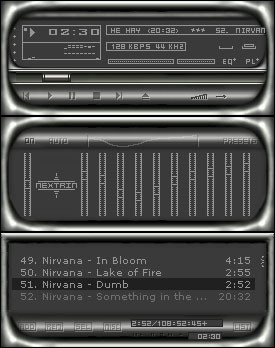
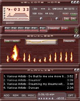
 trolpen — visions winamp
Published: 2002-02-03 02:14:04 +0000 UTC; Views: 1059; Favourites: 3; Downloads: 293
Redirect to original
Description
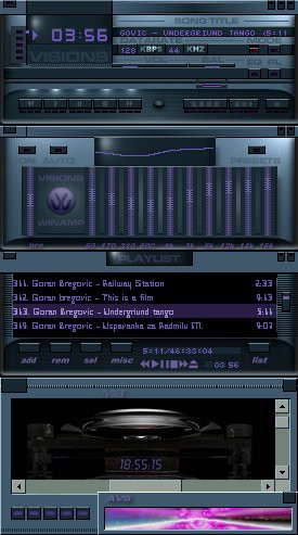
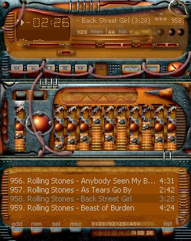
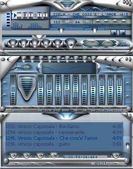
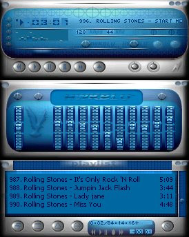
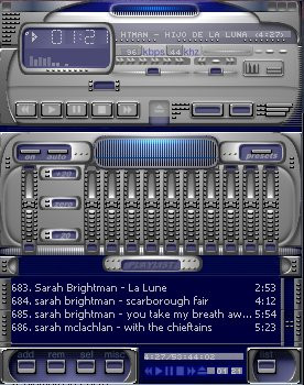
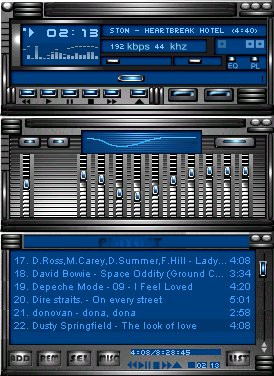
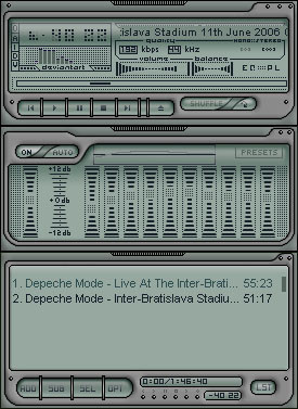
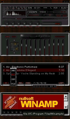
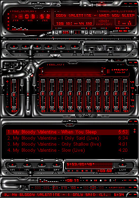
graphics and title by etype2Related content


Comments: 17

NICE! Yes, very nice, dark and delicious. I love it!!
-----
J Y
👍: 0 ⏩: 0

Super style points here! The consensus seems to be that there is a lot of inconsistancy in the piece. This would definitely be worth refining.
👍: 0 ⏩: 0


You used the volkswagon logo, lol. The main window seems strange to me.
This comment is provided AS IS without warranty of any kind, either express or implied. The entire risk arising out of use of the comment lies entirely with you.
👍: 0 ⏩: 0


Nice skin.
I think the PL and MB titlebars should be like the EQ and main ones.
👍: 0 ⏩: 0

Very different and very good. Reminds me of Fusion amp
.:THK:.
----------------------------------------
When one has learnt love, he has succeeded in life no matter how he has failed otherwise
👍: 0 ⏩: 0

ahhhhhhh,ohhhhhh!!! very good work, ei man you're the best skinner of the world...( ok!!! La vedi questa skin! direbbe in vecchio Robert
👍: 0 ⏩: 0

kinda nice lookin, but still not a super skin!
joneonline.com
👍: 0 ⏩: 0

superb work, although the titlebar and main EQ looks a bit strange, one dark and one lighter
-- Dredwerk
I love you all, appart from the ones I dont
👍: 0 ⏩: 0

I like the overall layout, but I dont like the font and the buttons in the playlist. but the main screen is very cool with the different colors and such
........................................ ..................
make love not war :: good guy revolution
👍: 0 ⏩: 0

Once again, Thank you for this wonderful gift.
A man has to know his limitations... Speak softly and carry a big stick
👍: 0 ⏩: 0
Oh man,what can I say. This skin is beautiful! You have applied all my suggestions and comments to this skin.The glass windows,the fonts,indirect lighting,animation,colors are very laid back and kool looking,smooth and clean,high resolution.The Visions logo looks great.Prag o,prago!You are a good friend. This is going on my bkaro tonight. If I ever return to Italy,I will look you up and we will have a few beers. 100%
A man has to know his limitations... Speak softly and carry a big stick
👍: 0 ⏩: 0

hm, not too shabby -- could do with some refinement here and there. Namely, the fonts and the use of the colour purple.
I love those lights above the cbuttons though, they're a really nice touch.
Good skin
👍: 0 ⏩: 0

MWAHAHAHAAHAHAHAAHAHAHA
you have Bregovic!!
lol
/don't believe my eyes ...
anyway, the font stinks, true
other than that, not bad, but i wouldn't use it personally
👍: 0 ⏩: 0

It looks pretty decent, all but the purple text and so & the font in the playlist window is not too readable.
- I am
👍: 0 ⏩: 0