HOME | DD
 tuxie — Sysmatic

Published: 2003-11-12 16:21:47 +0000 UTC; Views: 11368; Favourites: 117; Downloads: 16487
Redirect to original
Description
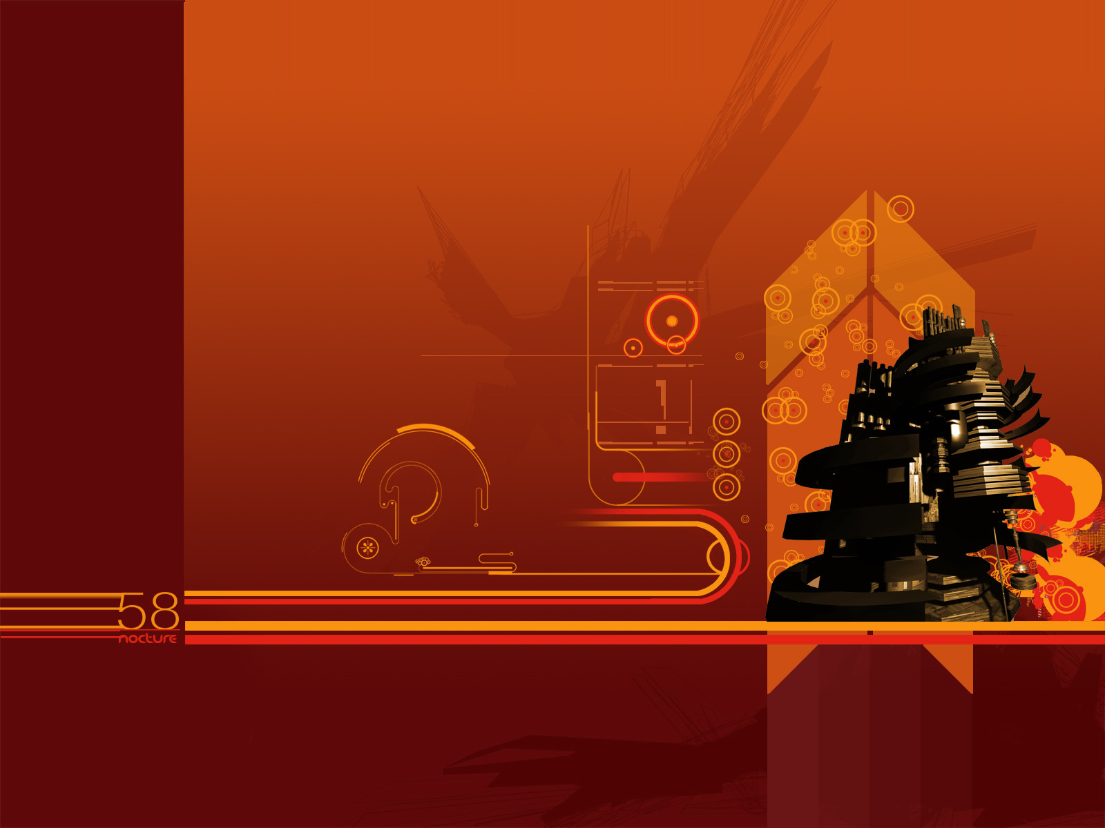
Sysmatic____________________
REGENERATED STEAM MACHINE
collaboration with sysmatic.net [link]
plz fullview.
Related content


Comments: 110

hmph.. i dont really like those colours but.. its otherwise nice  (Wink)")
👍: 0 ⏩: 0

damn, this owns
great 2d, everything looks damn well together, sick details
+fav
👍: 0 ⏩: 0


awesome pic! great vector work and amazing 3d object. good job
👍: 0 ⏩: 0
awesome pic! great vector work and amazing 3d abject. good job
👍: 0 ⏩: 0

awsome work. GREAT colors, very detailed, we are one in the same!
👍: 0 ⏩: 0

Perfect!! O_O Damn i wish i could make something like this ")
👍: 0 ⏩: 0


Very nice. Very complex. I love the coffee-like colours
👍: 0 ⏩: 0

this would make such an amazing wall-poster. i love the composition and the color corrdination i think it's fantastic. i don't think this peice could get any better. reminds of stuff i've seen on cubadust.com b4. which is obviously a good thing.
👍: 0 ⏩: 0


Regenerated or Degenrated?
It looks like its in flux between the two.
Great job on the copper tones and layout throughout. With a border on it it would be screaming, "Print Me!"
Great job br0.
👍: 0 ⏩: 0


+fav cker weten
netjes gedaan mischien word je wel een inspiratie bron
👍: 0 ⏩: 0

I have an urge to favorite right now, and lose my comment, but I won't...
...until now...
👍: 0 ⏩: 0


the renders are nice.
some of the 2ds are good aswell.
but i dont like the colors, the composition and some 2ds.
.. but obviously thats just me, so fuck it. ")
")
👍: 0 ⏩: 0

full view is a definite must.. the thumbnail does not do justice to it...
👍: 0 ⏩: 0


without coherent composition.
!?!?
~prologuetheory you use glasses !? right !? You do better I guess !?
anyway ...
Tuxie !  (Smile)")

👍: 0 ⏩: 0


i love it. fresh new colors. nice use of clouds. plusfave and my new wall
👍: 0 ⏩: 0

wow this is beautiful!
Love the render adn the great 2d work!
👍: 0 ⏩: 0


trite, boring, overdone, without coherent composition.
👍: 0 ⏩: 0

I like render and the layout.
worldmap and plus-signs just WAY overdone :/
👍: 0 ⏩: 0


too 
congratz on dtf by the way
")
👍: 0 ⏩: 0

what does it mean??im just getting a trendy shape, not any emotions....i acknowledge that it is very well crafted and looks very nice, but all the same, looks a bit lacking in meaning.....
👍: 0 ⏩: 0


I like it
👍: 0 ⏩: 0


pretty cool render...i love the 2d and the colours you used..good job both!
👍: 0 ⏩: 0


there's something off putting about it.
looks cool........but there's just something off and I can't put my finger on it.
meh...........I'll harang you again if I figure it out
👍: 0 ⏩: 0
| Next =>