HOME | DD
 typefunk —
Typefunkography
typefunk —
Typefunkography

Published: 2009-04-25 05:05:37 +0000 UTC; Views: 22947; Favourites: 495; Downloads: 758
Redirect to original
Description
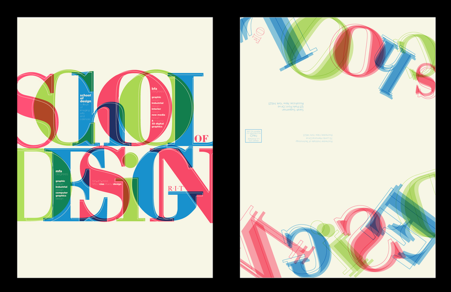
TYPEFUNKOGRAPHY™type or lettering, however you may want to call it, this is another approach ive just finished for my upcoming online portfolio.
= D
[link]
thanks luuk for the suggestion! = D
Related content


Comments: 102


I like the 4th and 5th ones down, it looks better without the tine art, but other than that this is a really inspirational piece!


👍: 0 ⏩: 1


Great work.
Don't you share the complete font?
👍: 0 ⏩: 0


Thats awesome! You made it very well.. I love it..
The wip pictures are awesome too
Congratz on the DD
👍: 0 ⏩: 0


")

Beautiful design and colors and what a nice font! I like the embossed look of this, as well! Excellent work and congratulations on the DD!
👍: 0 ⏩: 1

thankyou very much..
color is a passion!
👍: 0 ⏩: 0

amazing typography!!
I love it!
👍: 0 ⏩: 0


This is fresh man, i need to starting making some typo work
")
👍: 0 ⏩: 1
thanks man..
well, one thing i can say is that its alot of fun lol
👍: 0 ⏩: 0


Love the 3rd, 4th and 5th. Really nice work man.
👍: 0 ⏩: 1
glad ya like..
those are the actual finished work, variation experimenting and all..
thanks mate!
👍: 0 ⏩: 0


wow, border totally changes the feeling of it
still, both are awesome! *_*
👍: 0 ⏩: 0

rofl
glad ya like it man,
= D
👍: 0 ⏩: 0


 (Wink)")


yeah realy gj! but go for the one without the black outline
👍: 0 ⏩: 1
yeah..as i said to csjwcr, its gets more of a 3d feel to it, i liked it a lot..
👍: 0 ⏩: 0


Está muito bom amigo, continua o excelente trabalho  (Smile)")

👍: 0 ⏩: 1
valeu kra..
me esforço pra isso!
= D
👍: 0 ⏩: 0

2nd last for the win man, its better to read now, in your previous approach some letters were hard to read. now this is just top class typo work...
👍: 0 ⏩: 1
yeah..decided to do another only because of that..im glad i hit the right spot now
👍: 0 ⏩: 1

This is tasty. One of the best typography pieces i've seen in while. It is well balanced and all the variations you made are superb. A very good job man.
👍: 0 ⏩: 1


Real typography work.
Love it, outstanding.
👍: 0 ⏩: 1


i like the one without the outline, before the last one at the bottom
👍: 0 ⏩: 1
| Next =>