HOME | DD
 undefinedreference — Chroma Vs Saturation Gimp
Published: 2022-03-28 05:30:43 +0000 UTC; Views: 159; Favourites: 2; Downloads: 0
Redirect to original
Description
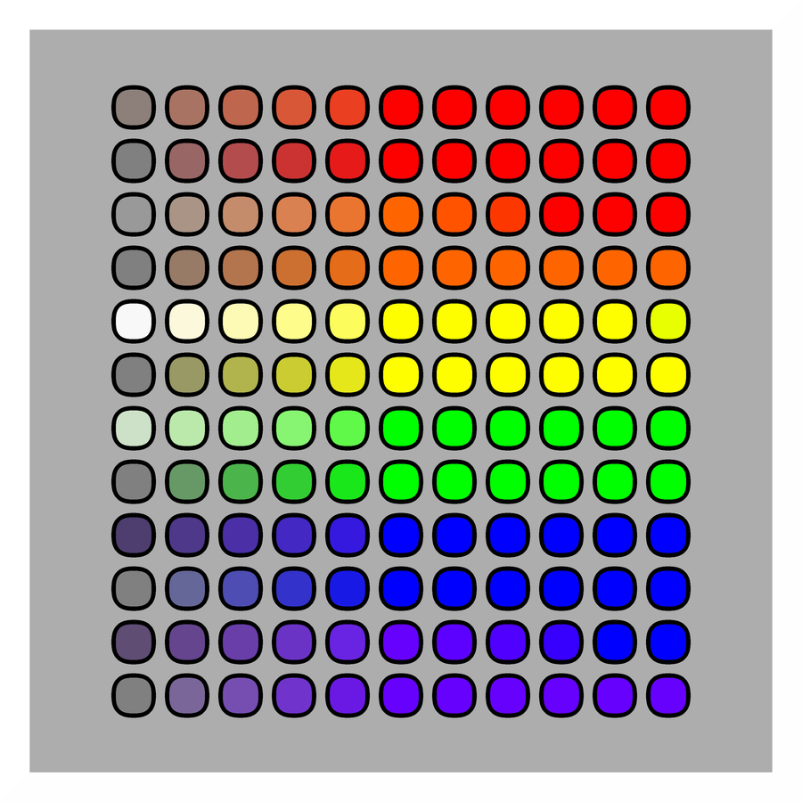
I made a chart for Chroma vs Saturation in Le GIMP. It's something to do. Here both tools have been unleashed on the six primary and secondary colors. Te odd rows are the result of shifts in Chroma in steps of 20, the even ones the same for Saturation. To me, this chart conveys extremely little information. I should find a suitable set of p'stel colors to start from. In that case, positive values would have a (strong) meaning to begin with. Here they don't, because the primary colors are already at their max saturation and chroma. With the secondary ones, upping the chroma value pushes the hue toward the dominant constituent color (not sure if these terms are even used in visual art, they sound rather musicy - but their meaning shall be clear: orange turns red and purple turns blue; with green, neither yellow nor blue is apparently dominant, so nothing happens). In addition, colors influence one another enormously, as is apparent even from this chart, so the amount of useful information that can be retrieved from a chart like this one is limited and heavily biased. Anyway, I decided to post it because it was a monk's task to perform and because it does look quite neat, doesn't it?Edit: of course I was thinking as a painter there - in RGB green is a 'primary' color! The yellow does veer off toward green at max chroma, although almost imperceptibly.