undefinedreference — Looks Good On Paper
Published: 2022-08-12 04:04:33 +0000 UTC; Views: 70; Favourites: 0; Downloads: 0 Redirect to originalDescription
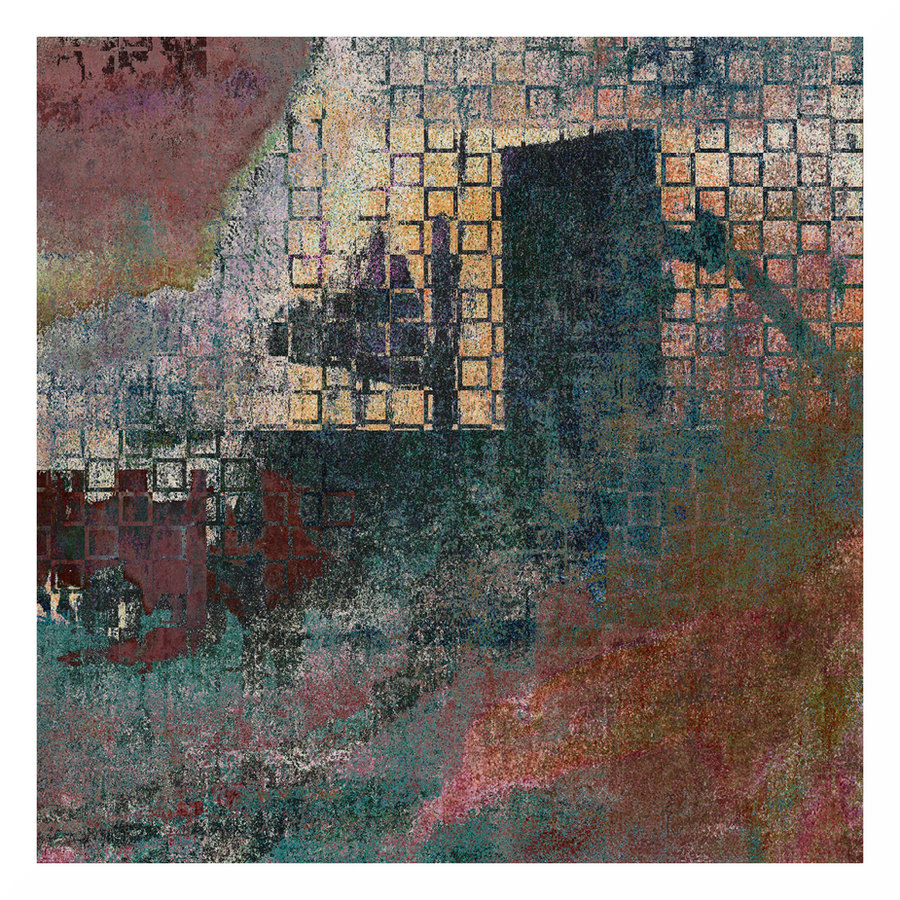
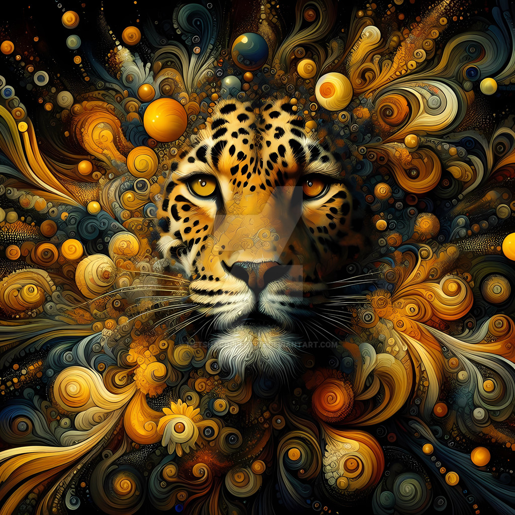
I love this papery effect. It is very difficult to control: the slightest adjustment can completely destroy it. The best approach is perhaps a negative on: invert an image and make it look 'oily' by upping the saturation/chroma and brightness, while at the same time adding black (effectively increasing the contrast). Invert the image again, and with a little luck it will look something like this. And indeed, if the oily image looks good, so will most likely its papery inversion.
Related content
 undefinedreference — Looks Good On Paper