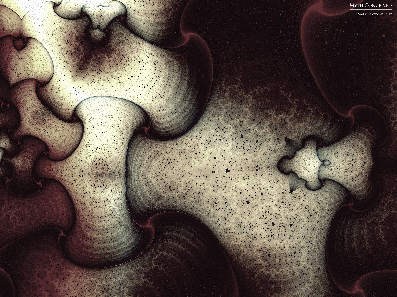
HOME | DD
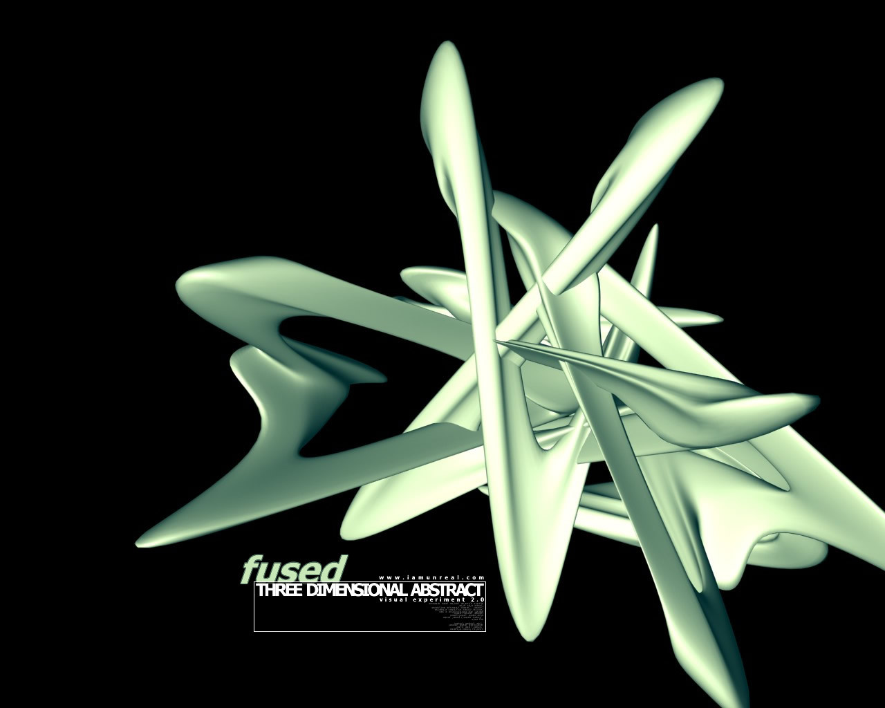
 unreal — fused black
Published: 2001-11-04 23:36:54 +0000 UTC; Views: 758; Favourites: 3; Downloads: 296
Redirect to original
Description
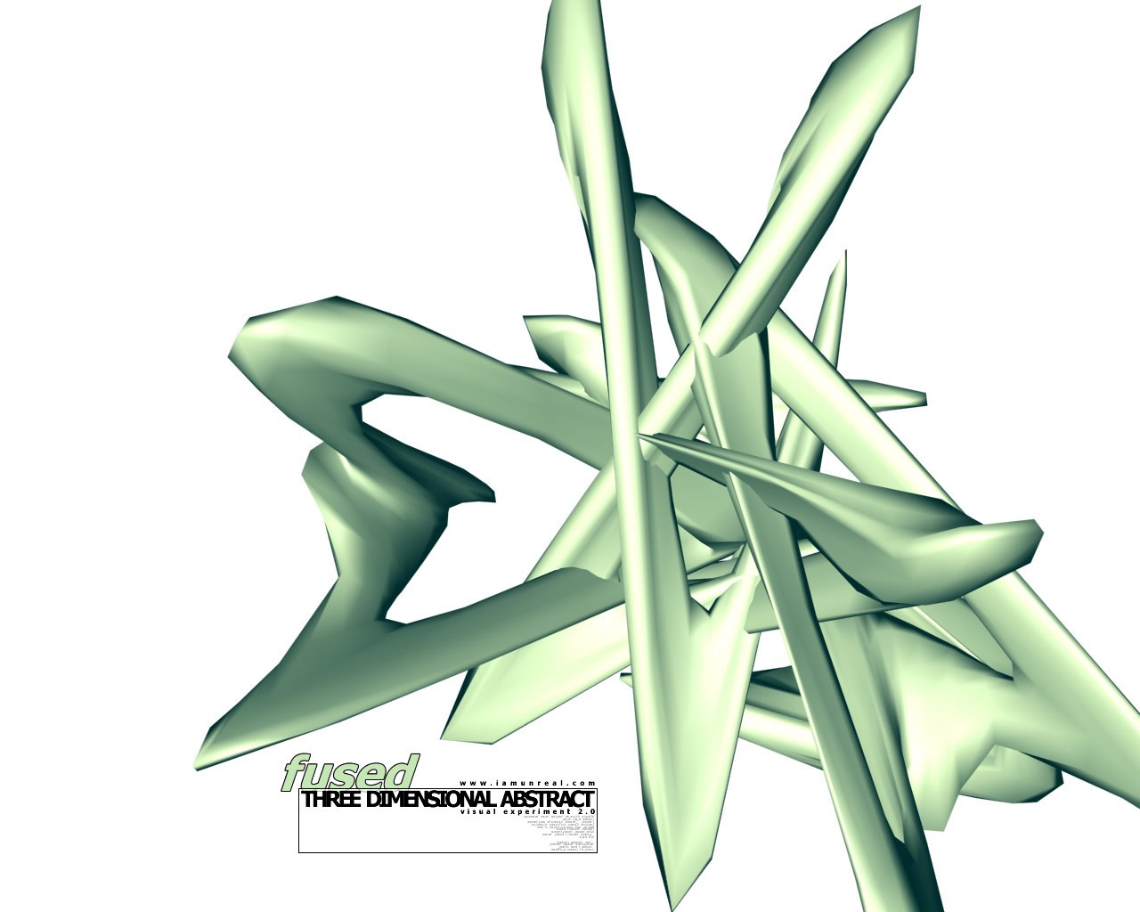
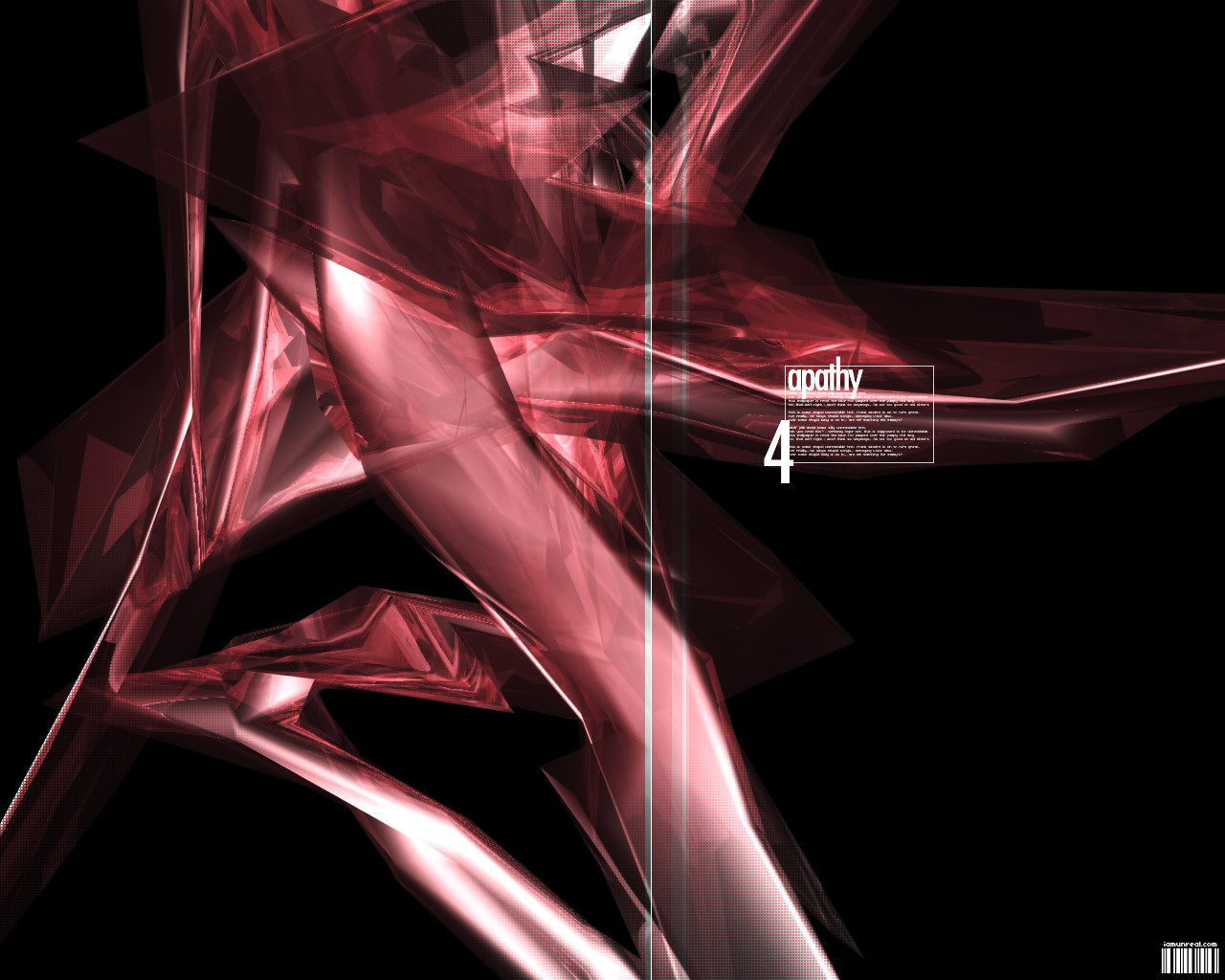
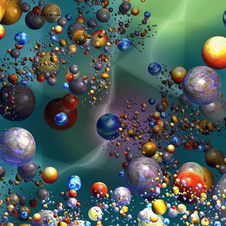
For those of you who like dark wallpapersBlack version of [link]
Related content


Comments: 9


very interesting object... maybe needs some texture... ?
👍: 0 ⏩: 0

lol - *gets in fetal position*
It does use default lighting!!!
haha!
*runs away*
lol - i'll probably re-use the shape for another wall with good texturing and the like
👍: 0 ⏩: 0

ADD A LIGHT ! Please.
Sorry about the caps, but the render looks to be done with default lighting.
Get some shadows in their pronto.
Maybe a self illuminated semi-transparent raytraced material with a refractive index other than 1 (experiment) would give some cool effects.
Good start, but I think it needs more.
_________________
see me in a polar bear suit ?
http://spots.flatland.com/mikehealy/pola r/pics.html
👍: 0 ⏩: 0

tight shape...I really like it... I think that it might be cool without the whit box outline around the text...but that not a big deal... great job!
May the force be with you!
-Jedeye459
👍: 0 ⏩: 0

YEAH! Much better than the last one. This is tight! I'm gonna be watching you from now on
Great work! ~s
👍: 0 ⏩: 0

ooh this one muuuuch better .. im taking it that the main rendered element was built originally on a black bg??
anywho ... i really love this one .. great layout .. trendy? oh hell yes .. did you manage to get past that? uh huh ..
great hue of green ....
rad
raaaaaaaaaah
👍: 0 ⏩: 0

yeaa..that looks hella-better..totally brings out the render more..
.·:·.shr00m.latest. https://www.deviantart.com/deviation.php? id=92787.·:·.
👍: 0 ⏩: 0