HOME | DD
 utro — Color Me v2
Published: 2003-03-12 16:23:38 +0000 UTC; Views: 2074; Favourites: 15; Downloads: 183
Redirect to original
Description
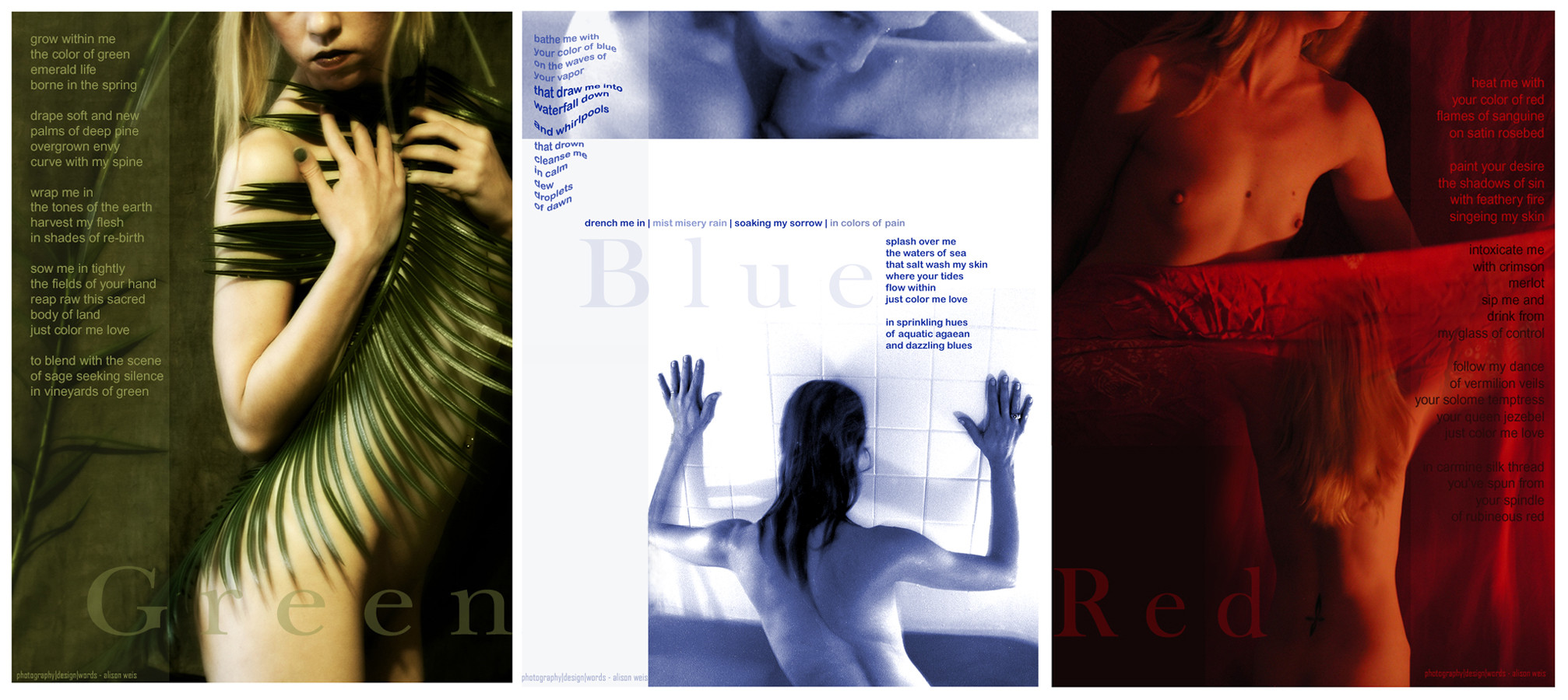
Back in August I did this spread for a mag called Press E:Jekt, which was going to include several DeviantART writers, photographers and designers; but it never got off the ground. I was also involved in a collab for the mag with *aethernaut and ~frite . Yesterday I saw that * aethernaut had submitted our collab piece Mandolin , so I decided to submit my spread as well.The theme of the first issue was to be The Body. I used an old poem (my first dd) entitled Color Me, as a base. I completely rewrote the poem and made it about 3 times as long for this spread. I then separated it into three smaller poems, each coordinating with a different color and mood which I felt that color represented for each individual page. I then tried to express that mood in photography, and finally in the layout. Here's my result.
Related content


Comments: 48

I suppose it has all been said by now...but wow!
I particularly like the photo for green. The fern leaf lends a secretive and vital quality to the image, as if it were a photo spread for a fertility goddess. Vivid and sexy!
I love the poetry above all else though. The three poems read like a sultry magic spell woven around the reader.
You are a sorceress of words and images, and I'm glad I washed up on your isle!
 (Smile)")

👍: 0 ⏩: 0

i forgot to mention how much i like this peice.
'to blend with the scene
of sage seeking silence
in vineyards of green'
'sip me and
drink from
my glass of control'
that is darling!
👍: 0 ⏩: 0

what a great work!
to be honest, I love green most - the leaf suits you perfectly!
👍: 0 ⏩: 0

I wish I could pick a simple subject like color and write something this great around it. You are awesome. And I love the pictures. Very good job.
👍: 0 ⏩: 0

Quite impressive, not many people can pull off poetry with a rhyme scheme like that, Great piece!
Stevo
👍: 0 ⏩: 0

I love this. The photography and the poem. You're definately one of my favourite deviants ..
👍: 0 ⏩: 0

you capture the essence of each color to well, spinning the words out that describe the colors of your soul beautiful. the photography is prefect with the poems.
👍: 0 ⏩: 0
how did this project fail?!?!
sigh. my faith in words falters.
👍: 0 ⏩: 0

nothing but the best from you... beautiful, absolutly beautiful..
👍: 0 ⏩: 0

The photo for green is stunning. The fronds of the palm following the contour of your flank, almost mirroring the lines of ribs.
I always associate greens with browns, the colours of life and nature, although this is clearly limited, but the words that go with green really hold to that theme.
The blended images for red are also very strong, fiery and utterly fitting.
Overall, the words you used for blue have the most meaning for me, which gets me wondering about that all time old question of, what is my favourite colour?
I am not sure.
I am sure, however, that I like this.
👍: 0 ⏩: 0

I am late, so I will not offer up anything, except, red has been my favorite color for some time.
👍: 0 ⏩: 0

Thank you for sharing..
it's hard to tell what lies ahead from the thumbnails of your work, but I am never let down.
I wish I could be bold enough to take some of the shots you create..
Maybe one day.
School me!?@
👍: 0 ⏩: 0

Why isn't there a "love devaiation" choice... I'm just stunned, this is so beautiful it almost hurts my eyes. Thank you so much for sharing it
👍: 0 ⏩: 0

i know everybody and their mother has commented on this piece already, but now i have to... because i are inspired to do so.
this is, in my humble opinion, sheer brilliance... just having the words is one thing, but with the pictures and the colour tones... it gives the words even more life than they would have on their own. much congratulations go to all three of you...
as far as the layout/design goes... simplicity, yet effective.. (simple usually has to be pretty friggin' good to apply for that...)
//spunj13
👍: 0 ⏩: 0

i remember you showing me this ageeeeeeeeeeeeeeeeeeeeeeeeeeeeeeeeeeeeeeeeeeeeeeeeeeeeeeeeeeeeeeeeeeeeee eeeeeeeeeeeeeeeeeeeeeeeeeeeeeeeeees .. ago ... or was it ages ago?
jesus time goes too fast.
:/
👍: 0 ⏩: 0

It was all a great job !
Nice poetry (yours is definitely the only one that really 'sings' in my ears), and photos
I like your transition, movement, from green to red... be it in the words or in the image...
You made us slide softly along the curve of a colours spectrum
It's remarkable that one same person could have produced it
👍: 0 ⏩: 0

Once again you astound and amase. Beautiful layout.
👍: 0 ⏩: 0


the colours and shapes in this piece are fantastic. the image cradles the writing so well. this work is shining, it was going to be an amazing magazine, i'm glad i got to finally see what you were working on.
👍: 0 ⏩: 0

i must say i am soooooooooooooooooooooooooooooooooooooooo in love with this its artistry in its most fabulous display. I miss you much.
👍: 0 ⏩: 0

This is gorgeous...I would definately buy it if I had money. I think this is not only beautiful, but it is also thought provoking. It makes me think of nature and the many different personalities I find myself in. I am many moods and people sometimes. I love how the girl in the bottom of blue is positioned and how her hair is flowing down her back. It is very sexy and admireable. One thing I would change is the color of the writing in red, because towards the bottom I couldnt read it. Ohter than that you have created something very intellectual here. Later, tif
👍: 0 ⏩: 0

wow this is beautiful. great work. out of all three colors, i can't pick a favorite..they're all very nice.
👍: 0 ⏩: 0

i love the most the red
but all the colors are lovely,
and express
your beauty
kisses
👍: 0 ⏩: 0

LOVE the palm. The way the lines curve with your body... I love that picture. The whole piece is excellent. The only thing I didn't like is how the line of your body gets cut off near the bottom of the red photo. A small nitpick, but it stuck out to me. yeah. nice piece.
👍: 0 ⏩: 0

Far too beautiful to be diminished by some pseudo-intellectual analysis - so I'll resist the temptation. I'll just repeat ... beautiful!
👍: 0 ⏩: 0

gorgeous, darlin'.
i'm sick and braindead right now- crashing after a month or two spent preparing for grad auditions and fighting off a cold- but wanted to let you know i was here- and there is so much beauty in this spread. the green, especially... the palm frond so perfect with the line of your body, and the vivid poetry... lovely.
👍: 0 ⏩: 0

ooooooooooooooooooooooo
WOW
i love it....sweeeeeeeeetttt
👍: 0 ⏩: 0

Red is still one of my favorite works of yours ever. Nice to see it posted here finally. These all work so well together. Reminds me a bit of Kieslowski's Blue, White, & Red series (foreign dramas) only more intense, in a way. I also like how you sneak rhyme in there but it's not overt enough to draw attention from the whole...very subtle. Overall this is perfect, with the words of Red being the true standout. I hope you'll be submitting more around here soon.
👍: 0 ⏩: 0


Now THIS is how erotic photography should be like. Thank you. I'll use this as an example now.
👍: 0 ⏩: 0

wow, seems like yesterday.. or maybe last week.. i was listenin to ya run around the store looking for plants and whatnot...
👍: 0 ⏩: 0

the orginal was written in 2001 and it is not 2003 i would say that your writing has improved between those periods of time, with you I do not have a favorite part. I think as a whole this is wonderful --each photo corresponds with the words, i've been waiting for you to submit something.
x
10000000000000000000000000000000000000000
00000000000000000000000000000000000000000
👍: 0 ⏩: 0

Ive missed your work
and for a good reason
this is amazing
👍: 0 ⏩: 0

Alison...just...I...
Jesus Christ, wow.
Remember when you asked in a forum thread what art poetry is? The answer: THIS. I'm not sure which imagery is more crisp and fresh: the photographic or the literal. Both epitomize "aesthetically pleasing."
If I were to make a suggestion, it would be to put red before blue (left-to-right), in order to reach a better climax, and establish a BEAUTIFUL falling action (Wow...that was innuendo-filled...).
The essence of poetry within the human matter. Alison, you defy metaphysics.
Plus fav. Ding!
Ube.
👍: 0 ⏩: 0

E:Jekt isn't dead... just in remission. I swear it will eventuially see the light of day... no, really!
👍: 0 ⏩: 0


loved the layout and composition, it's actually the first time i read the poem through... i might have glanced at the first few lines way back... i'm not too sure about the wavy font for the blue piece... i know it's sposed to represent water/liquidity, but i think your words would have done well enough... altogether good work, shame that it wasn't showcased with the mag
👍: 0 ⏩: 0

Very, very well done. I'm extremely impressed!
Your poetry and photography flow like one. The only problem I see is that your words in the red section are a little hard to read. But other than that, just wow...
👍: 0 ⏩: 0

glad to see this emerge into the light at last. wonderful work!
it's funny - green is normally my color - so based on personal preference, or based instead on how i respond to the interaction of text and images in each of the segments, i thought i would have a favorite portion. i don't, and i think that speaks immeasurably about how successful you are in balancing these pieces as separate, distinct sections of a larger unified whole. no piece feels - to me, at least, and i know that this is subjective - as if it outweighs the others.
i went back to the original Color Me, too, and was struck by how much you had truly added to and extended and re-shaped the original poem. anyone viewing this piece should read that poem, as well, to see its evolution. i noticed that, despite an emphasis on green in the first half of that previous version, there was no real separation of green, blue, red - other colors appeared, appearing to signify all the aspects of your muse and his ideas, ideals and wishes, or those of your relationship, which he is draping you with. this piece moves in a different direction to fit this structure, so it's interesting to see how you re-shaped your art to fit integrate into and break apart within this "framework".
it's also interesting to see that your full face, especially the eyes, which can be gateways or representatives of the human, aware, inhabited self, are removed from the images. that abstracts the body within the piece - only in one image does an eye appear, and then just a portion of one viewed from the side, so we never make contact with the awareness or insight which the eyes can express independent of anything else around them; i wonder if/how it would affect the piece to bring your face or even just both eyes into one of the images or as an element of composition. does that switch the direction or meaning once again? anyway, just thinking out loud.
wonderful work!
congratulations!
👍: 0 ⏩: 0

This is excellent, Alison.
I've never been a huge fan of writting that has a rhyme scheme, but I must tell you, this is excellent!
You have an amazing sensual expression in all of your writting that is truly enviable.
I love the idea of using the colors to emote different feelings, and how you do it is awesome.
Great job on this!
👍: 0 ⏩: 0

oh wow.... i wish i had a favorites vote on this... i'd love to see more!
👍: 0 ⏩: 0


WOW! Great work!! I love it! But I must say that I like the green and the red part best. Perharps because those two look more alike, and maybe because there's to much white in the blue part (in this one, the font is also smaller and different in form...). But I'd say; Well produced! Keep it going!
Take care!
👍: 0 ⏩: 0