HOME | DD
 vadersb — Paradoxion Main Menu RC3b
Published: 2002-05-21 14:35:47 +0000 UTC; Views: 2004; Favourites: 5; Downloads: 123
Redirect to original
Description
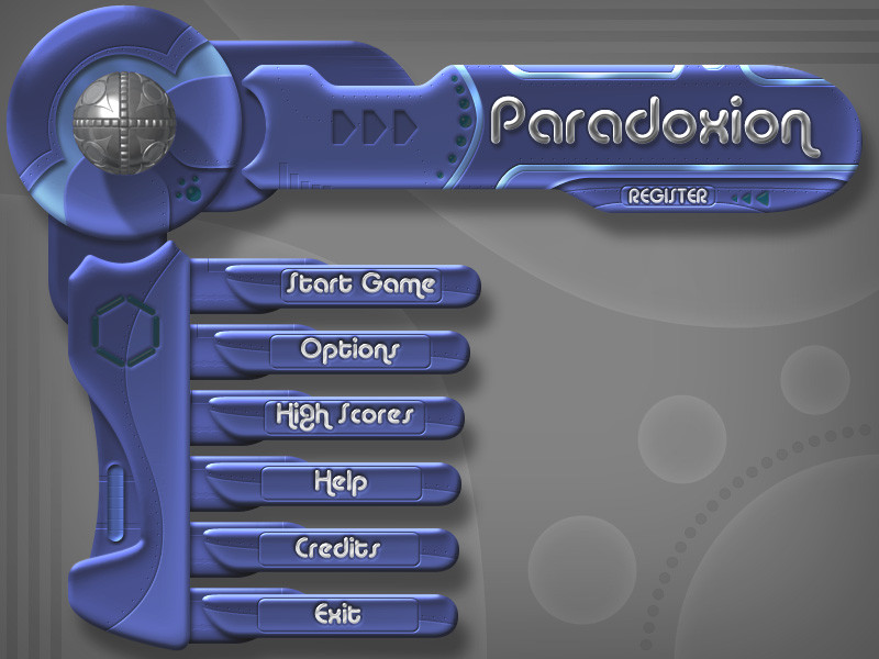
Here is the Paradoxion main menu RC3b. Changes:*totally remade Paradoxion Ball - it's much more complex now (it will be compositely animated in game)
*Paradoxion Ball is now more chromed
*reworked title text, contrast and 'metalness' added
*reworked some shapes of interface
*tweaked the brightness/contrast
note: empty circle shapes in bottom-left corner of image will be filled with rotating semi-transparent shapes in game. 20 arranged small circles will indicate the number of total/left shareware game launches. There will be some more animations and effects in game menu that I can't show on static field.
Paradoxion is original board-strategy game currently in development. The core concepts are classic, but there are some unique features that provide unmached control over the game board. There are even RPG elements in Paradoxion! The best thing is that everyone can enjoy it from very first minute of playing, even the casual player. To know more visit our site: [ link]
Any comments and suggestions about menu design are very welcome!
p.s. There were some errors in my previous submission, so I've resubmitted it.
Related content


Comments: 8


Lighting and shadows look great. The bottom right looks too empty but I asume your going to put a pic of the game down there. Great job
👍: 0 ⏩: 0

i like the design really neat, the chrome effect on the ball looks good, and it really does look like a game menu great job, obviously well though out
come rate my work im a begginer so tut's and help would be grateful
👍: 0 ⏩: 0

Absolutely beautiful. The colors are a little too purplish for my liking (I prefer dark and dreary colors) but whatever tickles your fancy. The text at the top is good. If there was one comment I would make to make it look better (I know you can't get this in a still image) it would be to get the arrows pointing to "register" to flash like those roadsigns and really catch the user's attention.
Other than that... gorgeous. I love it.
👍: 0 ⏩: 0

Personally I think there is plenty of detail, its looks good and isn't over the top.
Very creative and original shapes. Only thing I don't like is the Paradoxion text at the top. I think it is a little to bright, and I also would redo the anti aliasing as the edges look a little rough. Maybe also darken the blue edges abit.
Still looks excellent
👍: 0 ⏩: 0

looks pretty nice and functional.
myself i'd like to see more details though.
anyway nice work_
👍: 0 ⏩: 0

Looks kewl as hell, you did a great job!
-----
SurReaL
SurReaL StyLe
👍: 0 ⏩: 0

Hey, this is an excellent work, man! Too complicate for me to do... Maybe the back colour (grey) if it were changed by some tone of pink (or fucsia???)...
Well done!
👍: 0 ⏩: 0