HOME | DD
 vbu — VBU Logo - 3
Published: 2008-03-21 01:20:03 +0000 UTC; Views: 3214; Favourites: 6; Downloads: 206
Redirect to original
Description
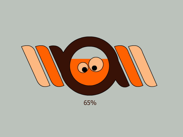
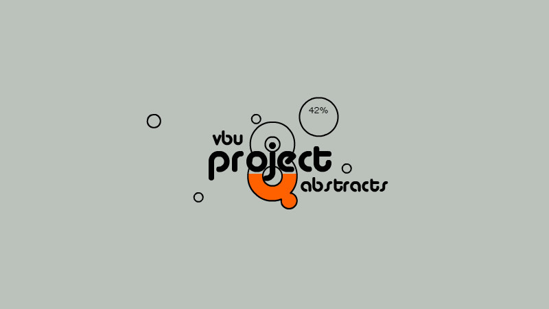
This is the new *vbu logo made by ^IkueRelated content


Comments: 6

Obviously I'm late coming on this one, but for me the bottom options are the strongest. They're the most simple and direct, which appeals to me.
👍: 0 ⏩: 0


I think the Vector Brothers Unite logo should be a more minimal and simple design. I like the shape where the letters are in though, but don't like that each letter is separated.
👍: 0 ⏩: 0

