HOME | DD
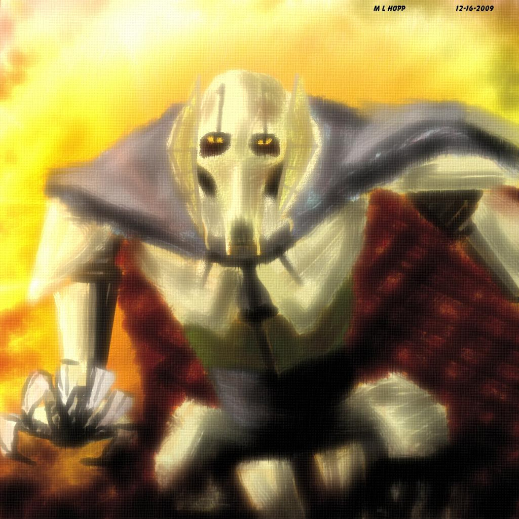
 VegasMike — Grievous Revision
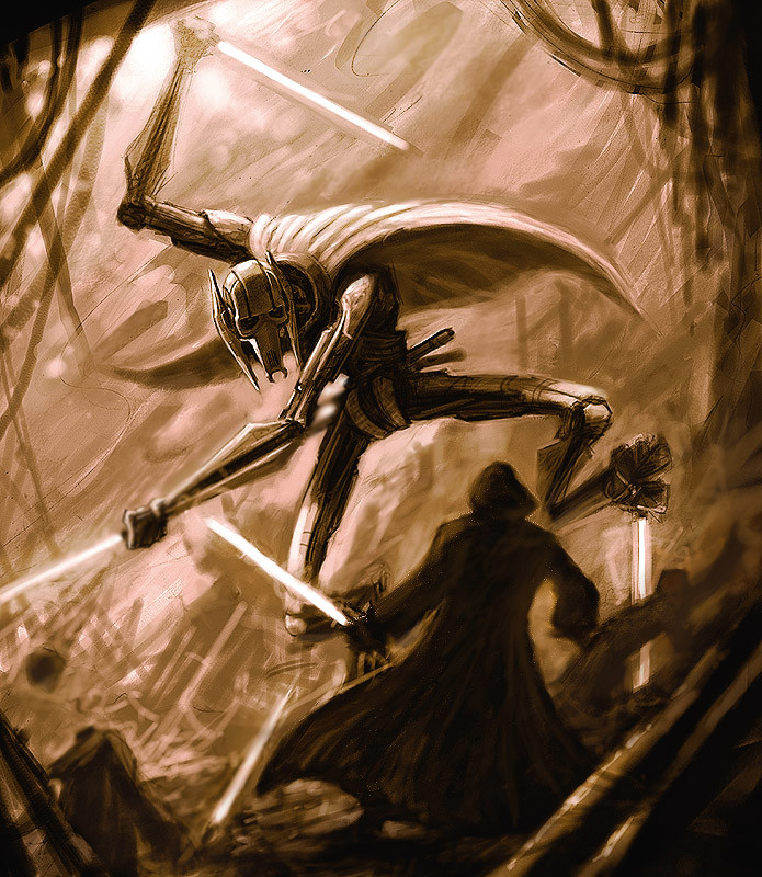
Published: 2004-10-02 07:27:03 +0000 UTC; Views: 22401; Favourites: 612; Downloads: 1832
Redirect to original
Description
I did some reworking on the image, tried to make it more dynamic. What do you guys think?Related content


Comments: 115

The coolest picture ive ever seen of Grievous, this guy is so the coolest Jedi ever to exist.
👍: 0 ⏩: 0


the last frames of the clone wars cartoon is your reference, correct? its a really good peice becuase it translates the essence of the scene into a very much different style. the sepia tones work very well but those and the pclack and white ones dont really add enough. instead of the sepia or achromatic i would have done this in a cool color scheme, but i can appreciate that it might have been much more difficult to do. nevertheless this is quality work and it should be commended.
👍: 0 ⏩: 1

Thanks! I can't wait to see Grievous in action!
👍: 0 ⏩: 1

Star wars fan here! and I love it!!!
it really looks dynamic, the jedi has just been surprised and if he doesn't use the force right away, he'll be dead in a second.
"show no mercy"
cheers i send you


👍: 0 ⏩: 1
Thanks! Im so hyped for this next one!
👍: 0 ⏩: 1
hell yeah man... hell yeah!
cheers!

👍: 0 ⏩: 0

this picture, as well as the movie, looks completely fucking nuts  (Smile)")
👍: 0 ⏩: 0

 (Wink)")


god damn, just makes me want Revenge of the Sith to come even faster...because you know he's gonna be an utter badass pimp after The Clone Wars miniseries shorts...
you've done a fantastic job on both of these, keep up the good work and churn out some more Star Wars stuff!
👍: 0 ⏩: 0

is this the end of the clone wars season 2? superb.
👍: 0 ⏩: 0


i think you need more blur on the lightsaber where he's chopping the guys head off...
👍: 0 ⏩: 0


This was a good picture in the first place, but you've definitely improved it here. The poses are certainly much more dynamic, giving much more sense of confrontation and controlled style for the Jedi and Grievous respectively. I think the sharpening on Grievous works excellently; it makes him much more defined, and makes him stand out as a robot among life. The right arm's still blurry, though, whether or not that's intentional... but it's quite offputting, lol.
I think the background, being as low detail as it is, suffers a bit from the sharpening... in the original it was blurred and indistinct, the smoke of a battleground, but here it looks odd, with obvious pencil marks.
Grievous himself looks ace though, especially the face. It has the right kind of faceless evil, determination and impending death he needs. The legs look a bit... awkward. Chicken-like, shall we say. I remember a game on my Amiga that had you in control of a giant, lethal robot, stalking a city amid flame and bullet... but all you could ever concentrate on was the fact it walked like a chicken. It's just not graceful.
Overall though, this is full of that tingly Star Wars atmosphere that makes it special, that extra cool that sometimes appears like a gem in the Gungan-pyre.
👍: 0 ⏩: 0


Dude, that's awesome. What setting do you have on the brushes/airbrushes?
👍: 0 ⏩: 1
Pretty moch normal brushes, no airbrushes. I use a sharpen filter at the end to crispy it up a bit too.
👍: 0 ⏩: 1
Interesting, what about spread? How much %?
👍: 0 ⏩: 1
I think it was about 30%
👍: 0 ⏩: 1
Thanks a lot for answering my questions!
👍: 0 ⏩: 0

once again u make a total favorite picture,, I love it... great work
👍: 0 ⏩: 0

It's cool! are you going to draw one in colour?
👍: 0 ⏩: 1
Probably not...Thanks for the comment!
👍: 0 ⏩: 0


Wonderful drawing. the changes you made with the Jedi really brought the piece together. The mood changed completely. The jedi no longer stands a chance. The first one gave at least a little hope. Great job tying that all together. I like this version better than your first by far. i agree with Torakhan about the cover art idea. I tip my hat to you. the jedi is so dead...sorry just playing the picture out in my head
👍: 0 ⏩: 0

Too overwhelmed to write anything intelligent... o_O
👍: 0 ⏩: 0


Looks better than the previous more dynamic, but the cloaked figure is a bit mmm...dunno the word in english, maybe..bidimensional or stiff. Doesnt have a lot of depth.
Overall composition and texture great, as usual!
👍: 0 ⏩: 0

Very nice, It sucked me in and makes me feel the dread of the guy
👍: 0 ⏩: 0


Changes: I like the dynamics added with the main Jedi, from "standing there" to "Holy shit!" as his buddy's head is lobbed off. Also, it may just be the compression changes, or maybe the tint, but the image looks much cleaner, more crisp.
Great work.
👍: 0 ⏩: 1
I pumped up the contrast and did a couple sharpens on it, goo eye.
👍: 0 ⏩: 1
*smiles* Thanks. I wanted to give some real comments, especially since it was an alteration and you were looking for comments on the differences in particular.
Though I like it sketchy and rough, I wonder if, with a few tweaks, how it would look more detailed as a polished finished piece.. like a cover-art or something.
It's still great on its own though, don't get me wrong.
👍: 0 ⏩: 0


Congrats mate....this ones better than the last
The pose of the jedi or whatever increases the dynamic level greatly. Color is also better.....although still monotone, it's much more intresting to look at rather than black and white. Plus, I love the slight texture or effect that the.....must be sharpen filter or tool gives to the image
Any chance of a polished, full color version???
Later. /
")
👍: 0 ⏩: 1
Yeah Im not sure if I want to color this up some more, maybe just the lightsabers and some minimal stuff.
👍: 0 ⏩: 0

I really like it ^.^ I think the Sepia tone really works well with it ")
👍: 0 ⏩: 0

lol i wouldnt go as far as to say its one of the coolest images ever created
but i definately like it
and i think the revision makes it allot more eye catching
👍: 0 ⏩: 0

............somehow or another, it's gotten even better. yes, it's definitally more dynamic.
the bg seems almost too indistinct, though, i think. and his upper-left hand is too much of a blur.
👍: 0 ⏩: 0

The background rocks. Your shading is excellent. Cool character, I say.
👍: 0 ⏩: 0

Woah, first time i aw the pic i didnt notice the Jedi's head being loped off
👍: 0 ⏩: 0


OMG! Grievous! I love this dude!
I love the style of the image, kinda sketchy. It has a lot of motion to it, like you know he's gunna swipe off that Jedi's head XD
👍: 0 ⏩: 0

The color of the image looks much better! Looks as if it's dawn or something
👍: 0 ⏩: 0
| Next =>