HOME | DD
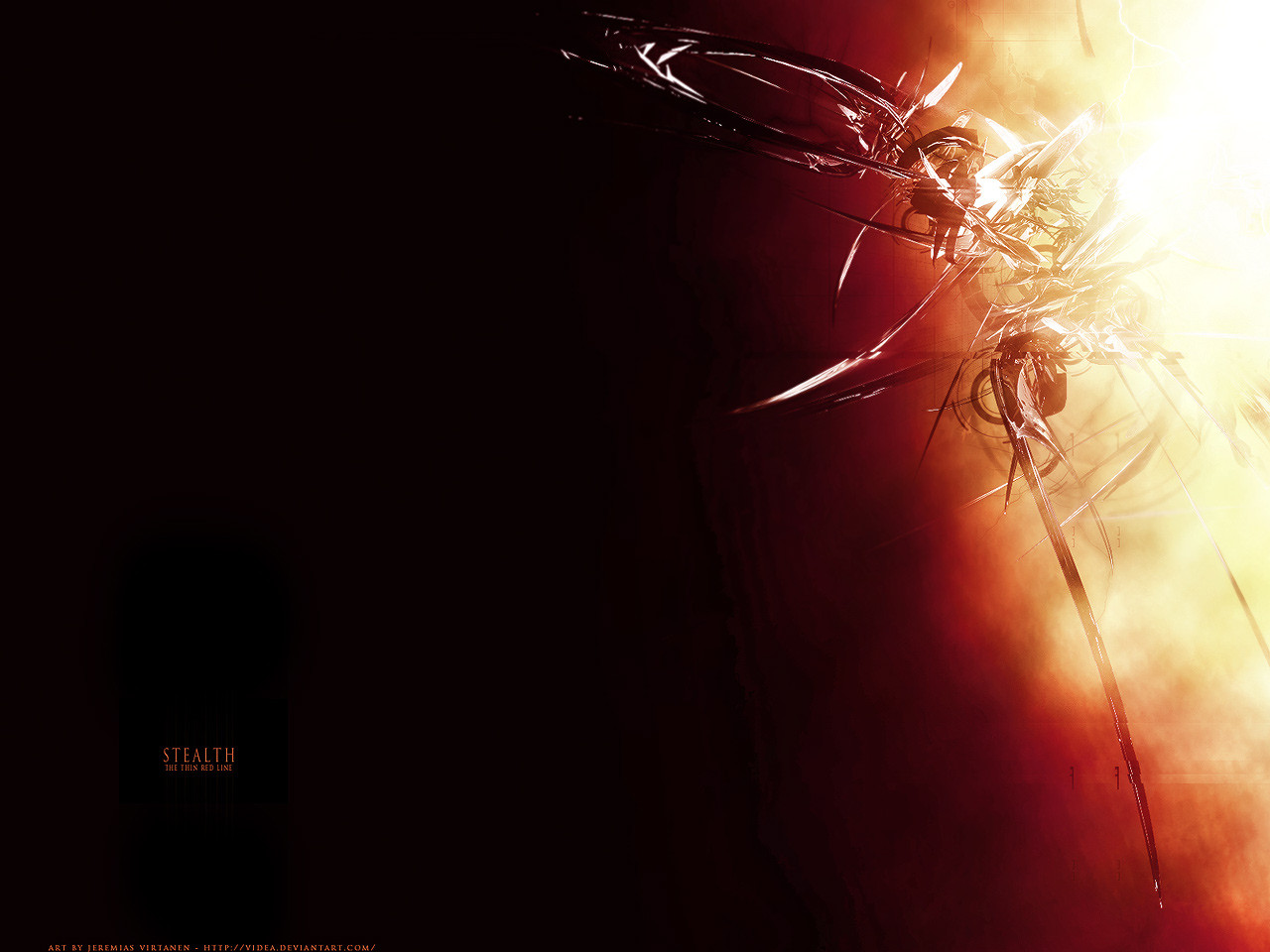
 videa — stealth
Published: 2004-07-30 20:44:03 +0000 UTC; Views: 3164; Favourites: 31; Downloads: 1078
Redirect to original
Description
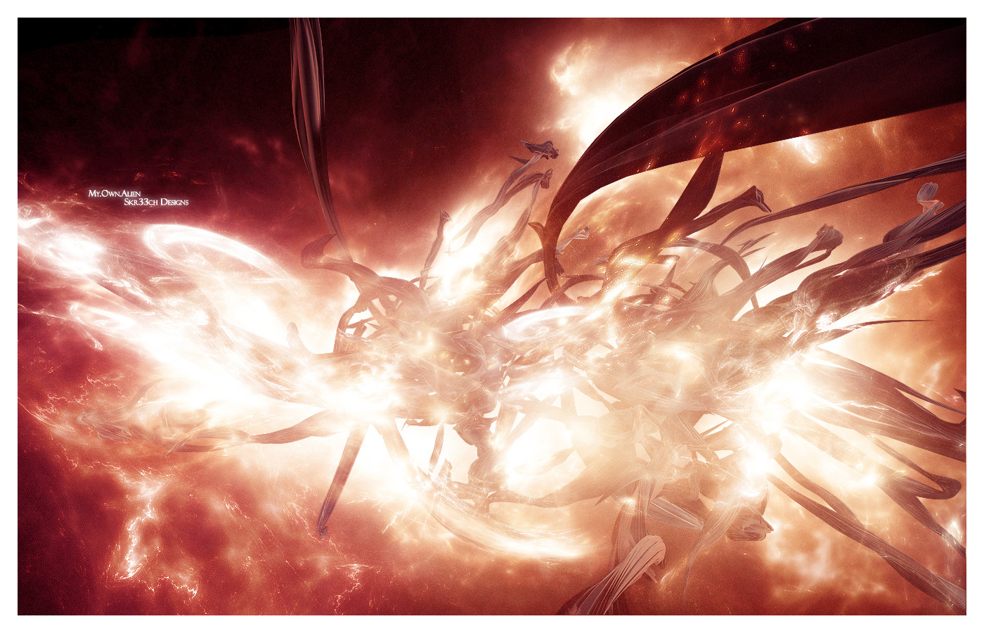
__stealth
the thin red line
_
_
my wallpaper.
_
Related content


Comments: 25

*sigh* is there a tutorial for this kind of thing for photoshop? i cant seem to find one....
👍: 0 ⏩: 0


 (Wink)")


haha.. one old shit from my gallery > [link]
cca. 1 year later..  (Smile)")
")
👍: 0 ⏩: 0
wow..! my new desktop picture..!
nicee.. great work here..

👍: 0 ⏩: 0

interesting render, more empty place for icons... great on desctop

👍: 0 ⏩: 0

really nice concept here. love the colors and teh composition. but the render could be a bit better in areas? and would be cooler if the right to left color fade went smoother. or maybe it's just me. 
👍: 0 ⏩: 0


Nicely done. I really like the mellow colors and the contrast that you have created in the upper right corner.
👍: 0 ⏩: 0

The lighting is too intense, and the typo is crap. But I love that render and the 2d on it, although the render is a bit jaggy. But I love the render design.

👍: 0 ⏩: 0


nice
gimme blue 1 so i can put it as wallpaper
and yes, i'm 2 lazy 2 start ps
👍: 0 ⏩: 0


Color is cool but the render could be better, i love the negative space, perfect for a desktop overall nice job
👍: 0 ⏩: 0

the negitive space there is great, thought the text could have been placed better, the render is pretty awesome too!
👍: 0 ⏩: 0