HOME | DD
 vincentwolf — Style Comparison

Published: 2008-10-02 22:24:59 +0000 UTC; Views: 547; Favourites: 18; Downloads: 11
Redirect to original
Description
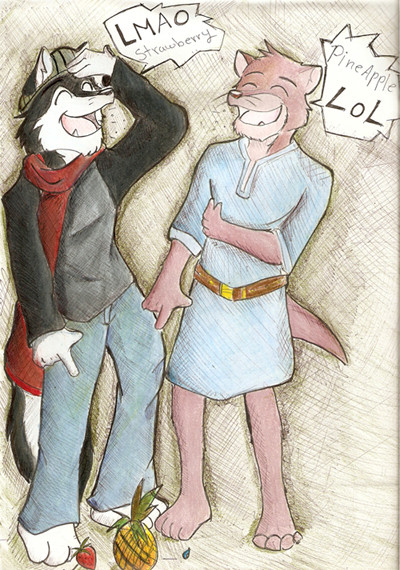
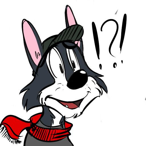
Kinda laying out my style, and see how they work and what are the difference.I basically re sketch the character on the right in my other more, real proportion style.
Looks interesting, what do you guys think?
Related content


Comments: 8

I really do like both designs ")
I've been keeping the cat's upright stance very human in a way, but I took the human proportions and made them a bit shorter to be interchangable.
👍: 0 ⏩: 0

I like how well you make the character fit a more "serious" and a more "cartoony" style so smoothly... and he's easy to recognize as the same guy. To be honest, I'd love to see him put into a project where, for some reason, one was able to change styles.
")
👍: 0 ⏩: 0

for a character like this, the more cartoony style fits him
👍: 0 ⏩: 0


Their style has much similarites! I guess it is a very flexible style, then
👍: 0 ⏩: 0


It's a really neat contrast between your cartoony style to your... um... not as cartoony style? I really can't say I like one over the other. They're both awesome.
👍: 0 ⏩: 0
