HOME | DD
 VioletDayz — HELP

Published: 2011-06-13 01:51:43 +0000 UTC; Views: 4855; Favourites: 15; Downloads: 1
Redirect to original
Description
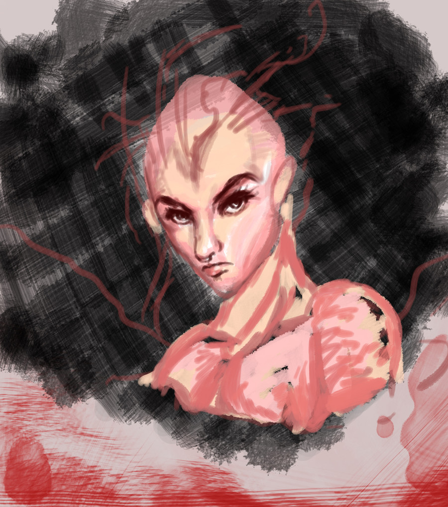
Now really.... tell me what you think.Download to see full size.
Related content


Comments: 12

i usually just upload both different versions
like these six
razor blade suit case blood snow-katt.deviantart.com/art/r…
razor blade suitcase no blood snow-katt.deviantart.com/art/R…
abbatoir blues just red snow-katt.deviantart.com/art/A…
abbatoir blues " colored" snow-katt.deviantart.com/art/a…
obiturary every birthday snow-katt.deviantart.com/art/o…
obituarary every birthday " colored" snow-katt.deviantart.com/art/O…
i generally tend to like the versiosn with just the red the most because they are so stark and spring out at you
oh and to awnser your question
the second
the first is a bit empty and the third looks too much like an inverted negative
the second is just right
👍: 0 ⏩: 0

I totally know that problem. I usually have 5-6 versions of an image and bug people with it the whole day. And when they can't decide, I blame them for it
Oh, and, btw I would go with the one in the middle, but exchange the blue background with a more greenish one.
👍: 0 ⏩: 0

I choose by which composition has the most appealing color scheme. I am a crazy person when it comes to color composition; I really feel like it can make or break an illustration!
👍: 0 ⏩: 0

I like the one in the middle best. It has nice contrast.
👍: 0 ⏩: 0

I do on occasion make different edits and variations of the same image as I try out different colors styles. [link]
👍: 0 ⏩: 0

I'm not often happy with my work.
Whn it comes to shading, I always start over because I can never get it right.
")

👍: 0 ⏩: 0

almost everyone will choose a different one and have a different opinion. I would personally add more "greenish" details in the background to help the character and the bg blend more easily, or leave it white like in the first one  (Smile)")
But it's not important what I, or anyone else thinks, the most important thing is what you think and how you feel when you look at them. You should go with the one you 'feel' the most and not get too distracted by the "it needs more/less" comments, you just remember them and keep them in mind for your next peace (if you think they would help you in improving)
hope it helped, keep it up! ")

👍: 0 ⏩: 0

i wud suggest u to take the top one and add a new background to it, the blue in the 2nd n 3rd is a bit too purple for me. great habit to make several versions
👍: 0 ⏩: 0

")

Not me, I tend to stick to traditional mostly, so I really can't do that.
I'll be honest, though, when I saw the first two I immediately thought of the Cloud of Darkness from Final Fantasy 3: [link]
👍: 0 ⏩: 0


Ah, I do this all the time. xD It's a struggle deciding which to put out there. Normally I just pick which one I like the best. When in doubt, do it for yourself.
👍: 0 ⏩: 0