HOME | DD
 Vishvesh99 — Deep Blue
Published: 2018-02-17 17:35:22 +0000 UTC; Views: 515; Favourites: 39; Downloads: 0
Redirect to original
Description
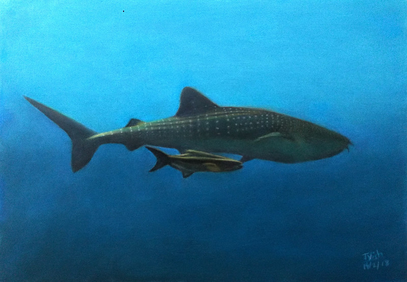
This is a pastel drawing of a whale shark in deep waters.Pastel on Fabriano
A3
Timelapse video : www.youtube.com/watch?v=jN2tv0…
Related content


Comments: 3

Really excellent work! Love the color play, like the yellow for the lighting on the tops of the fish.
👍: 0 ⏩: 0

Very nice! The blue is shaded so smoothly, and there is a good sense of how huge and slow-moving the shark is.
👍: 0 ⏩: 0

This image seems to be cropped in a way that reduces the emphasis on your subject. If your background is going to occupy more than a third of your total composition it needs much more complexity to compensate. This is especially true when your figures are so closely placed to one another. Because they are so tightly grouped, and the background has little to lead the viewer, your audience essentially ignores most of the painting. Adding depth to your background could be as simple as adding texture and subtle variations in colour and value, or as complex as adding a detailed sub-aquatic landscape. Separating the figures across your picture plane would also add to your composition, by forcing the viewer to travel between them to read your painting; separating them too much, however, will cause your viewer strain, and reduce viewer retention drastically.
Adding some interesting streams of light that travel from your light source into oblivion, but don't pass through your figures would also add a lot of intrigue, and despite it's simplicity it makes for an impressive effect(It looks like beams of light that come from between clouds, if my description was too hard to follow).
Adding a few more vibrant yellow or green highlights would increase the variety and interest of your painting: Tinting out of place colours with some white pastel, or blending with a light colour from your palette, will make colours that seem too different from your colour scheme blend into your painting, thus providing a reliable way to add variety without sacrificing harmony. In this painting you would blend a leaf-green or Naples yellow with cyan, or white, and repeatedly add more white or cyan to the colour until it seems to match your colour palette.
👍: 0 ⏩: 0