HOME | DD
 visualanti — SpongeToe
Published: 2002-02-06 06:50:23 +0000 UTC; Views: 1064; Favourites: 5; Downloads: 33
Redirect to original
Description
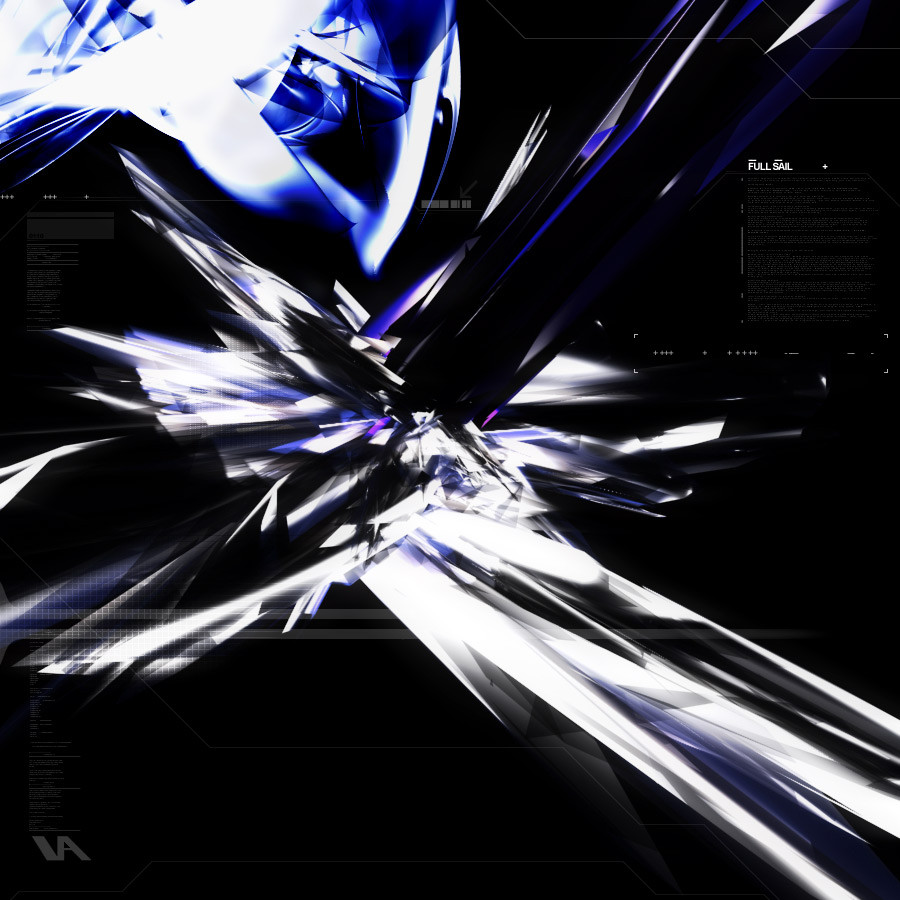
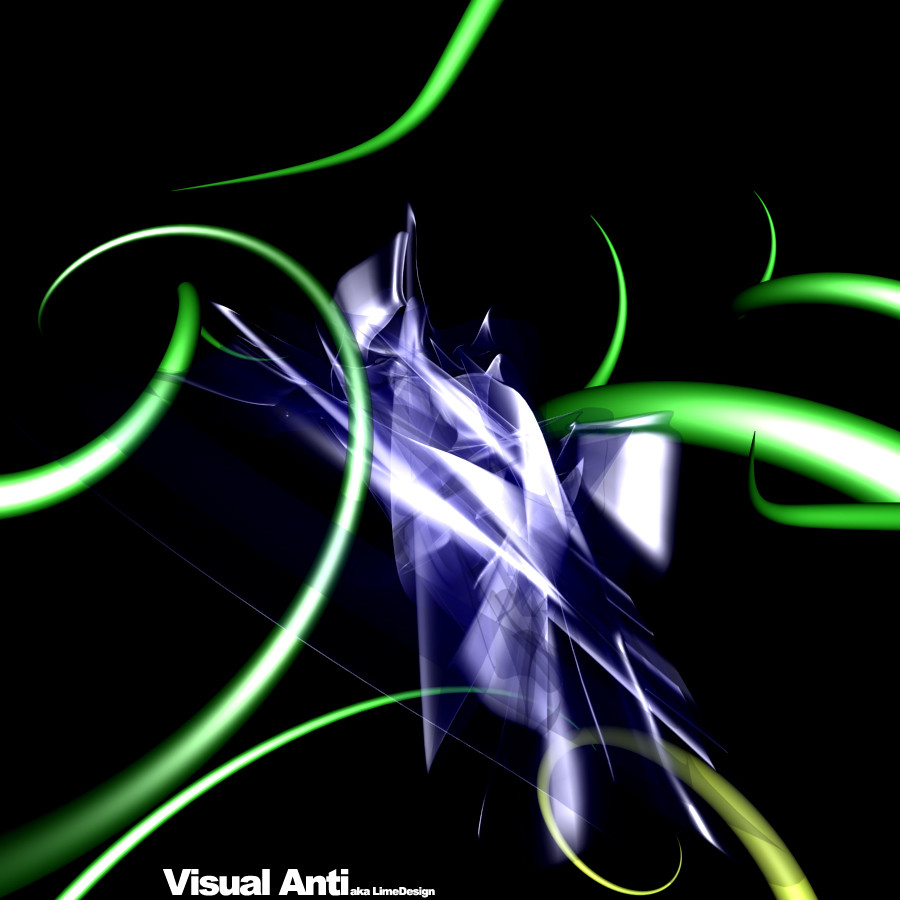
Just a piece i did today for fun, waiting for my lab to start.. .Comment on mine and i will comment on yours!
Related content


Comments: 11

this style is very overdone, but I like the high contrast and harsher color to it than normal ones
👍: 0 ⏩: 0

Exceptional! I just don't get the title, can you fill me in on it, I would like to know....
👍: 0 ⏩: 0

Contructive... First because it's "DESIGN" rather than WP ...Well, IT'S cool!!!! In wallpaper at 800x600 or 1024x768 , Well then IT'd be too black ( OR SO)...) Constructive??? OK.... Excellent!!
👍: 0 ⏩: 0

hey man thanks for the comments on my work
i'd really appreciate it if you could let me know what u use to fill in the text?!!? as in do you write it or do u use sample dummy text or what?
thanks bro
-dev-
-----
this above all, to thine ownself be true.
👍: 0 ⏩: 0

This is a pretty nice piece.
It has a really great dark feel, and some nice blending and lighting.
Good work.
-----
+ Latest Deviation: https://www.deviantart.com/deviation.php? id=169724
+ profanity.dk : www.profanity.dk
+ Kwan Studios Denmark: www.kwanstudios.com
👍: 0 ⏩: 0

My only problem with it is that it's not the right size for a wallpaper
👍: 0 ⏩: 0


i'd have to agree with blacksheep about it being trendy but its still quite good,and i love the name
👍: 0 ⏩: 0

This is a great piece.
Things I like: Dark black background with the sharp white contrast in front. the 3d shapes, although kinda trendy, are very nice. The top left of the image is very nice as well, with some nice detail.
Things I dont like all that much: the text markings at top right and bottom left. Although lots of artists are doing it, I like untouched pieces without words scrolling throughout. but thats just me.
Now I gotta go check out the rest of your work!
Keep up the good work,
-inFlux
http://www.digitalinflux.com
-----
-inFlux
http://www.digitalinflux.com
👍: 0 ⏩: 0

wow... !!! good colours!
-----
other Resulutions of my images on:
h t t p : / / w w w . d e a t h a n g e l s . d e
👍: 0 ⏩: 0
