HOME | DD
 visuali — bored - version 1

Published: 2003-12-06 01:13:16 +0000 UTC; Views: 387; Favourites: 3; Downloads: 72
Redirect to original
Description
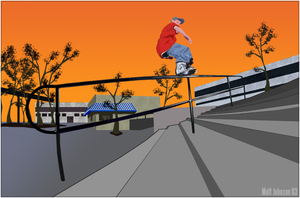
I was bored so I made this.. nothing special. The skater is Alex Broskow...Related content


Comments: 14

I like this a lot...
The colours work really well, and the high contrast is just right. (Not too little//much)
👍: 0 ⏩: 0

I love the retro feel you have with the yellows...soft, good contrast...stands out but doesn't blind you, you know?
Even though you were bored when you made this, I still think it's awesome! Great job!
👍: 0 ⏩: 0

 (Smile)")


jeez, i can't even do that if i'm not bored.....
nice soft color w/good contrast.
nice composition. i like stairs
👍: 0 ⏩: 0


Clean contrast and tones. Certainly more dramatic than if the photo were in colour. Good job.
")
👍: 0 ⏩: 0


Love the color scheme of the 2d, it fits exceptionally well with the actual photo. The dripping is done well.
👍: 0 ⏩: 0

That's very cool. I like your use of brown and lighting and shit like that. Good job.
👍: 0 ⏩: 0

great logo
cool paint effects
nice 1
o yeh jus 2 let u know u owe me comments...
hah
tom
👍: 0 ⏩: 0

Nice.... Might I make a suggestion? Next time you get a shot or a rail... tilt the camera slightly to emphasize the angle... Diagnal lines depict motion and if you exaggerate them it might look cool... try it!
👍: 0 ⏩: 0
Nice.... Might I make a suggestion? Next time you get a shot or a rail... tilt the camera slightly to emphasize the angle... Diagnal lines depict motion and if you exaggerate them it might look cool... try it!
👍: 0 ⏩: 0