HOME | DD
 VixartStudios — Adam bird form ref sheet
Published: 2018-10-02 23:11:22 +0000 UTC; Views: 665; Favourites: 44; Downloads: 0
Redirect to original
Description
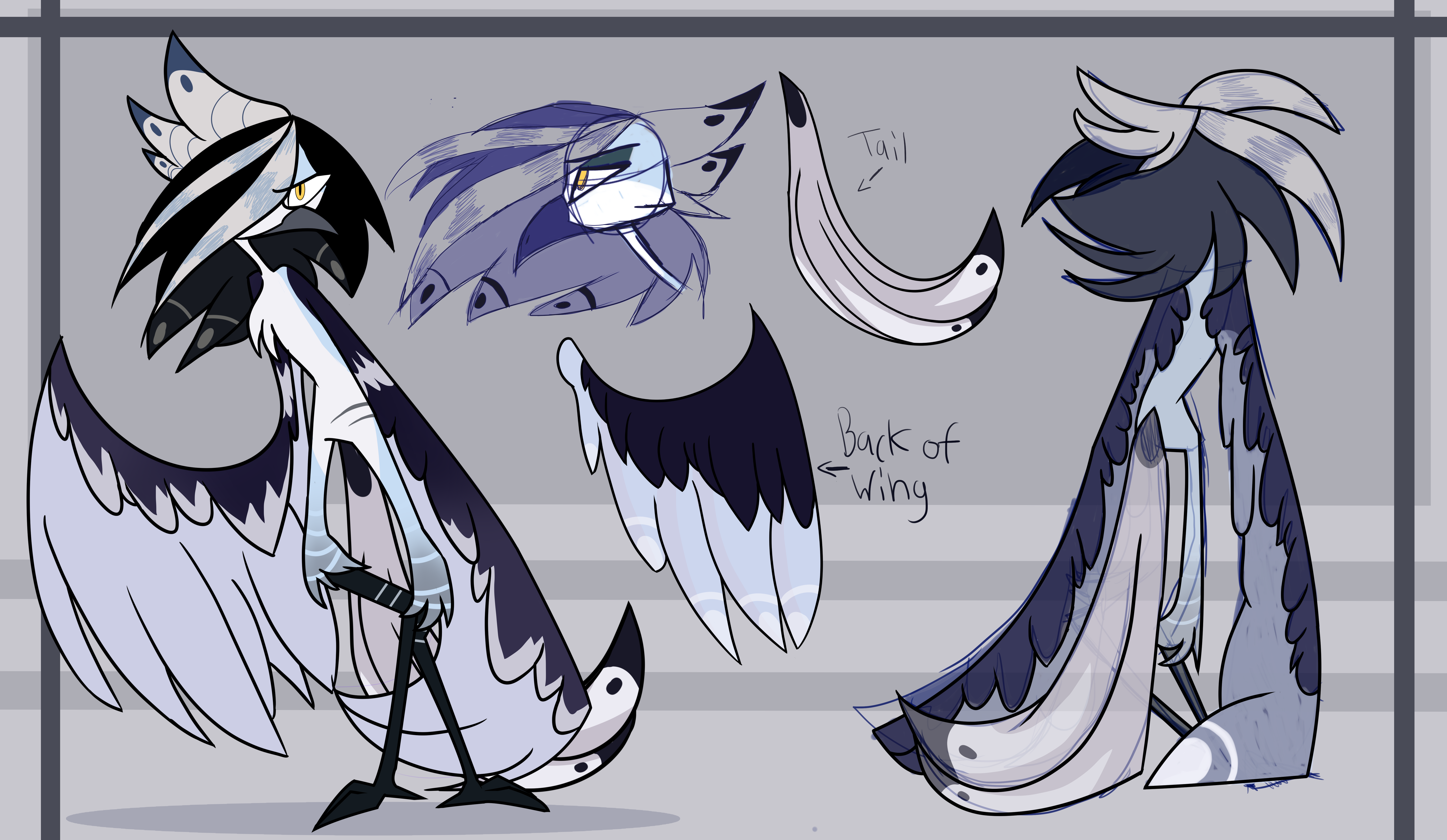
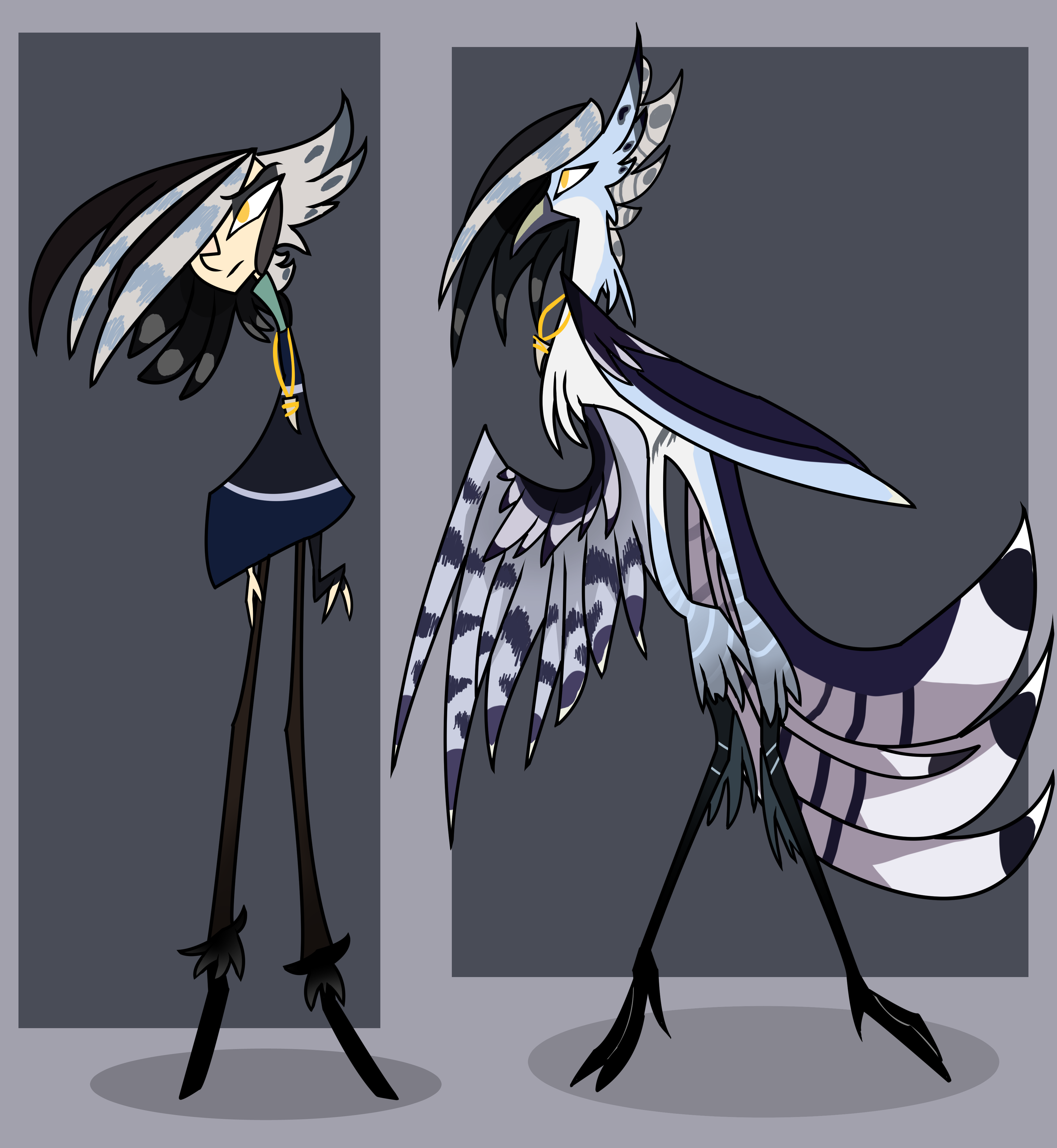
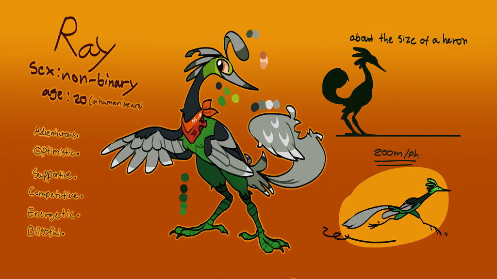
This is a quick ref sheet for Adam's bird form.
This is his original ref sheet:
it's a bit old but I thought i worked fine as a ref sheet. Though I wasn't happy with how his bird form looked so I decided to do a quick ref sheet of his bird form.
I like how this turned out though I still think i looks a little odd and that is because I suck at drawing birds.
EDIT: Shoot I forgot the necklace. Oh well I guess i didn't need to add it anyway
If you want to read his bio go here:
refsheet.net/vixartStudios/ada…
Feel free to critique this. I'd really like some feedback
Related content


Comments: 1

Overall


Vision
Originality
Technique
Impact
To start this off--
Holy HELL I love the way you draw bird-like creatures. The way you draw the beak especially looks great to me, and I can't put my finger on why exactly.
The anatomy is obviously very stylized, but even at that the wings and the legs appear a little off. The curve of the top part looks especially strange. Perhaps try looking at references of bird wings in real life? Just google "outstretched or folded bird wing" and you'll come up with plenty of results that I'm sure you'll find useful. The feathers also look a little clunky, instead of light and fluffy, as feathers are. Not to sound like a broken record, but references can help this as well e.deviantart.net/emoticons/b/b… " width="15" height="15" alt="
")
Same goes for the legs, too. They appear to bend backwards(?) almost, and look a little broken because of this. I understand this may be a stylistic choice, but it makes it look the character is about to fall over. Once again, referencing bird legs would help!
The last thing I can think to say about the anatomy is the eye on the first figure. It's a tad too large and close to the middle. If the hair didn't cover the other eye, they would touch. This one isn't too hard to fix, just shrink the eye just a tinge <3
The only other thing I can think of at the moment would probably be the weird transition between solid line-work and sketchy lines. This is kinda nit-picky, but I think it just makes the image look a little unfinished. Not only that, but it distracts from the clean line-work displayed in the first image.
Overall, I think this is a very nice piece! It's visually pleasing, and the colors are great together. This is my first critique, so please let me know how I did. I can't wait to see your work in the future n.n
👍: 0 ⏩: 0